What Are Embedded Dashboards? (An Express Guide)

John runs a fast-growing SaaS company.
Every morning, he logs into his platform, eager to check on customer engagement. But he dreads switching between different analytics tools. He wastes time exporting data, copying numbers, and trying to make sense of reports that never seem to sync. One day, his product team rolled out a new feature: an embedded dashboard. Suddenly, all the key metrics are right there, inside his app.
No extra clicks. No switching screens. Just answers, instantly.
This is the promise of embedded dashboards.
What Is an Embedded Dashboard?
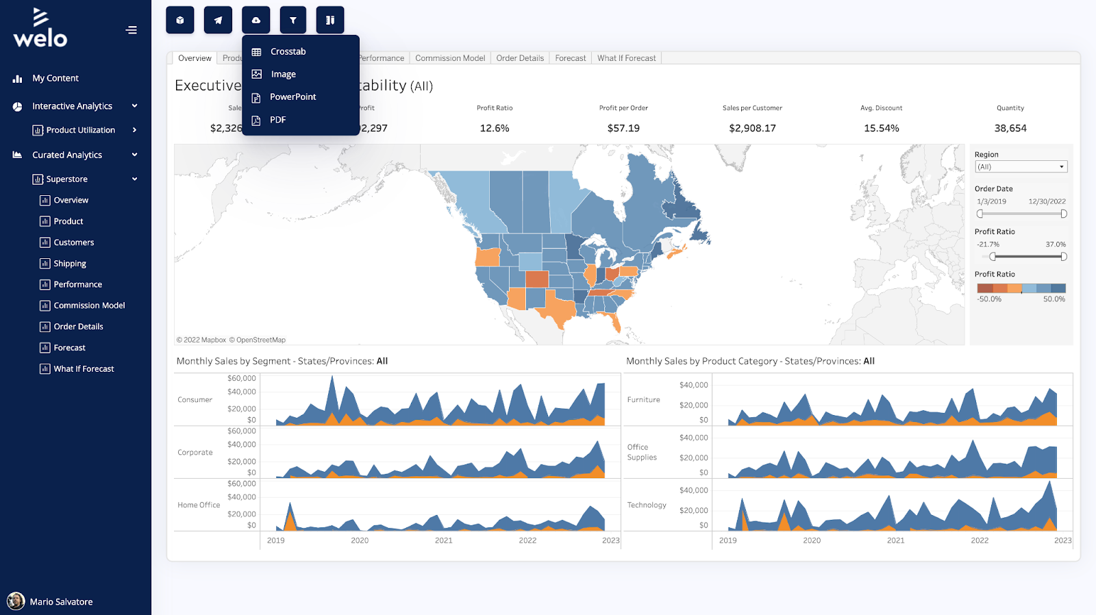
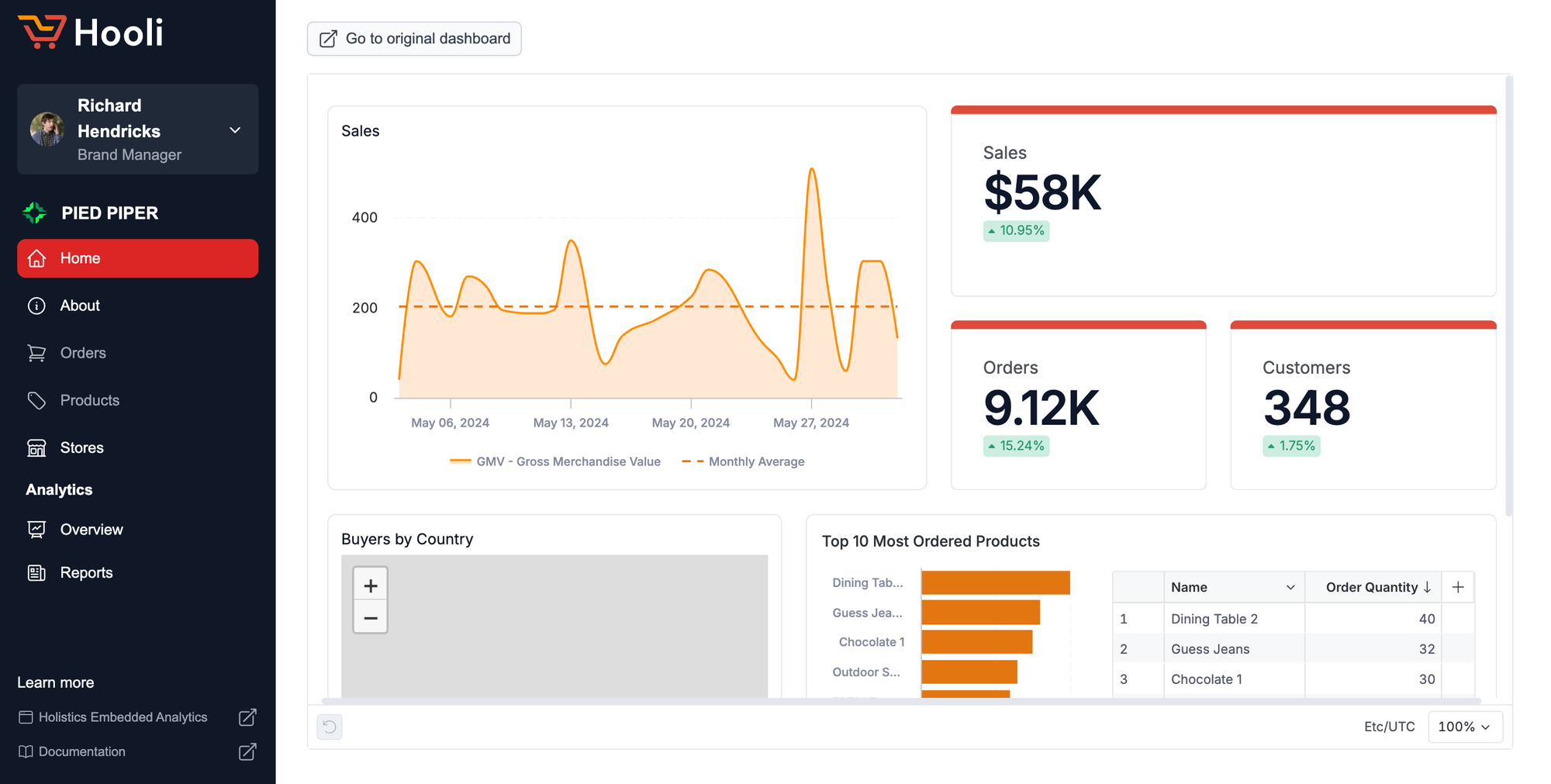
An embedded dashboard is an analytics tool placed directly inside an application. Instead of leaving the app to check data, users see key insights in real time, exactly where they need them.
Think of it like a car’s dashboard. Drivers don’t check a separate app to see their speed or fuel level. That data is right in front of them, built into the driving experience. Embedded dashboards work the same way. They blend analytics into everyday workflows.
Why Embedded Dashboards Matter
It's simple. Data drives decisions. But when insights are hard to access, they lose value. Users won’t take action on information they struggle to find.
Embedded dashboards remove this friction. They eliminate extra steps and give users direct access to the numbers they need. A sales rep sees deal progress inside their CRM. A marketer checks campaign performance right in their automation tool. An operations manager tracks inventory without leaving their supply chain software.
When data lives where work happens, better decisions follow.
Common Components of an Embedded Dashboard
A well-designed embedded dashboard consists of several key components that enhance usability and decision-making.
- Data visualizations
- Filters and drill-downs
- KPIs and metrics
- Alerts and notifications
- Export and sharing options
So why do these components matter?
First, data visualizations provide clear, digestible insights. Charts, graphs, and tables transform raw data into actionable information. Line charts track trends over time, while bar graphs compare different categories.
Second, filters and drill-downs allow users to explore data interactively. Instead of static reports, embedded dashboards offer dynamic controls. Users can filter by date, category, or segment, refining insights to their specific needs.
Third, KPIs and metrics display the most important numbers at a glance. These high-level indicators, such as revenue, conversion rates, or engagement scores, keep users informed without overwhelming them.
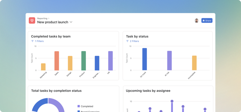
Fourth, alerts and notifications keep users proactive. Whether it's a spike in website traffic or a drop in sales, the dashboard can trigger real-time alerts, ensuring immediate action.
Example of alerts in Holistics
Finally, export and sharing options enhance collaboration. Users can generate reports, share snapshots, or integrate data with other systems, making insights more accessible to teams and stakeholders.
When these components work together, the result is a seamless, user-friendly experience that empowers users to make better decisions, faster.
How Embedded Dashboards Improve User Experience
Every extra step in a workflow adds friction. Switching tabs. Logging into different systems. Manually compiling reports. These slow things down.
Embedded dashboards streamline the experience. They reduce cognitive load by keeping everything in one place. Users stay focused. They don’t need to remember where to find reports or how to interpret raw data. Instead, they see clear, visual insights without breaking their workflow.
For product teams, this means higher engagement. When users get value without effort, they stick around longer. They trust the platform. They rely on it. Embedded analytics make products more essential.
Real-World Examples of Embedded Dashboards
Companies across industries use embedded dashboards to improve their products.
A project management tool like Asana includes visual workload dashboards. Team leads see who’s overloaded and who has capacity, without leaving the app.
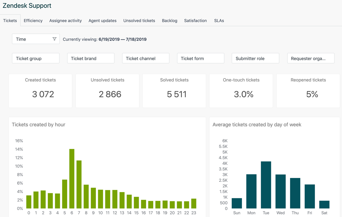
A customer support platform like Zendesk shows real-time ticket resolution stats. Agents see how they’re performing instantly, keeping them motivated and aware.
A fintech app like Stripe provides live payment analytics. Business owners track revenue without leaving the platform.
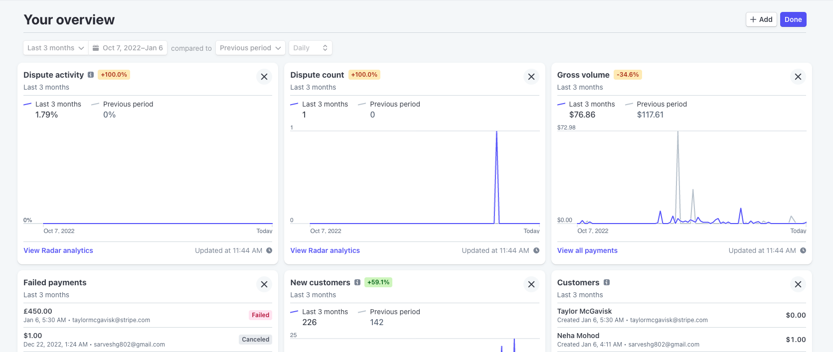
Across all these examples, the pattern is the same: Data appears where users need it, not in a separate tool. For more examples, check out this article: 20+ Embedded Analytics Examples for Every Industry
The Best Embedded Dashboarding Tools
Choosing the right embedded dashboarding tool depends on factors like ease of integration, flexibility, and scalability.
For a more detailed, fact-based comparison matrix of different embedded dashboard platforms and software, check out this guide.
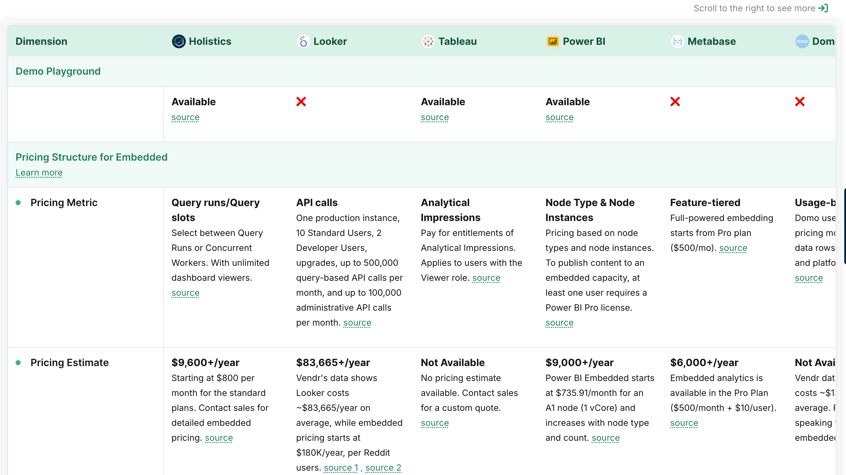
Here’s a look at five of the best tools:
1. Holistics Embedding
Holistics Embedding offers fast and flexible embedded analytics.
Product engineers can build reusable dashboards using code, govern with Git, and embed them using iframe. It provides a code-based approach to analytics, enabling engineers to adopt software best practices — define analytics logic, metrics, and dashboards as code, govern with Git version control, refactor and reuse with ease.
That said, Holistics comes with a learning curve. It requires engineering familiarity for full customization.
2. Tableau
Tableau provides industry-leading data visualization, with extensive interactive analytics capabilities. Tableau's embedded analytics solution offers both iframe and JavaScript SDK options, allowing for deeper customization.
That said, Tableau's lack of Git-based version control might make it difficult for engineering team to govern dashboards at scale.
3. Power BI
Power BI Embedded integrates deeply with Microsoft products, making it a go-to choice for enterprises using Azure and Office 365. It provides flexible embedding options through APIs and SDKs.
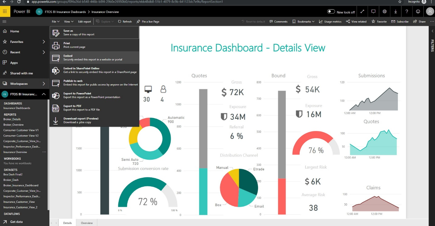
That said, while it integrates well with Microsoft products, its value may be diminished for organizations using non-Microsoft technologies or requiring more advanced customization options. PowerBI’s workflow is also not designed to have code checked into Git repository, making it difficult to manage changes, perform code branching, and maintain the accuracy of analytics logic.
4. Domo
Domo’s embedded analytics solution enables real-time data integration and sharing. It offers no-code and low-code customization options, making it user-friendly for business users.
While Domo offers extensive features and ease of use, it comes at a higher price point compared to other tools. The pricing structure can also become complex as your needs grow, especially with additional users or data sources.
5. Sisense
Sisense is built for large-scale embedded analytics, featuring an API-first approach that allows developers to fully customize the analytics experience. It includes AI-driven insights and strong data transformation capabilities.
That said, Sisense’s transition from a code-first visualization tool to an embedded analytics platform has reduced its focus on SQL-first capabilities and internal BI tools. This shift has made it less suitable for users who prioritize reusable, standardized models for internal analytics and reporting. Sisense’s pricing model can be expensive, particularly for larger deployments or highly customized solutions. Sisense pricing starts from $21K per year.
Final Words
Embedded dashboards (read: embedded BI) changes the way businesses interact with data. By placing key insights directly within applications, they eliminate friction, enhance decision-making, and improve user engagement. Companies that implement embedded analytics effectively can increase user retention, unlock new revenue streams, and differentiate their products in competitive markets.
The right dashboarding tool depends on your needs. If you want deep customization, Holistics, Looker Embedded, and Sisense might be great fits. If you need stunning visuals, Tableau excels. For those already in the Microsoft ecosystem, Power BI is a solid choice. And if automation is key, Domo delivers.
At the end of the day, the best analytics experience is the one that feels effortless. When data is where you need it, when you need it, everything just flows. That’s the power of embedded dashboards.
What's happening in the BI world?
Join 30k+ people to get insights from BI practitioners around the globe. In your inbox. Every week. Learn more
No spam, ever. We respect your email privacy. Unsubscribe anytime.
