Introducing Canvas Dashboard (Dashboard As Code)
Turn rigid dashboards into living documents, rich with interactivity, business context, and storytelling.

Contents
If you’ve been in the data world long enough, it’s almost suspicious if you don’t hear “dashboards are dead” every three months.
Ask all data analysts you know, and you’ll likely hear a consensus: Dashboards are bad. They’re hard to build, rarely used, and often left to collect virtual cobwebs after fulfilling that one ad-hoc data request. They’re the data equivalent of home treadmills—we expect transformation, but they end up neglected.
We do think that when people say dashboards are dead, they’re not being literal. It’s either frustration speaking or it’s part of a thinly veiled marketing campaign for a new product or company.
Yet, the frustration is real and understandable.
Traditional dashboards do one thing well: display a collection of charts and numbers. But when we demand more—business context, storytelling, sense-making—they crumble. So, people declare “dashboards are dead.”
We believe that dashboards aren’t dead (nor will they ever be), they just haven’t been done right. Traditional BI dashboards often come with a rigid layout, limiting analysts' ability to design dashboards that truly align with business mental models. On top of that, the lack of reusability means repetitive work and inconsistencies in shared components across dashboards in an organization.
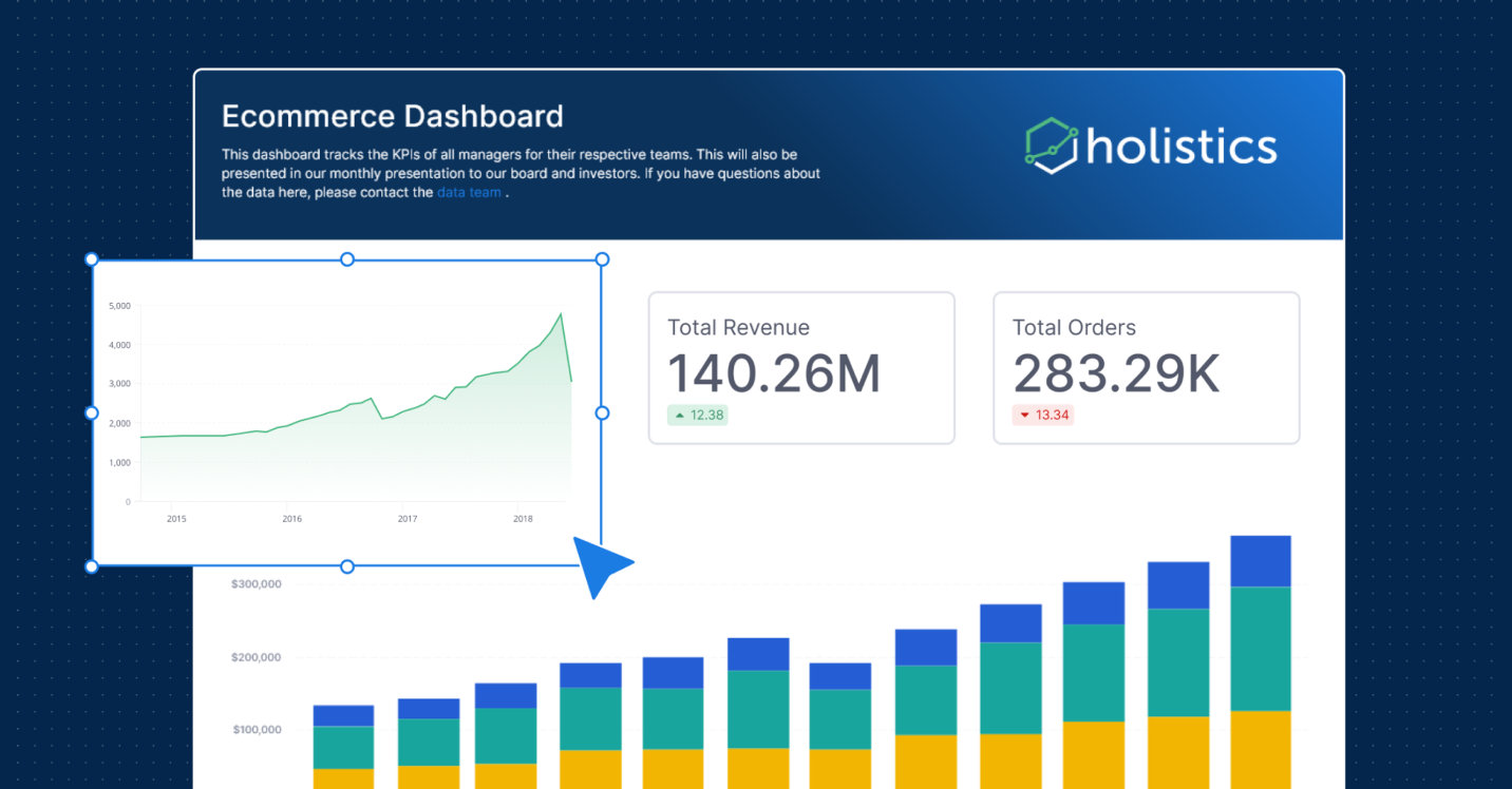
We built Canvas Dashboard (Dashboard As Code) to address these challenges. Our goal is to give analysts the freedom and flexibility to turn rigid dashboards into living documents, rich with interactivity, business context, and storytelling.
Let's explore its key features and how they solve the problems mentioned above.
What Makes Holistics Canvas Dashboard Stand Out
1. Analytics Blocks in Canvas Dashboard
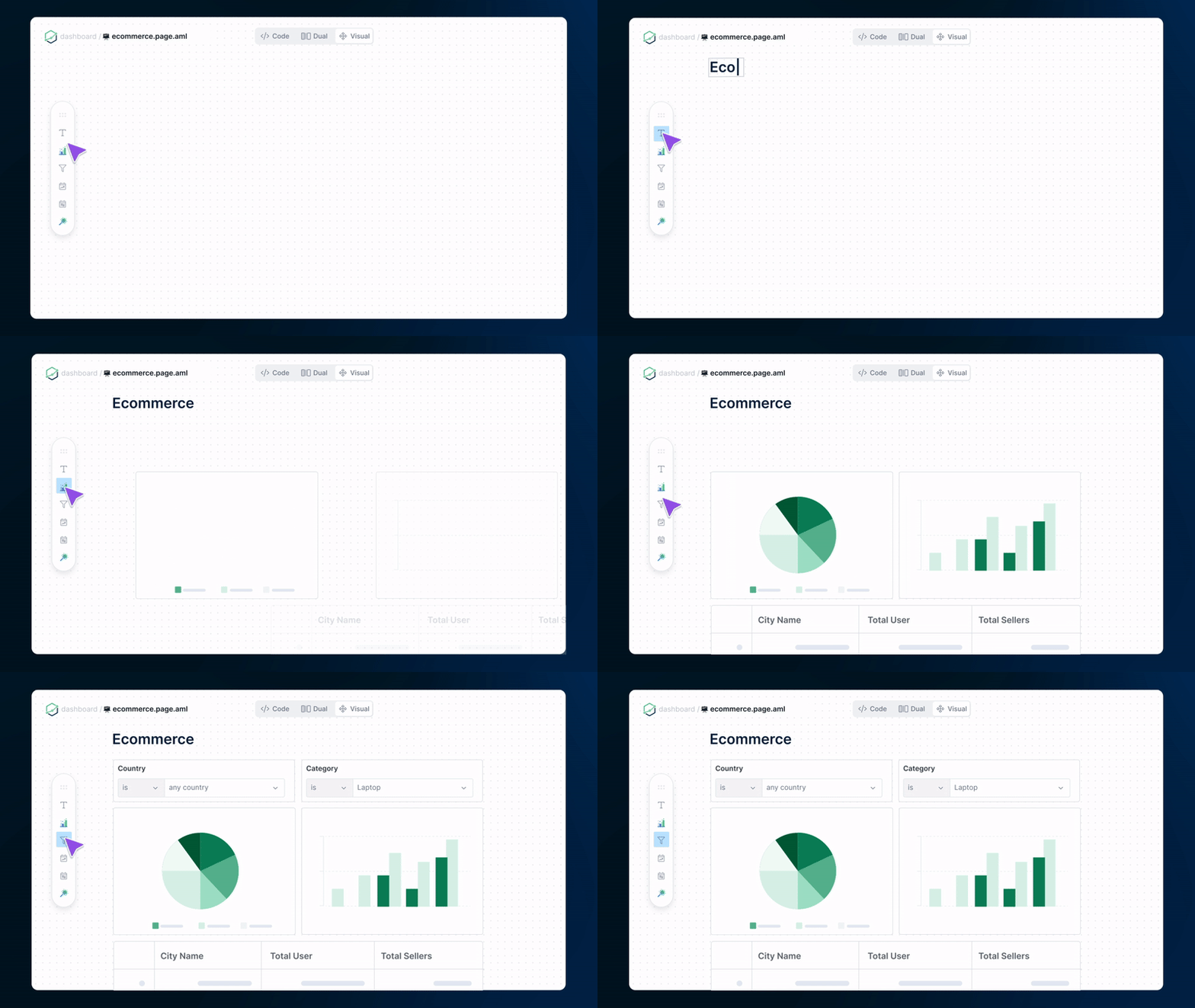
Canvas Dashboard reimagines dashboard elements as "Blocks" that can be freely arranged on a canvas. This includes Visualization Blocks for all your charts and tables, Text Blocks for adding context and explanations (Markdown supported), and Control Blocks for filters, period comparisons, and drills.
By treating every element as a block, you can have the flexibility to create custom layouts. You can place relevant filters next to charts, add explanatory text, or even embed an entire FigJam whiteboard of your business models, breaking free from the rigid layouts of traditional dashboards.

2. Develop Dashboard Programmatically
Canvas Dashboard supports a code-based approach, bringing software engineering best practices to dashboard development. This means you can:
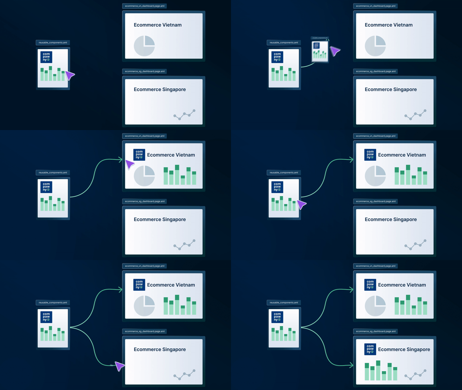
- Define reusable components and functions
- Generate multiple charts or dashboard sections dynamically
- Leverage version control for dashboard development
As-code development addresses the lack of reusability in traditional BI. You can create libraries of reusable components, ensuring consistency across dashboards and reducing development time.
With version control, you can enable more fluid collaboration without fear of breaking dashboards unexpectedly!

3. Style Dashboard with Custom Themes
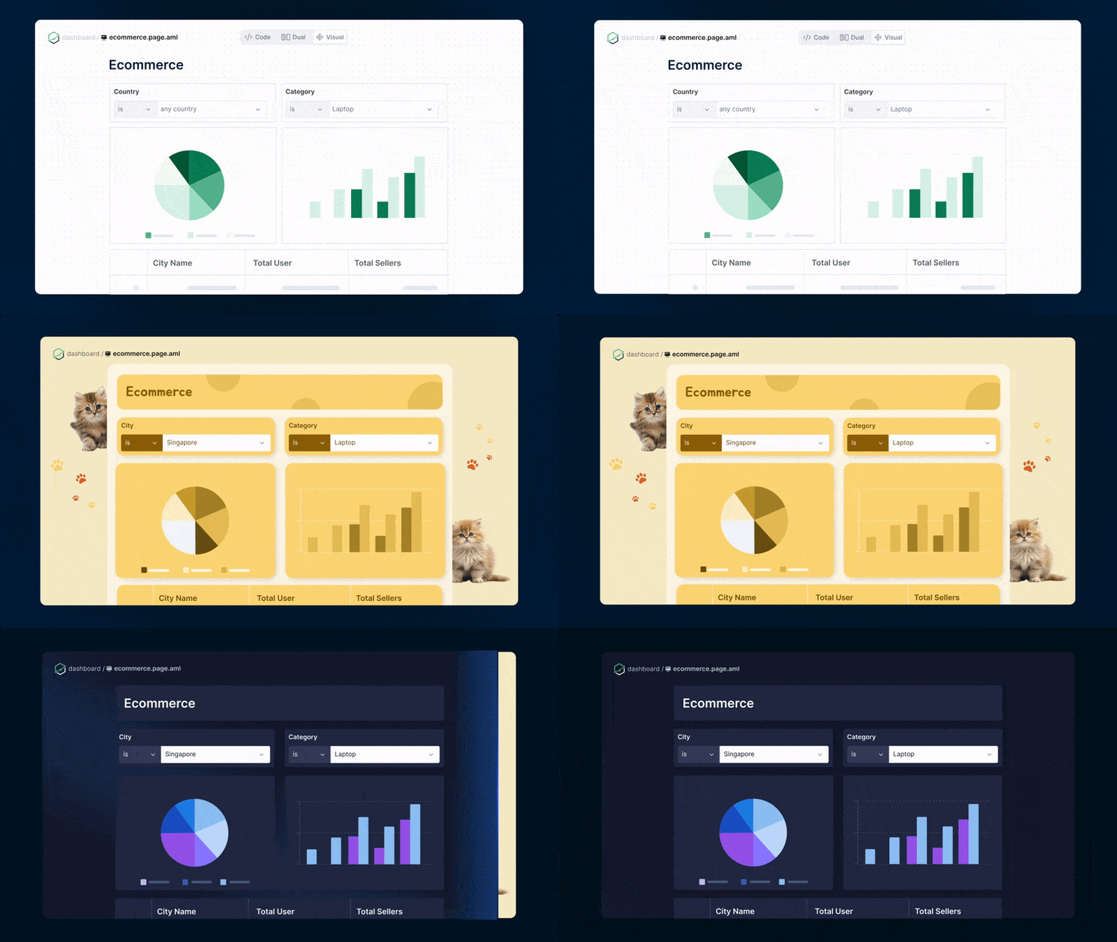
Canvas Dashboard lets you define custom color palettes, set typography styles, apply consistent styling, and create reusable, custom themes (like light and dark modes) that can be extended and built upon instead of rebuilding from scratch.
Now you can turn Holistics dashboards into a magazine cover with our Custom Dashboard Themes.

Better yet, you do it using our static-typed coding-friendly markup language instead of terribly-looking YAML!
Last Words
We believe the Canvas Dashboard opens up many new possibilities for data teams to build dashboards that people actually use—ones that spark stories, not boredom.
If you want to try it out, feel free to visit our playground anytime - no login needed: go.holistics.io/playground.
What's happening in the BI world?
Join 30k+ people to get insights from BI practitioners around the globe. In your inbox. Every week. Learn more
No spam, ever. We respect your email privacy. Unsubscribe anytime.
