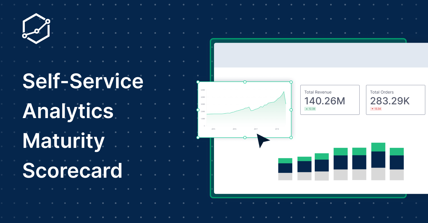
The Self-Service Analytics Maturity Scorecard

Contents
The industry seems split on what "self-service analytics means". Benn Stancil suggests it's more of a "feeling," while my colleague thinks of it as a specific state of business operations. The common thread? Both agree it's about empowering users to interact with data—without the manual.
This led me to ponder: How can we measure the maturity of a self-service analytics culture within an organization? So I've made this Self-Service Analytics Scorecard, as a tool designed to help businesses assess their own analytics landscape.
What is the Self-Service Analytics Scorecard?
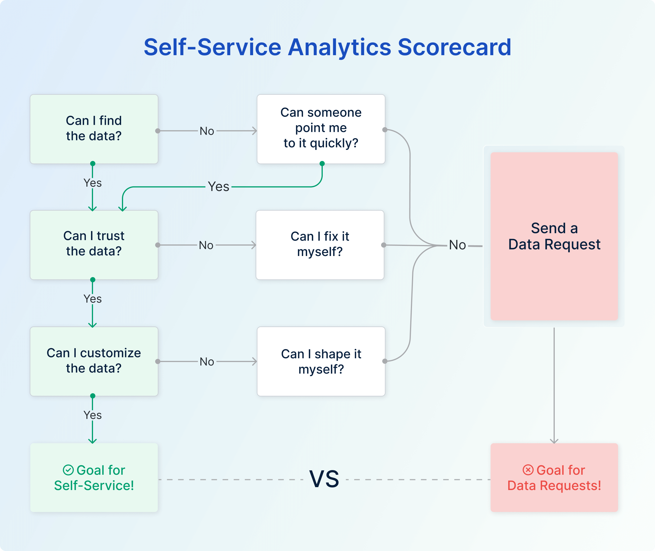
If you've ever found yourself wondering how effective your self-service analytics culture is, this scorecard provides a framework to answer that. It hinges on three simple yet fundamental questions:
- Can users find the data they want?
- Can users trust the data they find?
- Can users shape the data they need?
Get a "yes" to all three, and you're on the right track. But if you hear "no," be prepared for a new request in your data team's backlog.
Why This Scorecard Matters
Time to be blunt: A business burdened by constant data requests to a centralized team is a business that's falling behind. It's a scenario that resembles what Jeff Bezos wanted to avoid when he implemented the "Bezos API Mandate" at Amazon.
In essence, Bezos insisted that all data and functionality should be exposed through APIs, allowing different parts of the business to communicate without going through a central 'gatekeeper.' The mandate led to a surge in innovation and agility at Amazon.
Now, replace 'API' with 'internal data platform,' and the essence remains the same. Much like how the API Mandate decentralized software development within Amazon, the Self-Service Analytics Scorecard aims to decentralize data accessibility within your organization. The goal is to eliminate scenarios where data teams become bottlenecks, acting as mere customer service reps fielding requests from other departments.
High-Level Overview: How the Scorecard Works
So, how does the scorecard operate?
At its core, it poses three questions to assess each data request. If one of these questions fails, the user can, depending on their skillsets, be motivated to attempt a workaround to give the semblance of self-service analytics.
And if the workarounds don't work, the user will add to the data request queue, these requests are clarifications that the data teams can answer easily and effortlessly, thus still giving a semblance of self-service analytics feelings. So it does not really count as adding a significant workload to the data request queue. Find a section in the blog to define the self-service analytics workaround
If the workarounds for self-service analytics don't work, the user is likely to abandon the quest for data, export the data to fix it themselves or burden the data team with another request.
The Three Questions Test: Breaking It Down
1. Data Accessibility: Can Your Users Find What They Need?
Here, we're talking about data availability, discoverability, and understandability.
- Availability: If you've ever encountered a missing report or absent data in the warehouse, you know how this can create an accessibility issue.
- Discoverability: In a sea of similar-sounding reports and files, locating the one you need can be like finding a needle in a haystack.
- Understandability: Assuming you locate the data, there's the issue of comprehension. It might as well be in a foreign language if you don't understand what it means.
In a world where instant messaging is often quicker than searching through a manual, a simple Slack message to a colleague can surprisingly serve as a stopgap measure for all three components of data accessibility.
While this approach is far from ideal, it can still give users a feeling of self-service analytics if they get the answers fast enough. It’s reassuring to know that the data is out there; you just haven’t found it yet. This makeshift solution sustains the momentum of your quest for insights, buying time until a more robust data documentation culture can take over.
2. Data Quality: Is the Data Trustworthy?
This is the Achilles' heel for most. If your data is flawed, users will notice.
- Wrong Input or Calculation: Any inaccuracy here can be a dealbreaker.
- Outdated Data: Stale data is as bad as wrong data.
- Contradicting Data: If users find conflicting information, guess who they're going to ask for clarification.
The immediate solution to data quality issues might just be within your skill set.
- For Accuracy, if you notice an erroneous calculation, and you understand the formula well enough, you can correct it yourself.
- If the data seems Stale, and you're familiar with the dashboard tools, a simple refresh could update the metrics you need.
- When it comes to Consistency, being able to discern the most reliable report among conflicting ones can save you time and anxiety.
This is often where a quick Slack message to your data team comes into play. If you've taken steps to address these issues, a speedy confirmation from the experts can validate your work. It’s not the long-term solution we aim for, but if you manage to fix the problem yourself and get that quick nod from your data team, it fosters a feeling of self-service analytics. This temporary fix keeps you on track, allowing for swift and more confident decision-making until more permanent quality measures are in place.
3. Data Customization: Can Users Tailor the Data?
So, you've confirmed the data is accurate and trustworthy. What's next? The challenge often lies in customizing this data to suit your specific needs. Maybe you require a certain set of fields, a unique record configuration, or a specialized format to create the visualization you have in mind.
The more granular your request, the less likely you'll find a pre-built report that hits the nail on the head. Sure, you might find something "close enough," but what if that's not sufficient? Take this common scenario for instance: you're looking for a report with precisely four columns—A, B, X, and Y. What you find instead are Report 1 featuring columns A, B, and C, and Report 2 spotlighting X, Y, and Z. You've got the right data, but it's scattered across mismatched formats.
Here's your stopgap: You'll need to take the reins and do some last-mile customization.
Ask yourself, can you dig into the mechanics of Report 1 and Report 2, and then merge them to craft your desired Report 3? The good news is that the raw data is already there; it just needs a bit of tinkering. Alternatively, you might find it more straightforward to export these reports into separate spreadsheets and manually merge the data. Or, as a last resort, you might have to shoot a quick Slack message to your data team: "Can you help me create a report with columns A, B, X, and Y?"
While none of these options is a one-size-fits-all solution, they offer quick fixes to pressing problems. A timely confirmation from your data team can seal the deal, reinforcing that sense of self-service analytics. Just like before, you're empowered to continue your work, driven by data that's not just accurate and accessible, but also customized to your unique needs.
Often, users end up in a sort of "Goldilocks situation". They find reports that are close to what they want but not quite right. Let's consider an example: A user needs a report with four specific columns: "A, B, X, and Y." After some searching, they locate Report 1 containing columns "A, B, C" and Report 2 featuring columns "X, Y, Z." The data is accurate and relevant but divided between two almost-right reports.
So, what's the next step? The user has a few options, and each comes with its own set of questions. Can they dive into the data platform and mash-up Reports 1 and 2 to create their ideal Report 3? Do they have the necessary permissions and skills to pull this off?
Alternatively, could they export both reports into separate spreadsheets and manually combine them? And there's always the option of reaching out to the data team for a custom report, but that may take time.
The fastest course of action could be to use whatever customization tools are available within the platform to blend the two reports into the perfect Report 3. And just like before, a quick Slack message to the data team can validate their work: "I've combined fields from Reports 1 and 2 to make my own Report 3. Does this look good to you?" A timely confirmation from the data team adds another layer of confidence and preserves that empowering feeling of self-service analytics.
Applying the Self-Service Analytics Scorecard
This scorecard can be implemented in several ways:
- Per Request: Add a field to your ticketing system for each of the three questions.
- Quarterly Surveys: Gauge your business users' experiences periodically.
- Priority Setting: Use the collected data to steer your data team's focus.
Limitations and Caveats
The framework is not a victory lap; it identifies gaps, not successes. It also doesn't measure the overall data literacy or value realization from analytics within your organization. But it's a start, laying the foundation for a culture of trust in data, which we'll delve into in future discussions.
So there you have it, a practical framework to evaluate and improve your self-service analytics culture.
Because at the end of the day, self-service analytics isn’t just a buzzword, it’s a business imperative.
Read more: Comparing The Best Self-service Business Intelligence Platforms (Comparison Matrix)
What's happening in the BI world?
Join 30k+ people to get insights from BI practitioners around the globe. In your inbox. Every week. Learn more
No spam, ever. We respect your email privacy. Unsubscribe anytime.
