10 Sisense Alternatives For Embedded Analytics In 2026
In this article, we’ll break down some of the best Sisense alternatives for embedded analytics, covering strengths, limitations, and when you might want to choose them over Sisense.
Contents
Introduction
What We’ll Cover
- Sisens pros, cons, and common reasons teams outgrow or avoid it
- The top alternatives to Sisense for embedded analytics, and how they compare
- Which tools make sense based on your product’s stage, team structure, and customer needs
TL;DR: Strong Alternatives to Sisense
Here are the strongest embedded contenders we’ll explore:
- Metabase: Open-source alternative to Sisense. Ideal for teams that want to self-host. Simple to embed, with limited charting and customization capabilities.
- Holistics: Self-service embedded analytics with a strong semantic layer, Git-native workflow, and embedded AI chat. Built for data teams that want deep customization and control.
- Superset: Free, open-source alternative to Sisense embedded with deep customization, but expect a bit of engineering lift.
- Looker: Strong semantic modeling layer and governance; better suited for larger teams with structured data workflows.
- Sigma: Offer a spreadsheet-style interface. Great for finance-heavy workflows and less technical users.
- ThoughtSpot: Designed for end users, with search-based analytics and embedded AI insights. Best for SaaS apps targeting business audiences.
- Qlik Sense: Known for its associative engine and powerful in-memory data model. Flexible, but comes with a steeper learning curve and a higher cost.
- GoodData: White-label friendly and built for embedded scenarios. Strong on multi-tenancy and scalable deployment, especially in enterprise settings.
Sisense At A Glance: Pros and Cons
Sisense Strengths
Sisense brings several benefits that make it a popular choice for customer-facing analytics:
- Robust Embedded Analytics: With a powerful API and plenty of flexibility, Sisense integrates seamlessly with your product and offers white-labeling options that let you customize dashboards to fit right in with the rest of your app.
- Customizability for Developers: If you have a technical background, you’ll appreciate the ability to write custom scripts and extend functionality using JavaScript. This lets you modify dashboard behaviors or add unique features not available out of the box.
- Flexible Data Connectivity: Sisense connects to pretty much any data source you can think of—cloud databases, on-premise systems, and even Excel files.
Sisense Limitations
The strengths make Sisense a compelling option, but its shortcomings definitely can’t be overlooked.
1. Steep Learning Curve
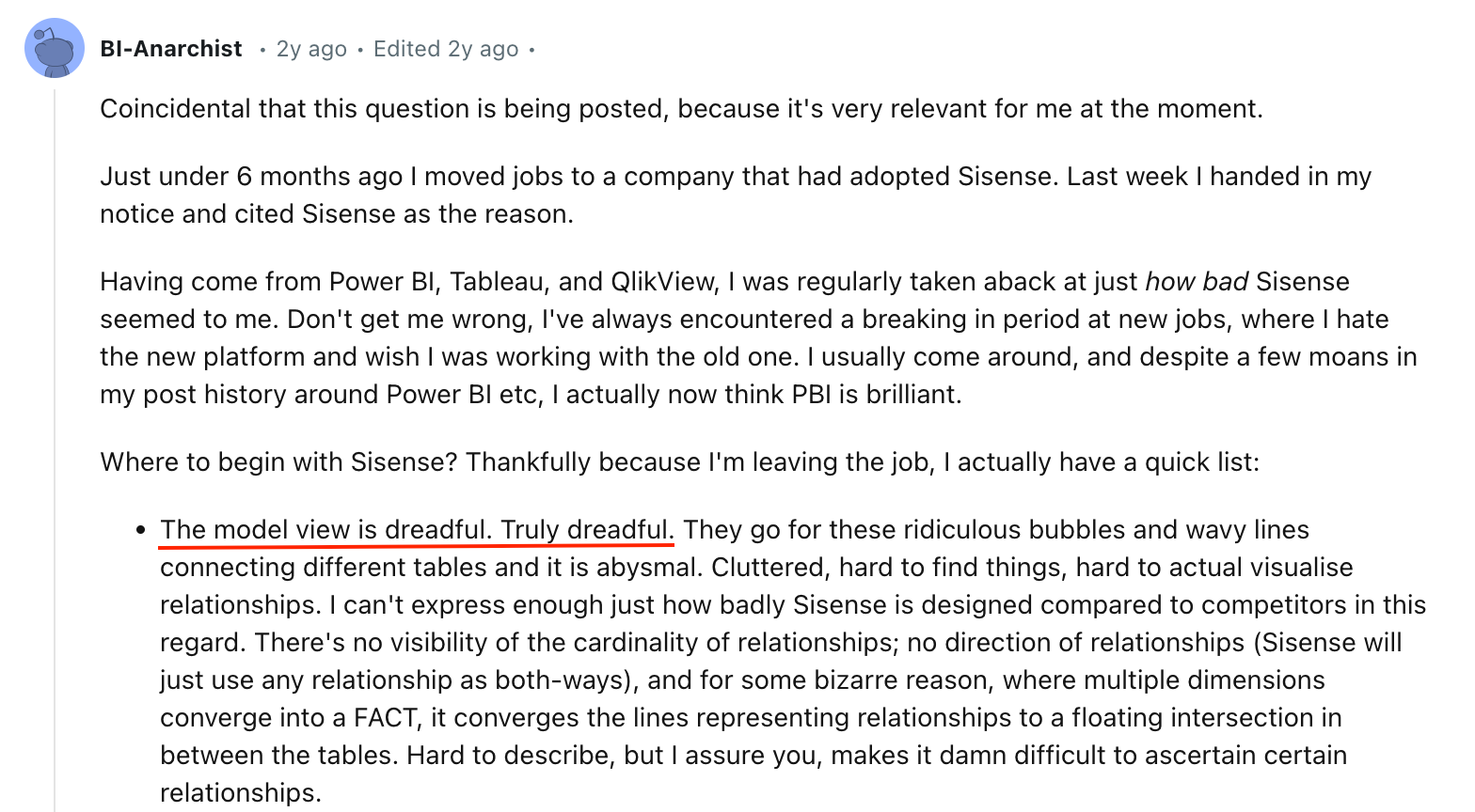
Based on what people are saying on forums like Reddit, one of the biggest issues with Sisense is how complicated it can be to use.
These users mention that it’s tough to get started, especially if you’re used to more user-friendly tools like Power BI or Tableau. The data modeling view is cluttered and not intuitive, making it hard to see how tables connect and relate to each other. One frustrated user even called the design of the model view "dreadful" compared to its competitors.
2. Unintuitive Dashboarding and Layouts
Building dashboards in Sisense can be a real hassle. The same user on r/BusinessIntelligence pointed out the limited layout flexibility and the annoying snap grid system that isn’t precise enough.
A small change at the top of the dashboard can throw off everything below it. To make matters worse, even basic style tweaks—like changing font colors—often require clunky scripting that doesn’t always work as expected.
3. Unreliable Scripting and Customization
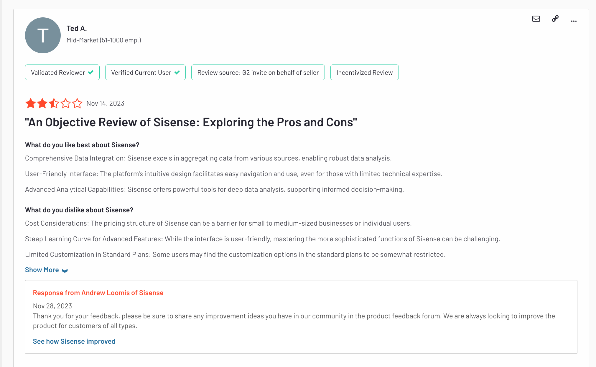
Despite offering customization options, its reliance on JavaScript can lead to inconsistent results. Users on Reddit also highlighted issues where scripts only partially execute, leading to unpredictable outcomes and increased troubleshooting time. You might end up spending more time fixing errors than actually building out your analytics.
Sisense users on G2 also shared the same sentiments on customization capabilities.
4. Documentation and Support Issues
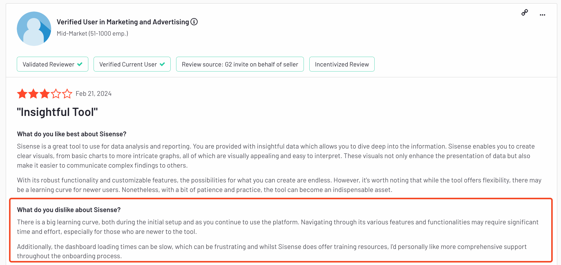
Another major frustration is Sisense’s documentation, as users report it to be less than ideal and often filled with outdated links. Based on Gartner Peer Insights aggregated scores, Sisense is also below average in overall rating, willingness to recommend, and community support compared with its peers.
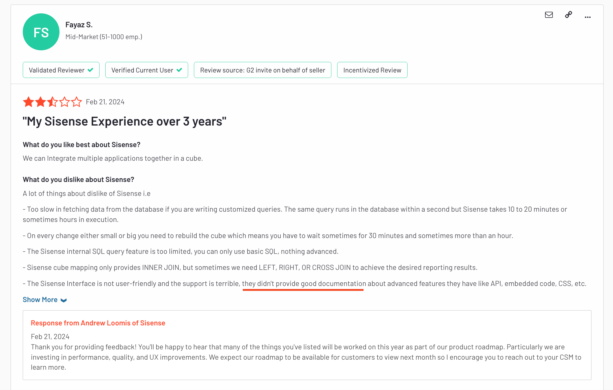
While documentation issues are common across many platforms, what makes it worse for Sisense is the lack of a strong community, something that’s abundant for other BI tools like Tableau or Power BI.
5. Unclear Pricing and High Costs
Pricing is another big pain point. Sisense is known for being super secretive about its pricing structure, and it’s often considered pricey even compared to other enterprise-level tools. This lack of transparency makes it tough for companies to budget properly.
6. Limited Out-of-the-Box Functionalities
If you want to do something simple—like create a dynamic date table—Sisense’s recommended solution is shockingly primitive. Their official documentation suggests building a list of dates in Excel and uploading it into an Elasticube. For a modern BI platform, that’s as basic as it gets, as mentioned by this user.

G2 users also echoed this sentiment - sharing that Sisense's offering is lacking when compared to other tools on the market.
10 Best Sisense Alternatives For Embedded Analytics
If Sisense’s high costs and complex setup are making you question your options, you’re not alone.
The world of BI tools, especially for embedded BI, offers plenty of alternatives that match, or even surpass, Sisense’s capabilities, minus the steep learning curve and unclear pricing.
Here’s a rundown of the top 10 alternatives for embedded analytics, each with its own strengths, limitations, and standout features to help you find the best fit for your needs.
1. Holistics Embedded
As a part of Holistics BI platform, Holistics Embedded is a developer-first embedded analytics solution designed for customer-facing dashboards that feel like a natural part of your products and applications.
What makes Holistics Embedded different, compared to other embedded BI tools, is that it’s purpose-built to eliminate the common trade-offs engineering teams face when adding reporting modules to their product. Teams typically must choose between:
- Pulling engineers off the product roadmap to reinvent analytics infrastructure and build everything from scratch, or
- Paying a legacy embedded analytics vendor to launch quickly, only to be locked into rigid design constraints, clunky workflows, and a lack of modern practices like version control or code-based development.

Holistics Embedded's key features include:
- Easy Embedding: With just a few lines of code, you can embed Holistics dashboards into any tech stack, supporting all programming languages. This makes integration straightforward and hassle-free.
- Robust Semantic Layer: At the core of Holistics is a strong data modeling and semantic layer that allows metrics to be defined, extended, and reused across the organization to help you build customer trust with consistent, accurate metrics.
- Flexible Exploration: Embedded viewers can drill down, view underlying data, and cross-filter to explore pre-built embedded dashboards.
- Embedded Report Builder: Customers can build reports themselves, without writing code, using Holistics' drag-and-drop report builder or embedded AI chat interface.
- Rich Customization Capabilities: Make analytics feel like a natural part of your product and app using custom CSS, custom themes, styling, and custom charts.
- Dashboard as Code: Every aspect of your embedded analytics, data models, semantic definitions, and dashboards, can be defined as code and versioned in Git. This approach enables you to track changes, collaborate efficiently, and reuse logic across different customers, significantly reducing maintenance efforts.
- Enterprise-grade Security: Protect your customers’ data with robust security controls, including row-level and role-based access, audit logs, usage monitoring, and compliance with SOC 2, HIPAA, and GDPR standards.
Pricing: Holistics’s embedded analytics solution starts at $800/month and comes with unlimited viewers, unlimited reports created, and all functionalities included.
2. Embeddable
Embeddable’s core strength lies in its ability to deliver native-feeling, high-performance dashboards that integrate seamlessly into any SaaS product. It allows teams to connect data from multiple sources, build interactive analytics using its no-code builder, and embed them directly via lightweight web components or React/Vue embeds, without clunky iframes.
Beyond embedding, Embeddable supports self-serve analytics, localization, exporting, and drilldowns, giving end-users the flexibility to explore data independently. Its multi-layer caching and high-speed data service ensure that dashboards load in milliseconds at scale.
Unlike traditional BI tools, Embeddable is developer-first and fully extensible, allowing engineers to modify or import charts in code, integrate with CI/CD pipelines, control versioning, and manage deployments across QA, staging, and production environments.

3. Metabase
If you’re after a straightforward BI tool that’s easy to get up and running, this one could be a solid choice. It’s open-source and easy to set up, making it perfect for startups and small teams that need quick data insights without diving into complex data modeling. The interface is intuitive—non-technical users can easily ask questions and get answers in the form of visualizations or detailed tables.
Metabase has its strengths, but when it comes to scaling and maintaining control, it starts to show some cracks. One major limitation is its lack of native version control. As your team grows, tracking changes across reports can quickly become a headache. There's no built-in way to see who’s changing what, which can lead to different versions of the same report floating around—causing confusion and inconsistent data. Metabase has also attempted to build a self-service analytics layer like Looker, but users find it complicated and not well integrated.
Despite its limitations, Metabase is ideal if you need a lightweight tool to get started with analytics fast. Its cloud-hosted plans start at $85/month, but there’s also a free, self-hosted version that’s great for teams on a budget. Just don’t expect it to scale up as smoothly as more robust platforms like Holistics or Looker.
4. Tableau
Tableau is the go-to tool for creating stunning, interactive visualizations. With its drag-and-drop interface, you can build beautiful dashboards that go way beyond basic charts and graphs. Plus, you can customize the embedded dashboards to match your brand’s look and feel, providing a cohesive experience for your end users.
Tableau’s main drawback is its complex pricing structure. Plans start at $70/user/month but costs can quickly add up, especially for larger teams. Tableau Embedded Analytics, with its consumption-based pricing model, also brings a new layer of complexity to the calculation.
Plus, Tableau’s use of proprietary file formats means there’s no built-in version control, which makes it tough to maintain consistency across dashboards. While it’s great for visual storytelling, Tableau isn’t the best option for data modeling and governance.
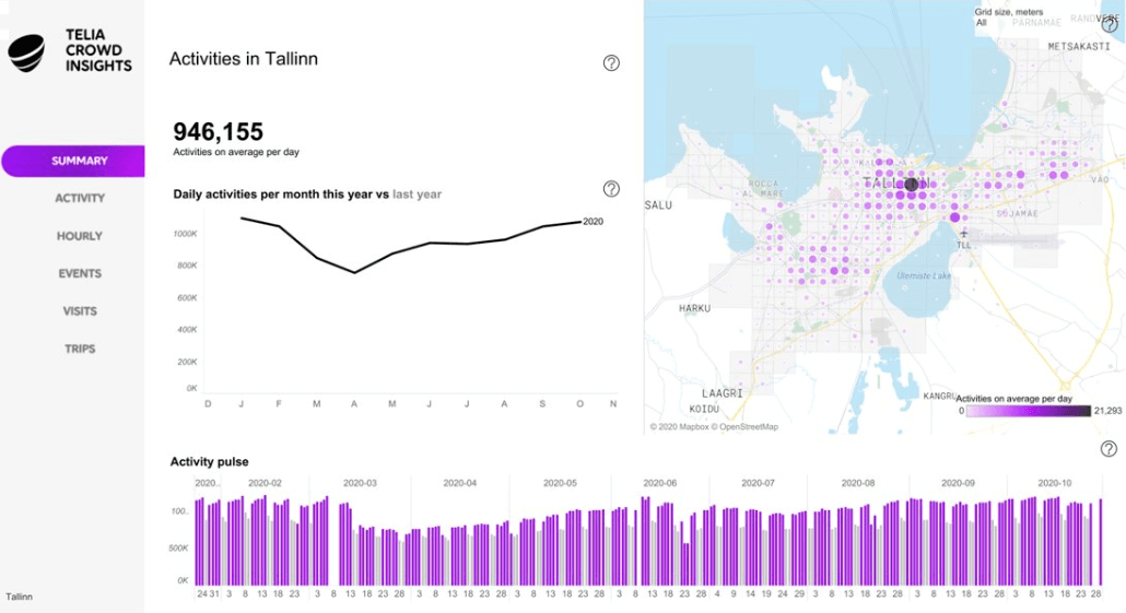
Compared to other BI tools like Looker or Holistics, it lacks flexibility and stronger data management capabilities, making it less ideal if you need more control over your data models and metrics.
5. Power BI Embedded
Power BI Embedded is a no-brainer if your organization is already embedded in the Microsoft ecosystem. With seamless integration with tools like Excel, Azure, and SQL Server, it’s designed to streamline workflows for teams already using Microsoft products. Power BI offers a range of visualization options and powerful data modeling features through DAX calculations.
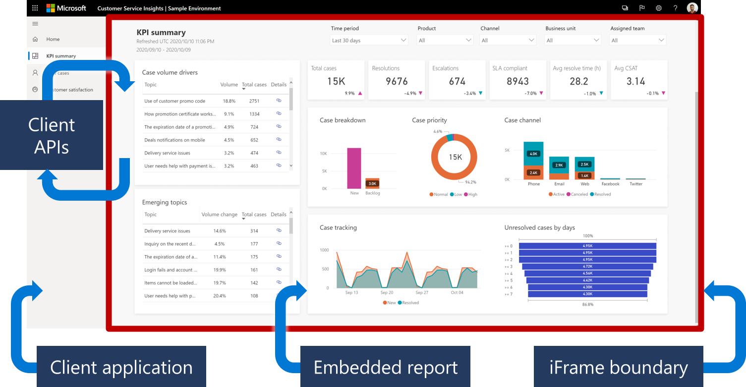
Power BI is great for small to medium-sized teams with pricing starting at $9.99/user/month.
However, mastering advanced features often means diving into DAX or Power M, which can feel overwhelming for new users. Plus, data models are restricted to Windows machines, making it tricky for teams working with Google Cloud or non-Microsoft environments.
Another major issue is governance—Power BI deployments can quickly become difficult to manage. With multiple ways to do the same task, like data modeling (using datasets, data marts, dataflows, or Dataverse), enforcing standard practices can be a struggle. This becomes especially problematic as more users create and publish content, leading to inconsistencies and a lack of control over the process.
6. Looker Embedded
Looker’s strength lies in its powerful semantic layer, which enables data teams to define metrics centrally and maintain data consistency across the organization. If you’re working with large-scale data and need to ensure consistent data definitions, Looker Embedded is a strong choice, especially if you’re already using Google Cloud, as Looker integrates seamlessly with GCP.
However, Looker users on Reddit and G2 constantly shared their concerns over Looker’s lack of friendly visualization options and support experience.
Pricing also starts at around $3,500 per month, which can be a steep investment.
7. ThoughtSpot
ThoughtSpot is unique in that it uses AI to help users get insights faster. Its natural language search feature allows users to ask questions in plain English and get visual answers, making it perfect for non-technical users who want to dive into data without learning SQL. For developers building custom analytics, ThoughtSpot offers great composability with its ThoughtSpot Embedded software, APIs, SDKs, and modeling language (TML). It also supports cloud-agnostic deployment and integrates with tools like
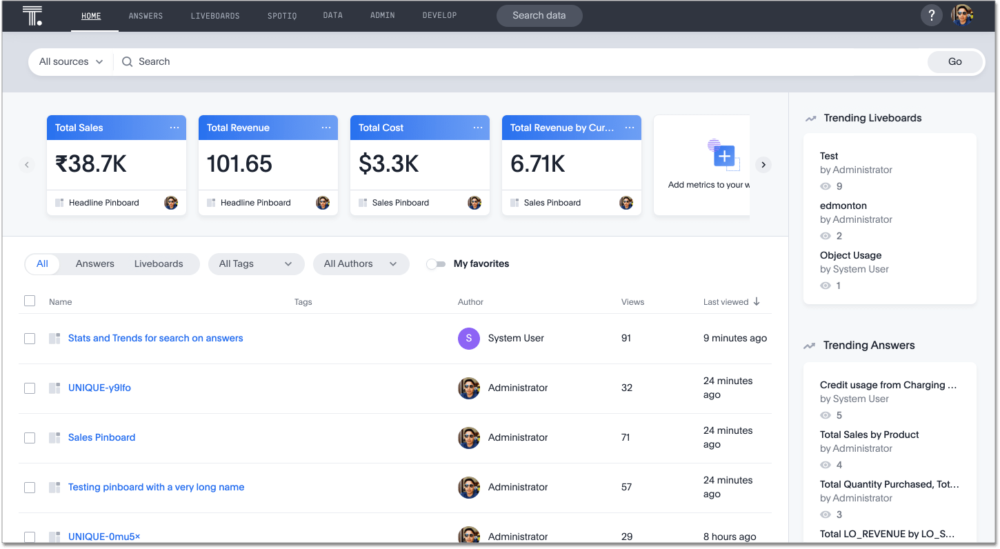
dbt, Excel, Google Sheets, and Slack, giving users flexibility in their data workflows.
That said, Gartner users pointed out that ThoughtSpot lags behind competitors when it comes to data visualization. If you need highly customizable charts, you might find more robust options elsewhere. ThoughtSpot is also relatively young and still maturing. It doesn’t integrate well with version control tools like Git (compared to Looker, Holistics or Sisense) and lacks some security features, which could increase the risk of critical mistakes in production.
Pricing for the Essentials plan starts at $1,250/month for up to 20 users, while Pro and Enterprise plans have custom pricing based on your usage and come with features like unlimited data and 24/7 support.
8. Domo
Domo has made a name for itself as the go-to BI for small and midsize businesses (SMBs) that don’t have a full-fledged data warehouse in place. Its end-to-end architecture covers everything from data collection and ETL to BI, analytics, and even app creation. With over 1,000 native data connectors and strong integration with cloud platforms, Domo helps businesses get their data pipelines up and running quickly, delivering value fast. Its real-time data monitoring is also useful for industries where tracking metrics in real-time is crucial, such as finance or logistics.
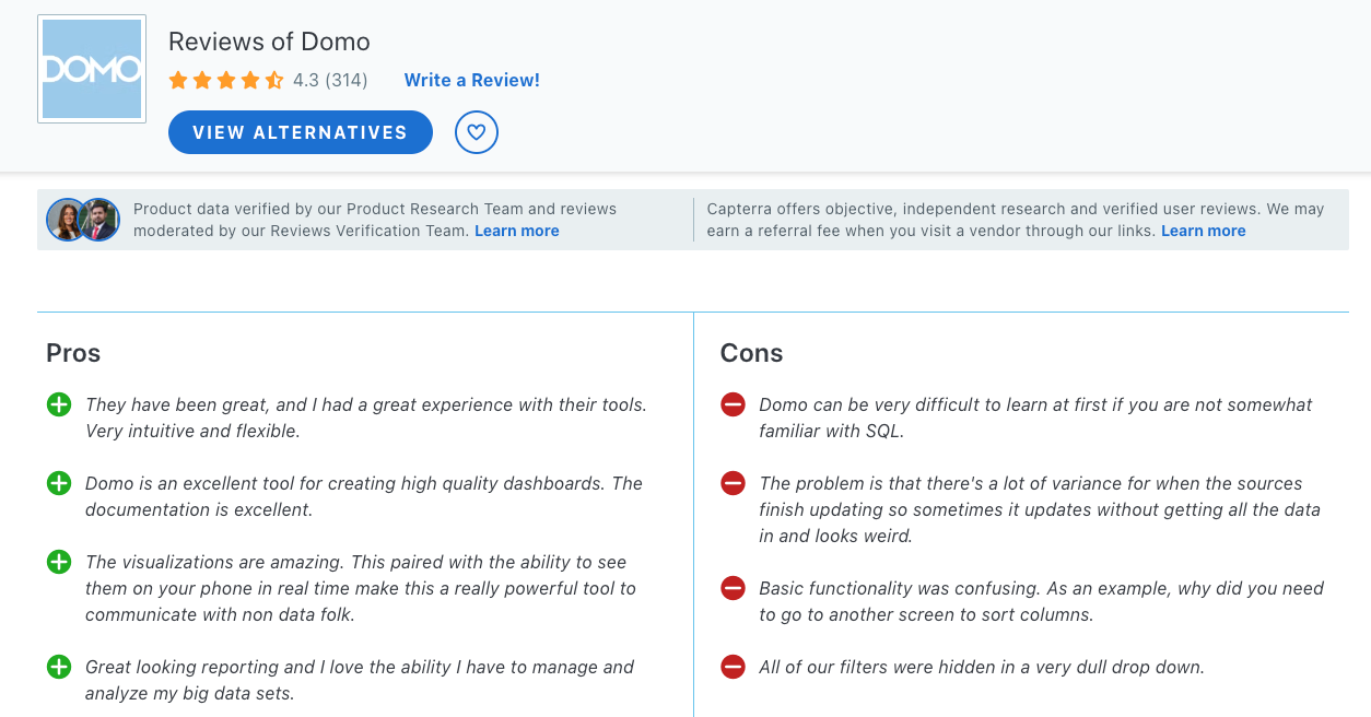
That said, slow load times for large datasets, limited customization for visualizations, and frequent bugs are common complaints. If you’re looking for flexibility or more robust support, Domo might not be the best fit. Its pricing isn’t publicly disclosed, but it’s known to be on the higher end.
The platform is billed based on the number of user accounts and data usage, which can make it costly, especially for smaller teams.
9. Qlik Sense
Qlik Sense is a solid option for enterprises, especially with its recent acquisition of Talend, boosting its data integration capabilities. The platform also takes big steps in integrating data science and AI, making it a strong choice for developers and analysts working across various cloud environments. It’s available on all major cloud platforms, including Alibaba Cloud, which is a big plus for companies with multi-cloud setups or diverse enterprise applications.
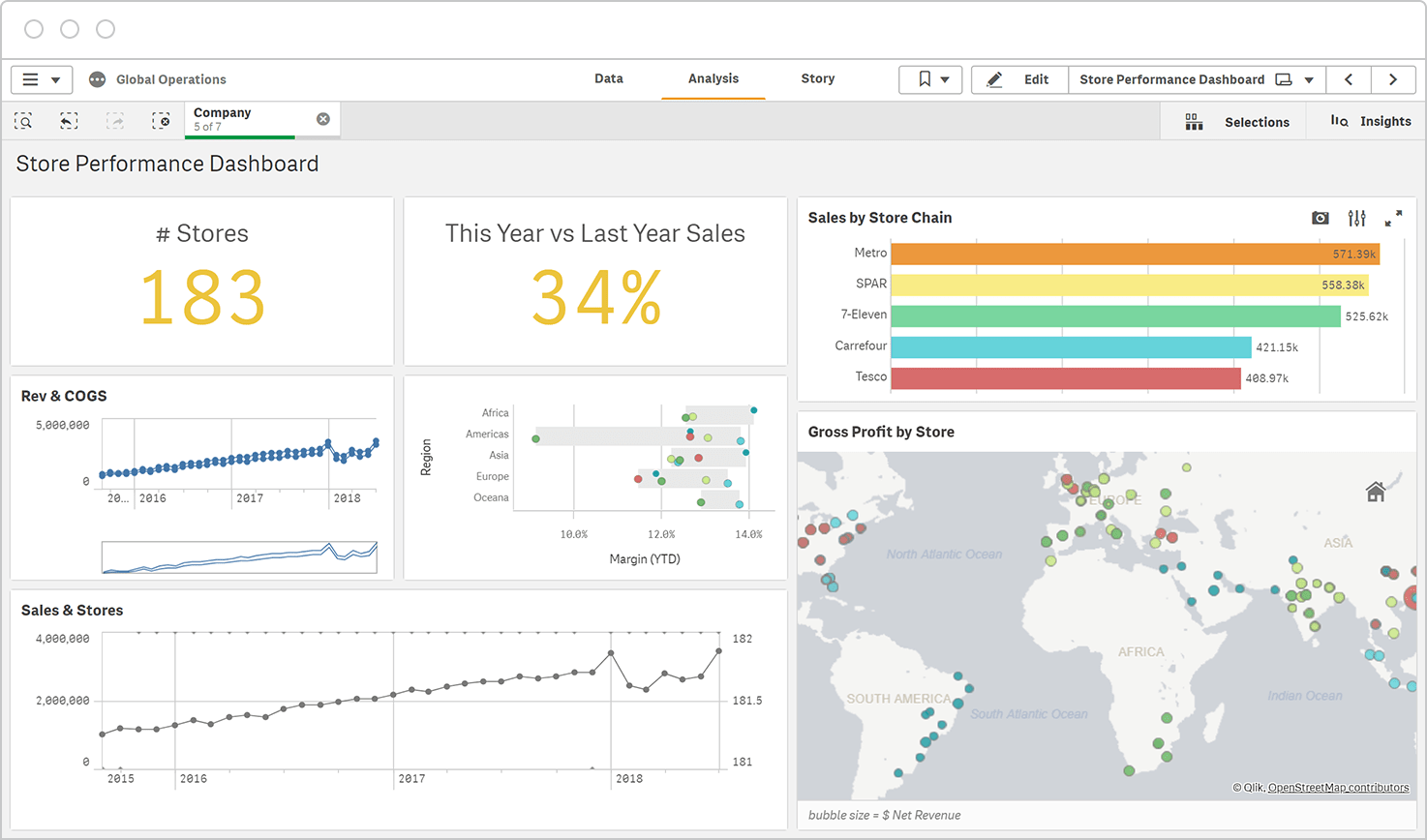
However, one common complaint is the steep learning curve—Qlik Sense offers a lot of components for data transformation, which can take some time to fully grasp. Many users find the UI tricky to navigate and run into issues when trying to customize dashboards. And while it's great for ETL, the support experience leaves a lot to be desired. Users often report long wait times for issue resolution, sometimes stretching beyond a week. The contract renewal process can also be a hassle, with license keys arriving just before expiration, which poses risks for ETL processes if there’s any delay.
10. GoodData
GoodData has a lot going for it, especially if you're looking for a tool that prioritizes centralized metrics and aligns well with a code-first approach. It’s built with composability in mind, meaning you can integrate analytics into your broader development lifecycle. This makes it a good choice for teams that want to scale operations and focus on automation and release management.
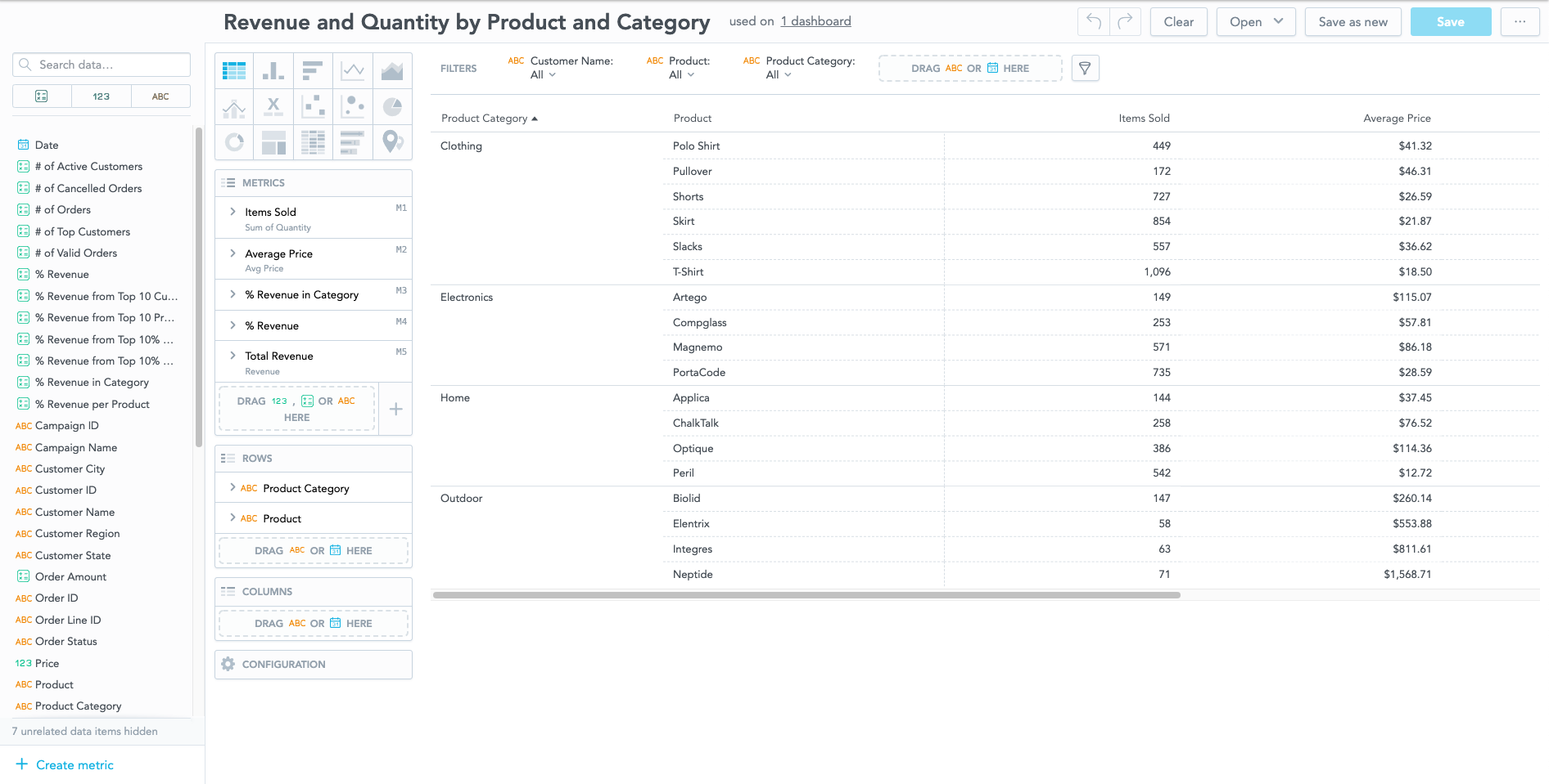
That said, there are some usability limitations worth noting. Customizing charts can feel overly complex, making it frustrating for users. Plus, you can’t hide fields in the data model, which can lead to cluttered reports if you’ve denormalized your data. Filters are restricted to AND conditions, with no support for OR filters unless you dive into custom expressions. And if you need to calculate min or max dates—like the first or last sale date—you’re out of options.
Conclusion
To wrap it up, it really depends on what your team values most.
Tools like Holistics offer code-based flexibility and maintainability, while Metabase keeps it simple for quick insights. If visuals are your thing, Tableau’s your best bet, and if you want powerful modeling and governance, Holisitcs and Looker got you covered. Each tool has its pros and cons, so weigh them carefully to find the one that fits your needs best.
What's happening in the BI world?
Join 30k+ people to get insights from BI practitioners around the globe. In your inbox. Every week. Learn more
No spam, ever. We respect your email privacy. Unsubscribe anytime.

