40+ Chart Types | A Guide To Data Storytelling (+ Examples)
Contents
Ever stared at a chart and thought, “What the hell am I even looking at?”
Yeah, we’ve all been there. Using the wrong type of chart can be, well, painful. Like putting together IKEA furniture without the manual—you’ll end up with a confusing mess. And when data gets miscommunicated (through poorly chosen charts and graphs), it’s not just frustrating; it’s costly.
When data distribution and trends are obscured by poor chart choices, it’s easy to misread the information and make misguided decisions. As a self-service BI company, we know the struggle. Our internal users self-serve a lot, but sometimes they dive into data viz without a map. A bar chart when you needed a line? Or, heaven forbid, a pie chart for complex data? I don't wish that on my worst enemy.
That’s why our senior data analysts put together this guide on chart types and best practices when choosing them. Originally, this was an internal survival kit for our team to stop charting chaos in its tracks. But we figured, why keep all the love to ourselves?
I. Categorical Chart Types (Charts to Compare Categories)
Think of these charts and graphs as the toolkit for when you want to visualize "who did better" or "what contributed the most." Options like bar charts, column charts, donut charts, and radar charts are staples for effectively showing category comparisons and proportions.
Let’s break them down!
1. Bar Chart
Bar charts are the gold standard for comparing categories side by side and tracking a key performance indicator effectively. They provide a clear and intuitive way to visualize data because our brains are wired to compare lengths easily.
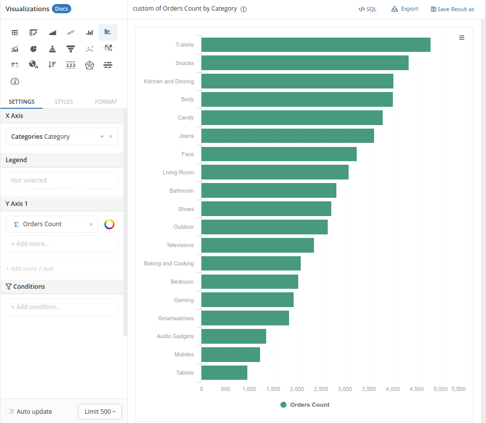
To keep things clean, avoid overwhelming your bard chart with too many categories or adding unnecessary embellishments like 3D effects. If you're comparing regional sales, a simple, sorted bar chart with proper data labels makes it so easy to see which region performs best at a glance.
2. Column Chart
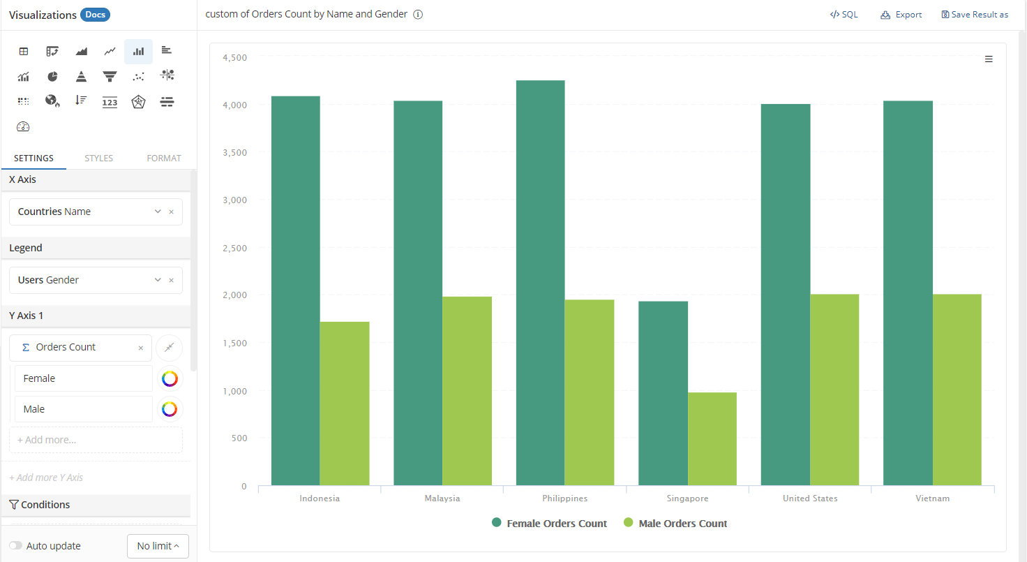
A column chart is essentially a vertical bar chart, and it’s perfect for comparing numeric values and showing time-based data.
Column charts are ideal for displaying trends over time in a way that's easy to digest. When you need to visualize data such as monthly revenue growth, for instance, column charts give a clear snapshot of how your numbers are evolving month by month, highlighting the peaks and valleys. Plus, with a well-structured column chart, it’s easy to identify patterns in performance, making it a favorite for showing financial or seasonal trends.
3. Pie Chart
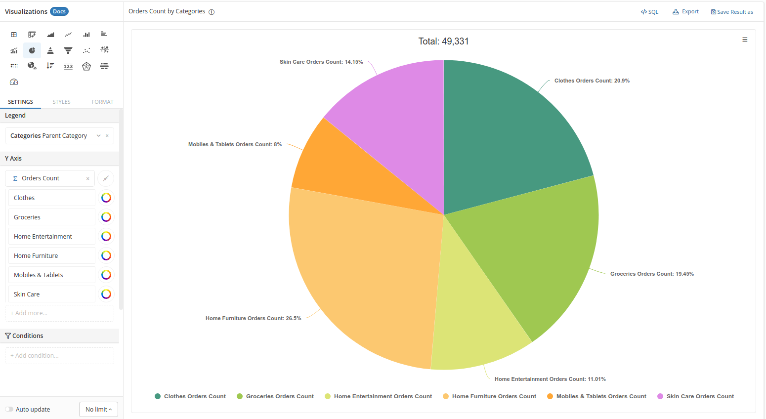
Be cautious with pie charts. Our senior analysts emphasize that they are often overused, and humans aren’t particularly good at comparing angles. If the differences between slices are subtle, it’s likely your audience will struggle to interpret the data. However, pie charts can still be effective for showing simple part-to-whole relationships, such as market share among a few competitors—just remember to keep things minimal.
4. Donut Chart
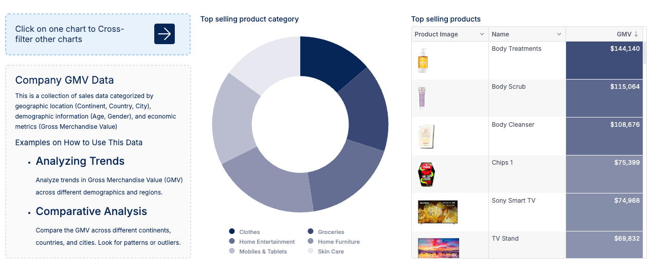
The donut chart, while visually similar to a pie chart, leaves space in the center, often making it more aesthetically pleasing and useful for displaying key numbers or labels.
For example, if you're showing how a $1 million marketing budget is split across digital, print, social media, and events, a donut chart not only displays the proportions but also leaves room in the middle to highlight the total budget or a standout figure, such as the percentage spent on digital marketing.
However, our data analysts recommend using the donut chart sparingly. It’s most effective when showing clear proportions, and too many slices can still cause confusion. Stick to a minimal design for the best results. Donut charts can be a great way to balance visual appeal with functionality, but it’s important to remember that they work best when conveying simple, high-level insights rather than detailed comparisons.
5. Nightingale Rose Chart
Nightingale Rose charts are essentially pie charts on steroids, with each segment varying in radius. While visually appealing, our data analysts warn that this type of data visualization can easily detract from the data's message if not done thoughtfully.
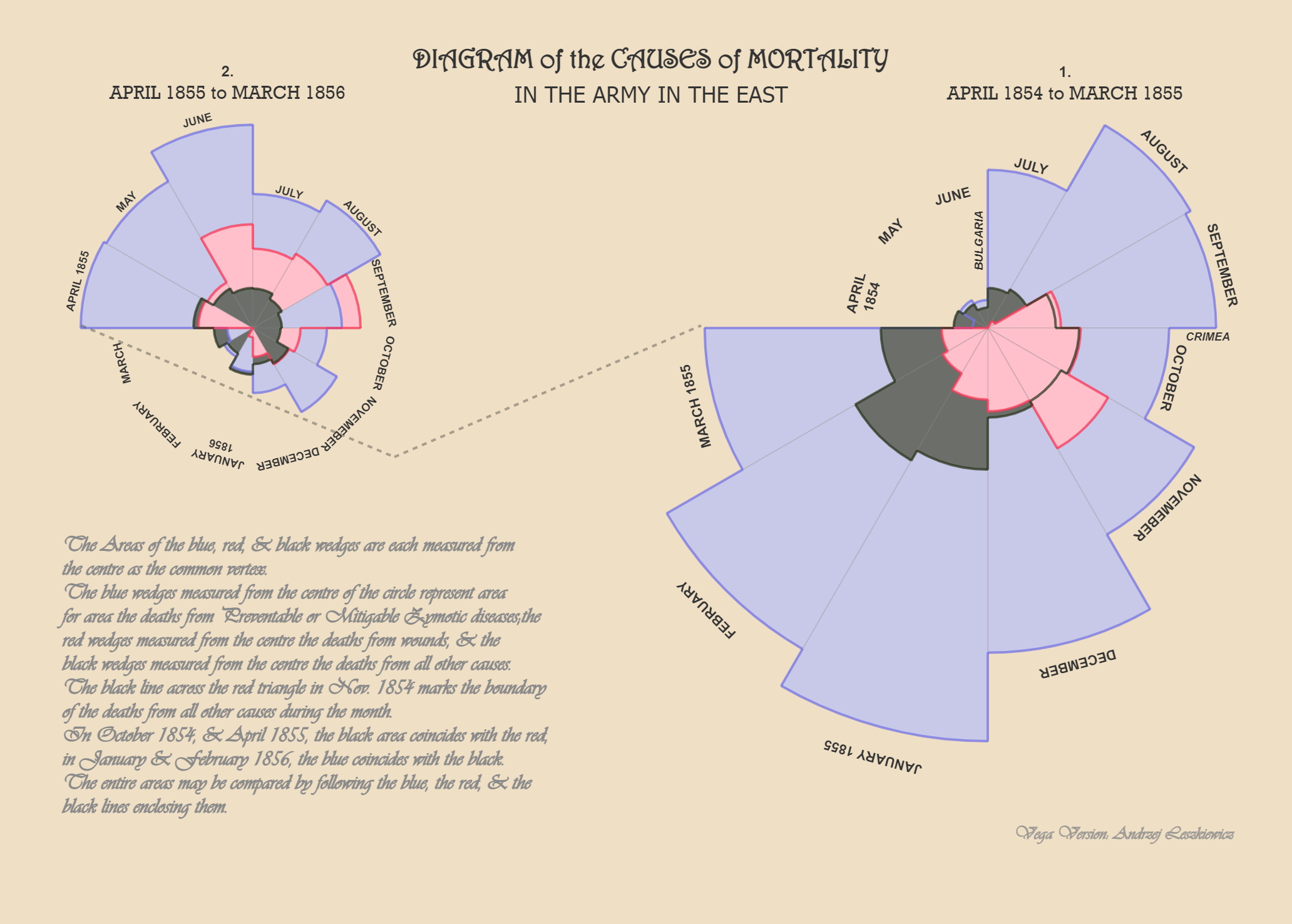
If you want to display seasonal patterns, such as energy consumption over a year, this chart can add an interesting visual dimension—but only if it makes the data clearer, not just more “exciting.”
6. Stacked Bar Graph
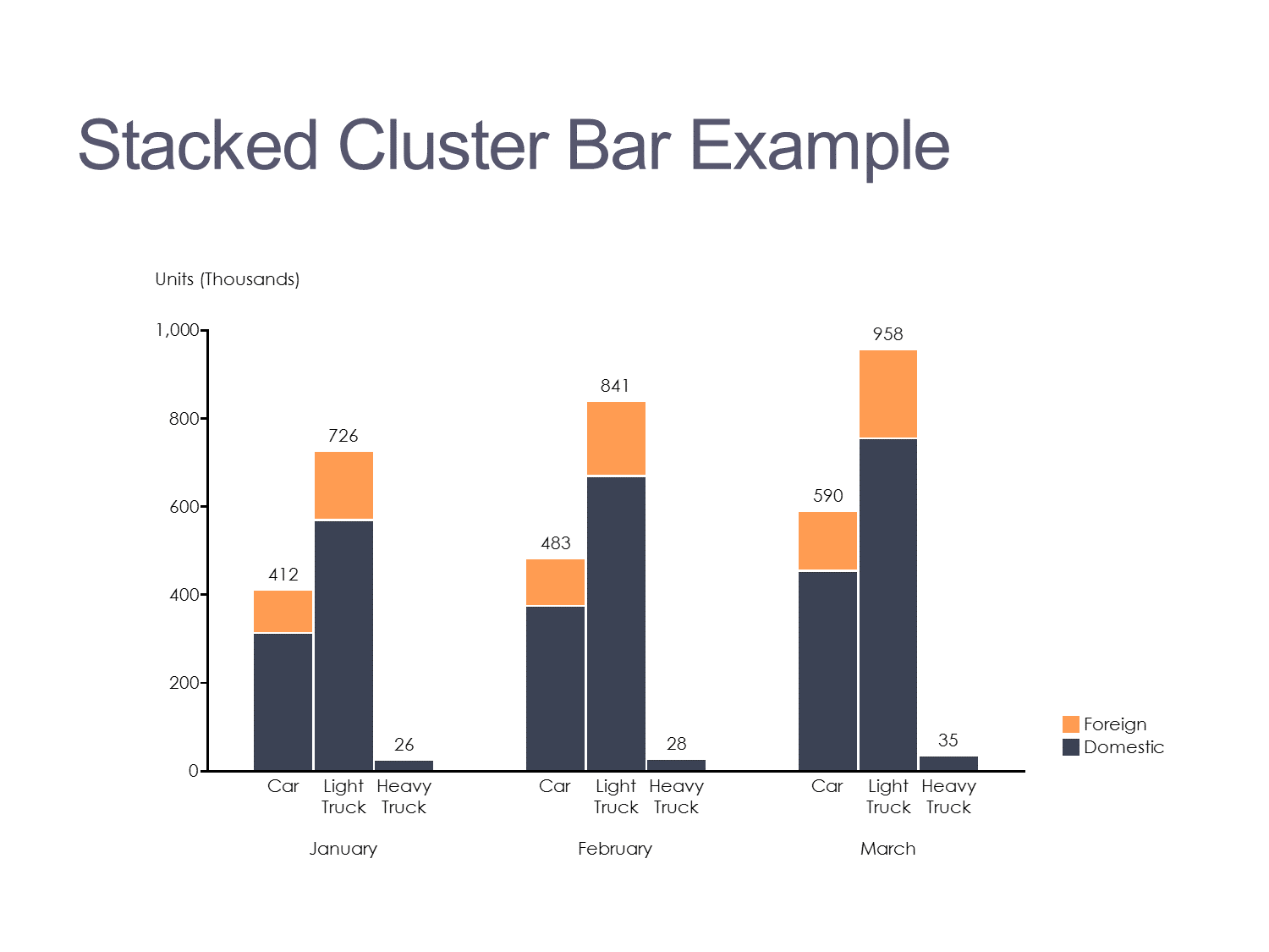
Visualizing how multiple values and subcomponents contribute to a total is often best done through a bar graph that layers different elements together. A stacked bar graph does this well by showing both the total value and the individual parts within each category.
However, our data analysts point out, that it’s essential not to overload the bar chart with too many segments, as this can make it harder to read. For example, when comparing product sales by region, this approach helps you see both the overall sales for each region and the specific contribution of individual products, keeping the visualization clear and impactful.
7. Radar Chart
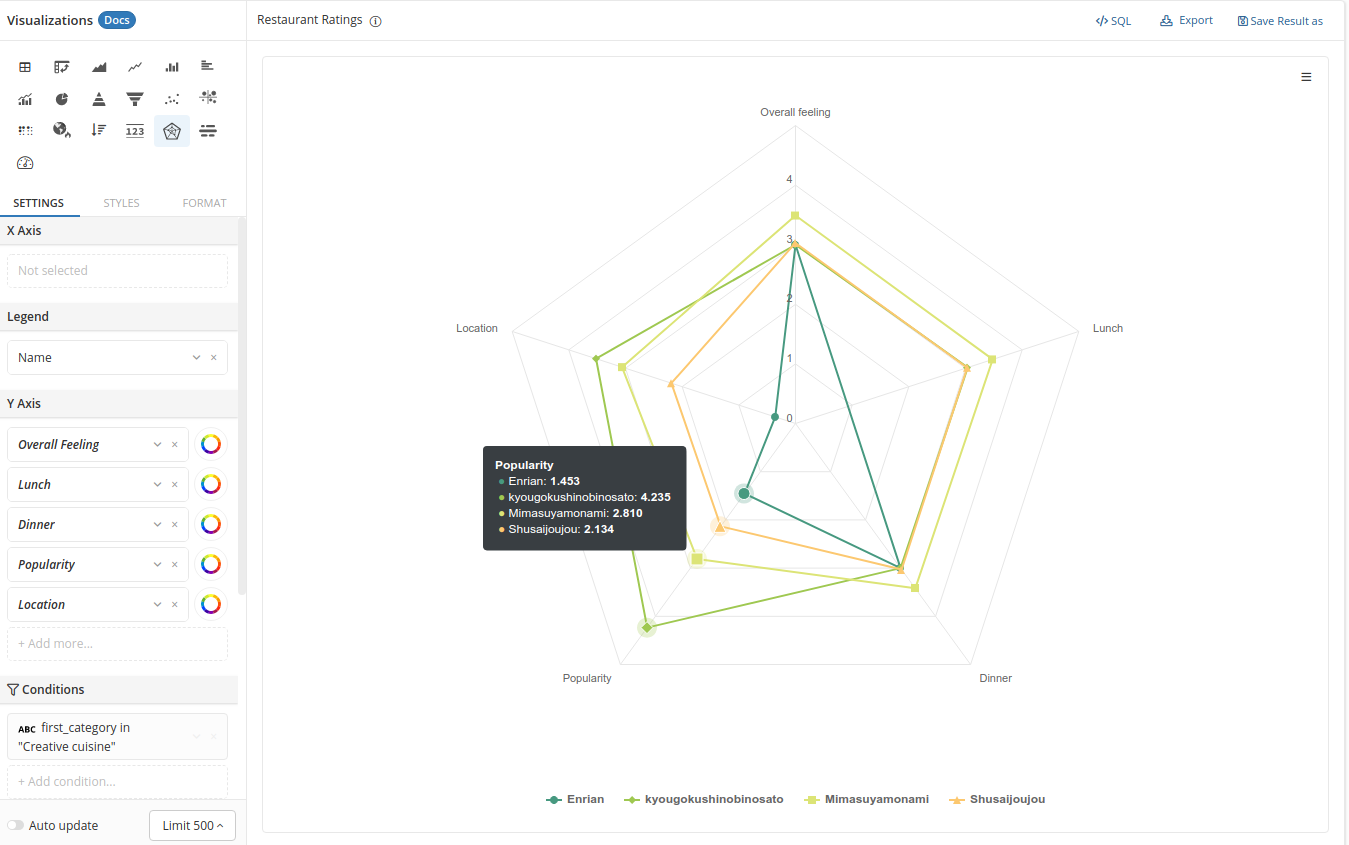
Think of a Radar Chart (or Spider Chart, if you like) as a way to map out multivariate data in a circular layout. Each variable gets its own axis, all radiating from a central point, like spokes on a wheel.
Radar charts are perfect when you want to compare multiple aspects of a single item or see how different items stack up across the same set of criteria. Each item is connected along these axes, forming a shape that instantly highlights strengths and weaknesses across the board.
8. Marimekko Chart
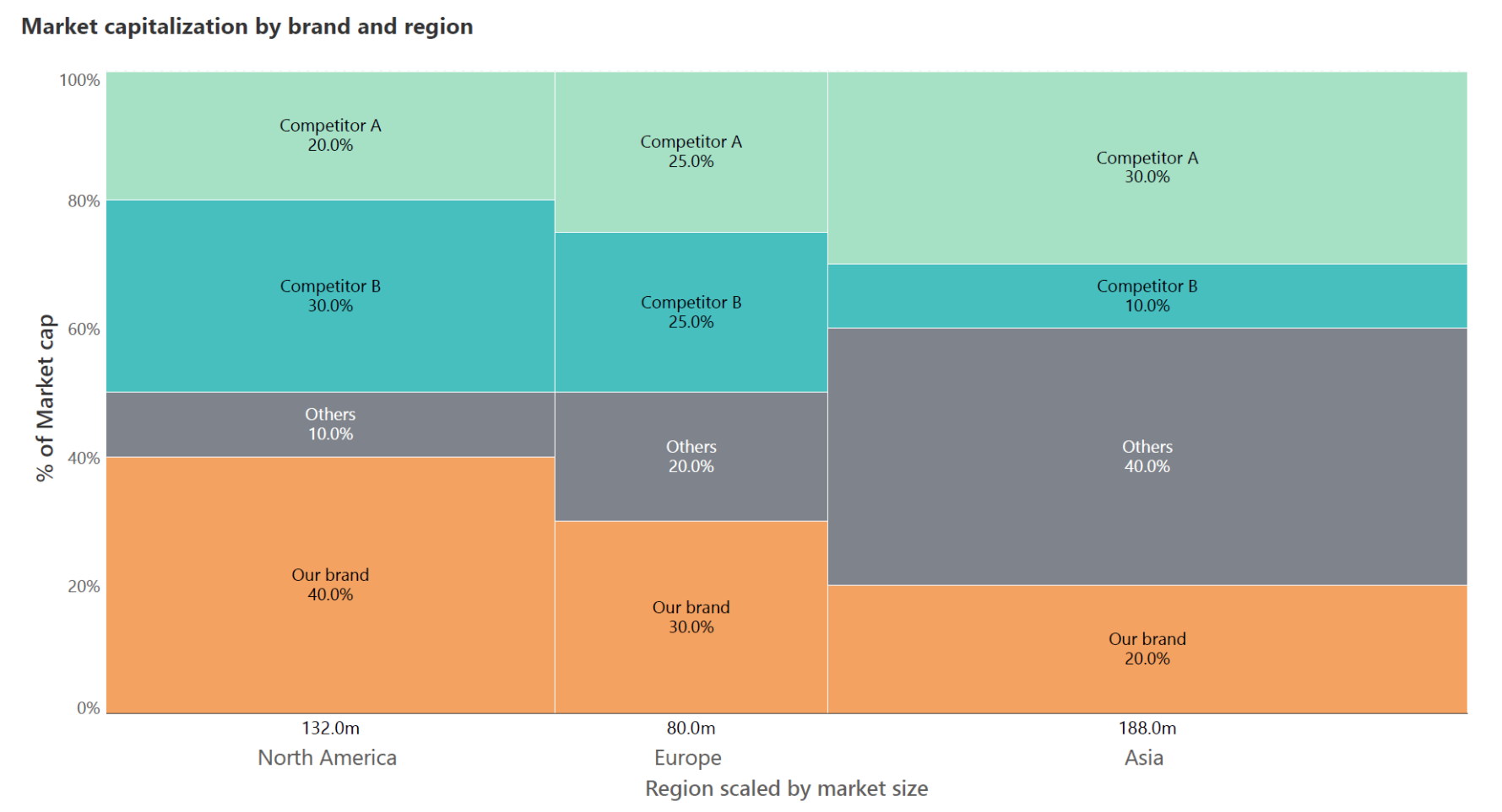
Marimekko charts combine elements of bar and pie charts, showing both the percentage breakdown and the size of categories.
Our data analysts recommend this type of chart when you want to emphasize both total values and proportions. It’s best for visualizing things like market share, where you not only care about each segment's size but also how much of the whole each category occupies.
II. Temporal Charts (Charts to Show Data Over Time)
Temporal chart types, like Line charts and Gantt charts, are perfect for showing how data changes over time. They highlight trends and patterns, helping your audience easily grasp shifts across specific periods.
Remember, keep these charts and graphs clean and straightforward to ensure the story of change comes through clearly without overwhelming viewers.
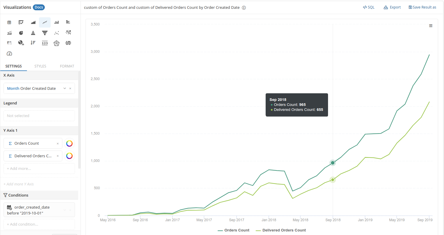
9. Line Chart
Tracking changes over time is the bread and butter of data analysis, and line charts excel at this. A simple line chart connecting numerical data points allows the audience to see trends, whether it's stock prices, sales growth, or any other continuous data.
Our data analysts emphasize that you should always keep line charts clean and straightforward. Avoid overcomplicating it with too many lines—two or three at most—to ensure clarity.
For instance, when tracking sales over the last year, a line graph can easily show the peaks and troughs of your data, making it clear when and where shifts happened. Maintain a minimalist design, with direct labeling on the lines to avoid the dreaded "legend look-up."
10. Area Chart
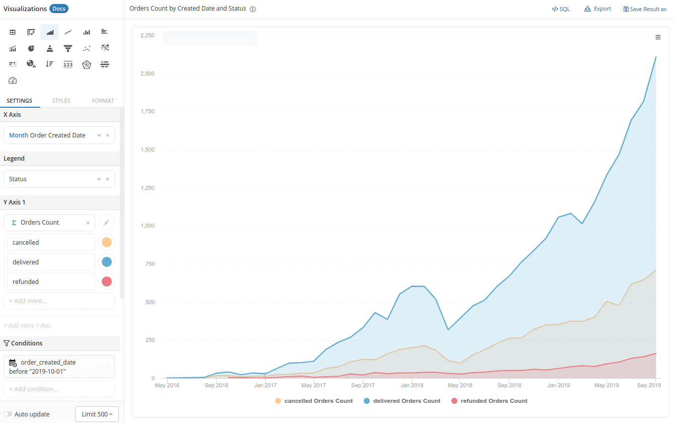
An area chart is an extension of the line chart with the space under the line filled in, which helps highlight the volume of data alongside the trend. They’re especially useful when you need to compare multiple data series over time, as each shaded area visually represents a separate dataset.
An area chart is great when you want to emphasize how big the changes are over time. Just be careful not to pile on too many datasets, or things can get messy fast. For example, if you’re showing cumulative revenue growth, the shaded area gives a strong sense of scale without cluttering the view. Keep it simple with minimal colors so it stays clean and easy to read.
11. Gantt Chart
For project timelines and task scheduling, Gantt charts are invaluable. They show how long each task is expected to take and how tasks overlap within a project.
A Gantt chart should be used to communicate project timelines clearly, without cramming in too much detail. For example, when managing a product launch, a Gantt chart can easily show the different phases of development, testing, and release in relation to each other, making sure everyone stays on track. Simplicity is critical, with minimal use of color to avoid distractions.
12. Candlestick Chart
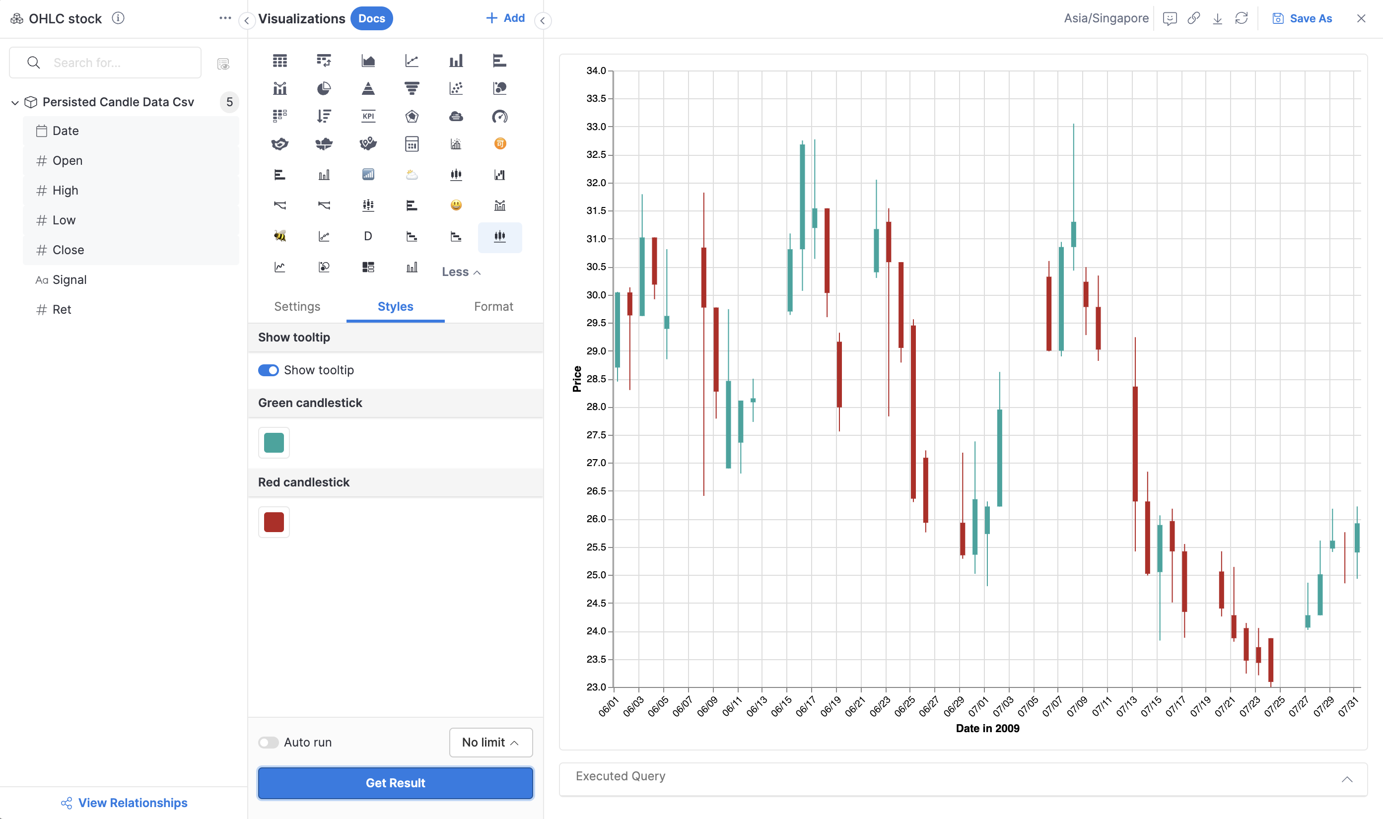
Candlestick charts are the type of charts commonly seen in finance, often used to track price movements over time.
Each "candlestick" shows the opening, closing, high, and low prices for a specific period. They’re super useful for spotting trends in stock prices, but they can get pretty complex, so they’re best suited for an audience that’s familiar with financial data. If you need precision, especially in trading, this chart is perfect for identifying patterns over both short and long periods. However, for general audiences, it might be a bit too confusing.
13. Stream Graph
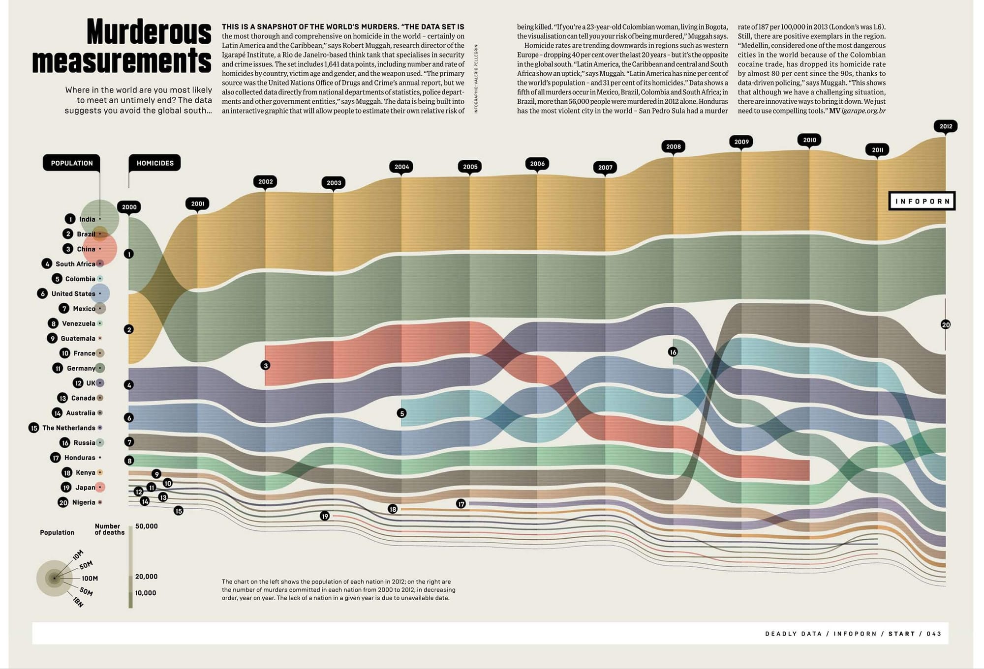
Stream graphs, though visually striking, can often lean more toward style than substance if not handled carefully. They show the flow of data over time, with layered categories, but they can quickly become overwhelming. Both Cole and Wexler advise that while stream graphs can look impressive, they should only be used when the data is best understood as a flow. For instance, if you’re visualizing the changing volume of web traffic from different sources, a stream graph can offer a unique perspective, but make sure it adds clarity rather than confusion.
III. Distribution Charts (Charts to Show Data Distribution)
These types of charts help you visualize how your data is spread out or concentrated, making it easier to spot patterns like clustering, gaps, or outliers.
When using these types of data visualization, simplicity is key. Our data analysts recommends focusing on the data itself without adding unnecessary complexity that could distract from your message.
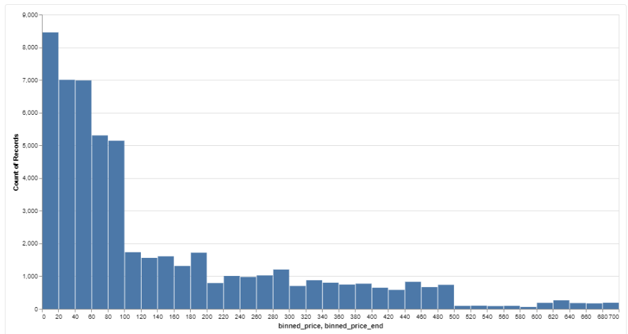
14. Histogram
A histogram is one of the most straightforward ways to show the distribution of quantitative values across different ranges. It groups data into bins and uses bars to represent the frequency of each group.
This chart type is particularly useful when you want to understand how data points are distributed across different ranges. Let’s say you're analyzing customer ages—a histogram can help you see which age ranges have the most customers and which are underrepresented. Just keep in mind that too many bins can clutter the chart, making it harder to interpret the data.
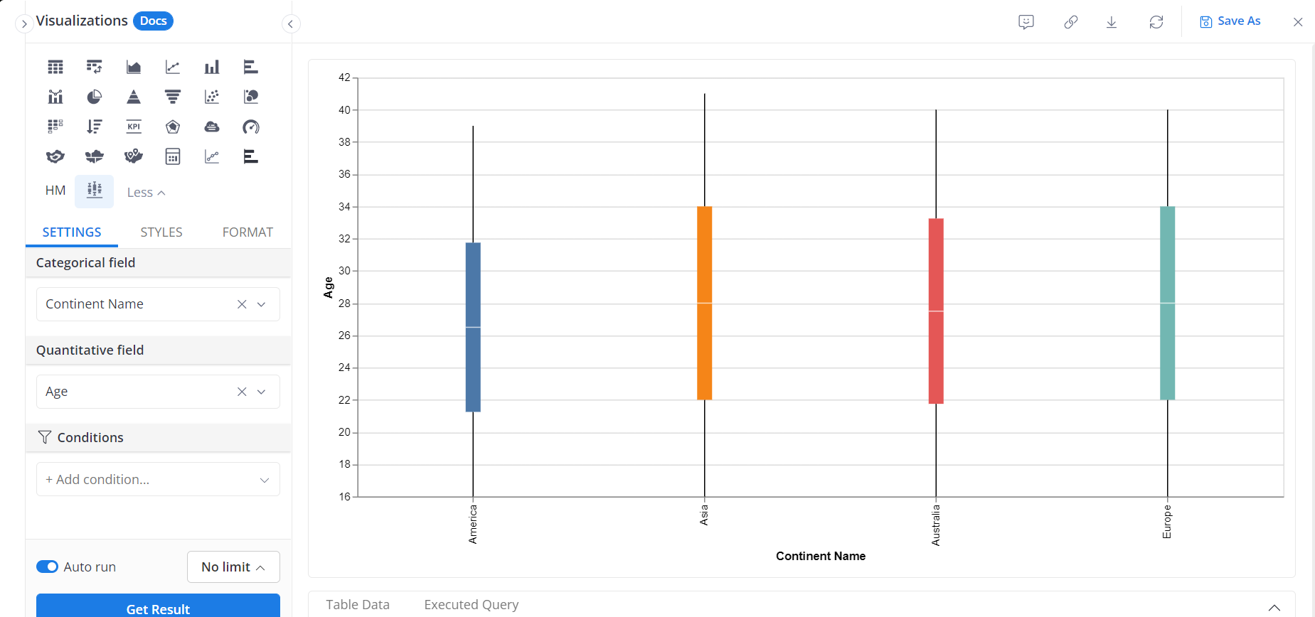
15. Box Plot (Box-and-Whisker Plot)
When you need to show the spread of data and spot any outliers, this chart is perfect for the job. It neatly displays the median, quartiles, and outliers along the vertical axis, all in one simple visual, making it ideal for comparing multiple groups. Say you're looking at salary distributions across departments—this chart helps you quickly spot any big variations or outliers that need attention. Just be careful not to include too many categories at once, as that can make the chart feel cluttered and harder to read.
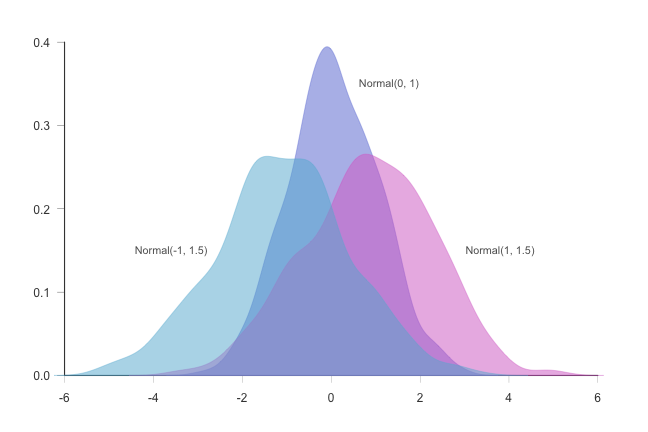
16. Density Plot
A density plot is basically a smoother, more polished version of the same chart as Histogram. Instead of using bars, it gives you a continuous curve that shows how your data is distributed. This makes it great for visualizing continuous data without the chunky bins you get with histograms.
Think about when you're tracking website traffic over time, a density plot creates a smooth curve that highlights where most of your data points fall, without the breaks or sharp edges you'd see in a histogram. It’s a nice way to get a clearer picture of the distribution
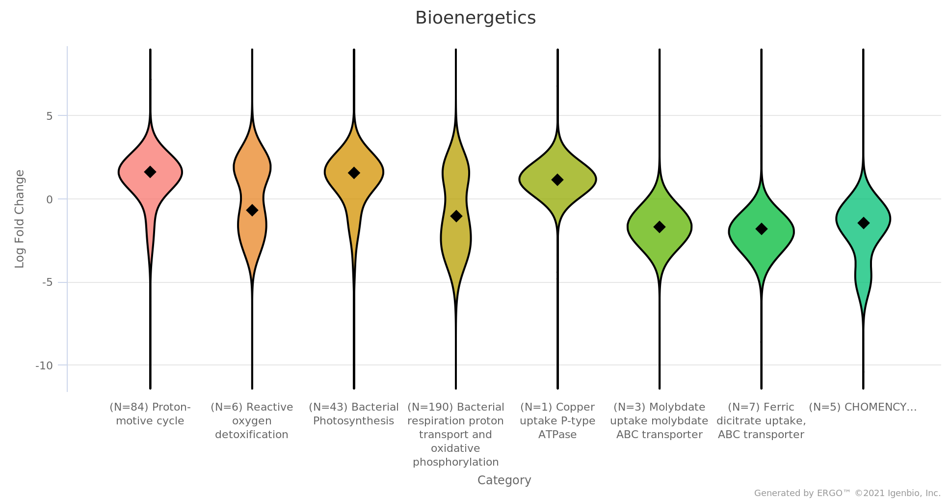
17. Violin Plot
When you need to visualize both the distribution and probability of data, this chart works perfectly by blending the features of a box plot and a density plot.
It shows the overall shape and spread of the data while allowing you to compare multiple categories at once. For example, if you’re analyzing test scores from different schools, this type of chart reveals not only the range of scores but also where the bulk of the scores are concentrated.
IV. Relational Chart Types (Charts to Show Relationships Between Variables)
Relational chart type helps to visualize the connections or correlations between two or more variables. These charts can highlight whether variables are related, how strong that relationship is, and whether it's positive or negative.
18. Scatter Plot
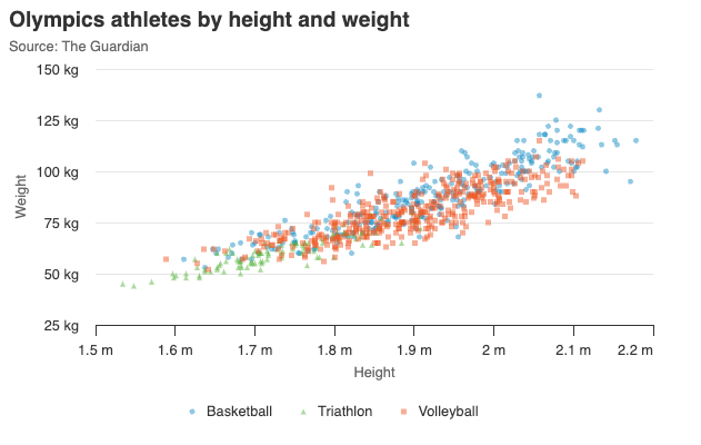
A scatter plot, often referred to as a scatter chart, is perfect for identifying relationships or correlations between two numeric variables or for visualizing numerical data patterns. They plot data points along two axes, allowing you to see how closely linked the variables are. This chart is great for exploring patterns, like the link between advertising spend and sales. Each point shows ad spend and the related sales for a given period. An upward trend suggests more spending leads to higher sales, while a scattered pattern could mean little to no correlation.
However, unironically, a scatter plot can become too scattered, if you have too many data points or if the relationship isn’t clear, so it’s important to consider the dataset size and the story you want to tell. Keeping the scatter plot clear and focused helps make the main insights easy to understand.
19. Bubble Chart
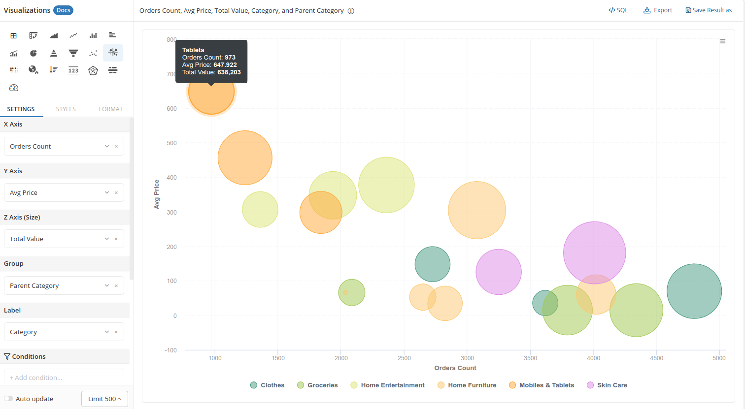
A bubble chart is basically a scatter plot with a twist—it adds a third variable by changing the size of the bubbles. This makes it great for comparing three things at once.
For example, you could plot company revenue on one axis, and market share on the other, and use the size of the bubble to show the profit margin. The tricky part is making sure the bubbles don’t overlap too much, which can make the chart hard to read. It’s all about finding the right balance, so the bubble sizes give you useful info without cluttering up the chart. A well-designed bubble chart ensures that insights are easily understood without visual overload.
20. Heatmap
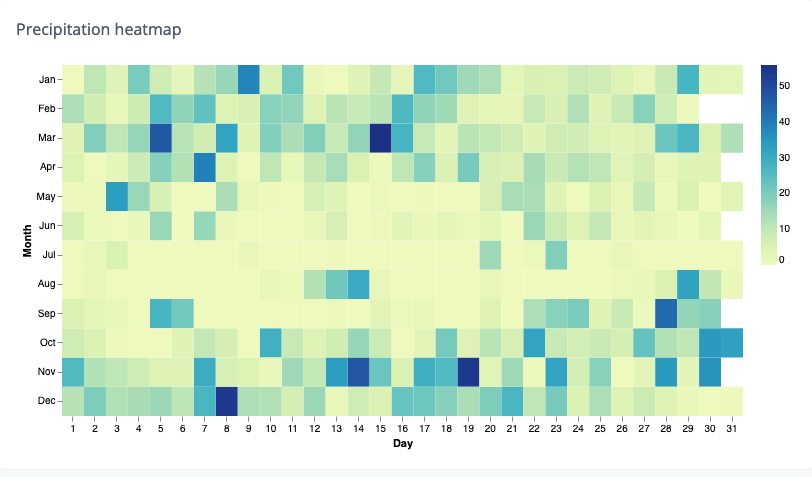
Using color gradients to represent the intensity or frequency of values is a great way to visualize relationships between two variables, and this is exactly what a heatmap does. It's especially useful when you have a lot of data to plot but want to avoid overcrowding with too many points. For example, in tracking website clicks over a grid of days and times, heatmaps make it easy to spot peak periods by using darker colors for higher values. The choice of color palette is crucial—making sure the intensity differences are clear without being too harsh or distracting for the viewer.
21. Parallel Coordinates Plot
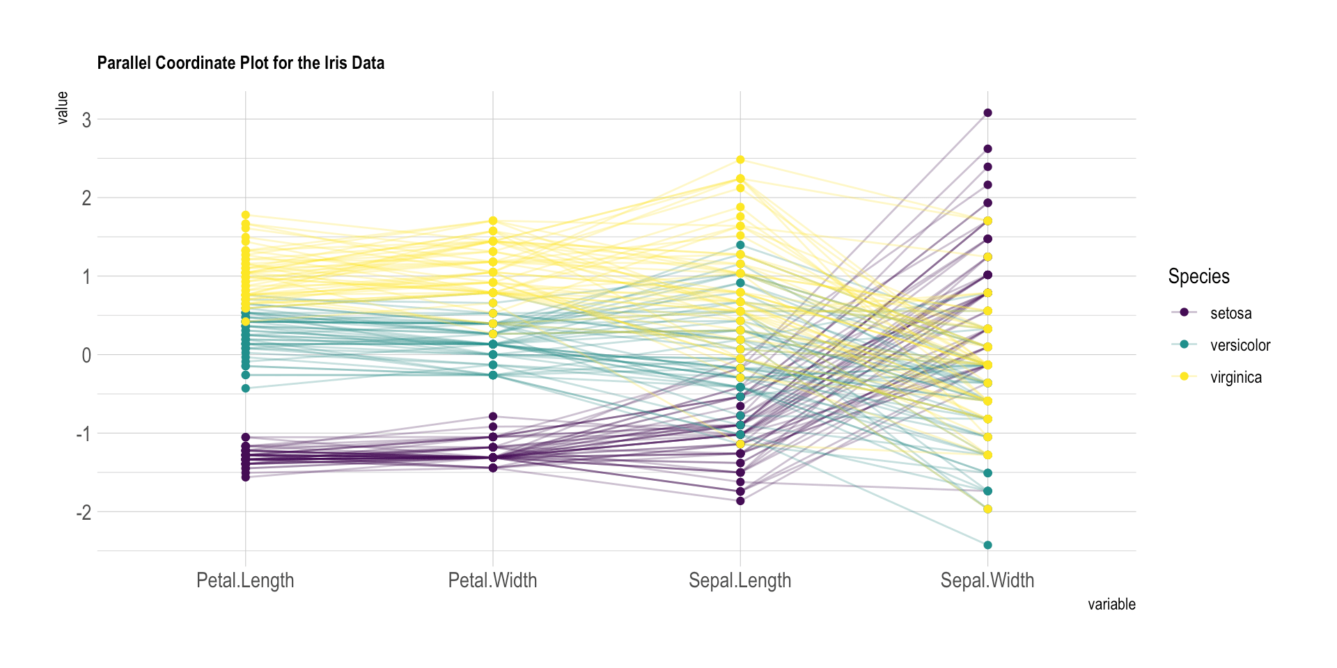
When you're working with multiple variables and complex relationships, parallel coordinate plots help you see how everything interacts. They plot each variable on parallel axes, and lines connect the data points, making it easier to spot patterns across categories.
While these types of charts can be super informative, they can also get messy fast. The key to keeping things clear is to limit the number of variables and use color thoughtfully, so the chart doesn’t turn into a cluttered mess.
22. Chord Diagram
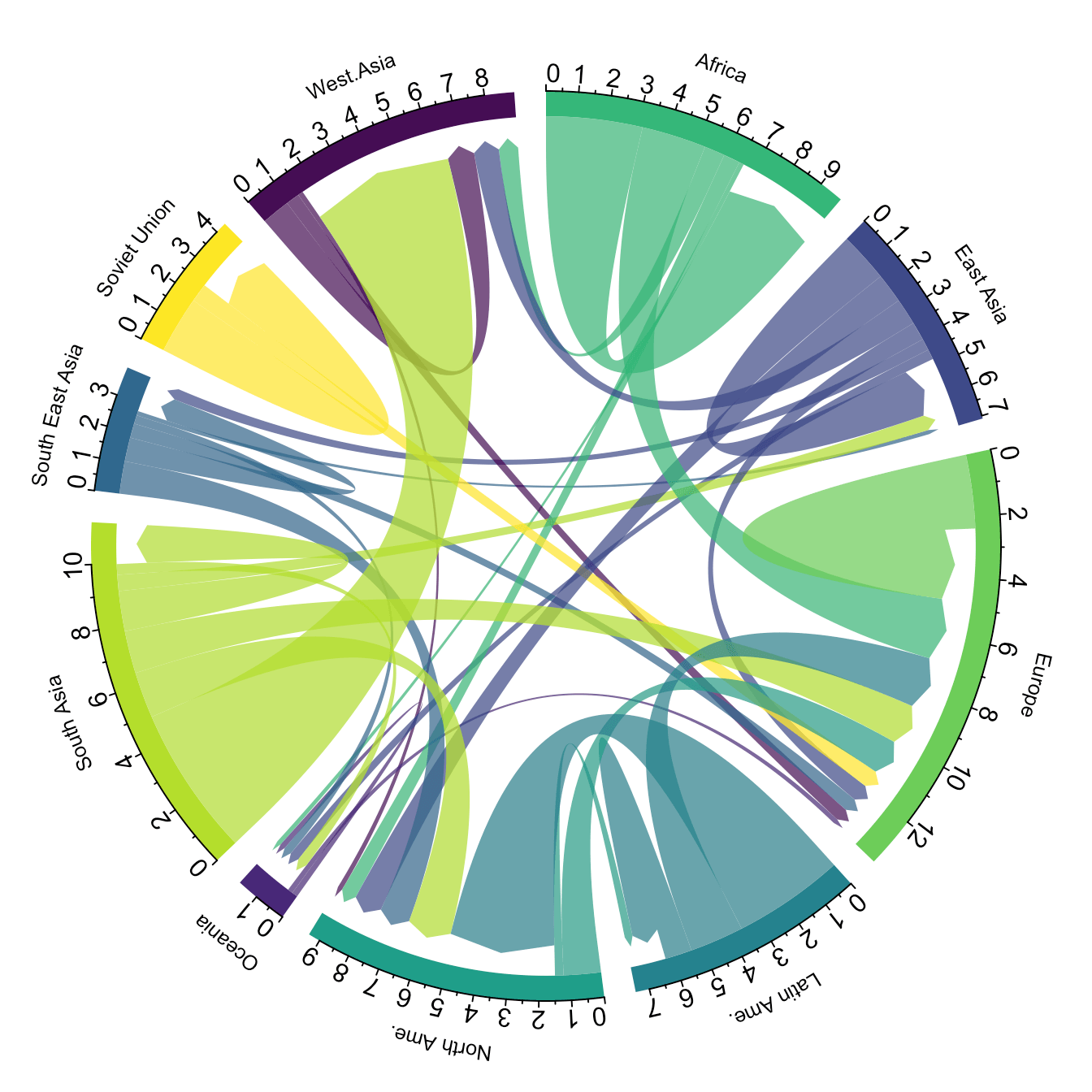
Chord diagrams show relationships between categories using arcs and chords, making them useful for visualizing connections within a dataset. This chart is visually striking, but it can easily overwhelm an audience if not used carefully. A good example might be showing how different departments within a company share resources or collaborate. The trick to using a chord diagram effectively is to keep the number of categories low and apply colors sparingly to avoid making the chart too complex.
23. Network Diagram
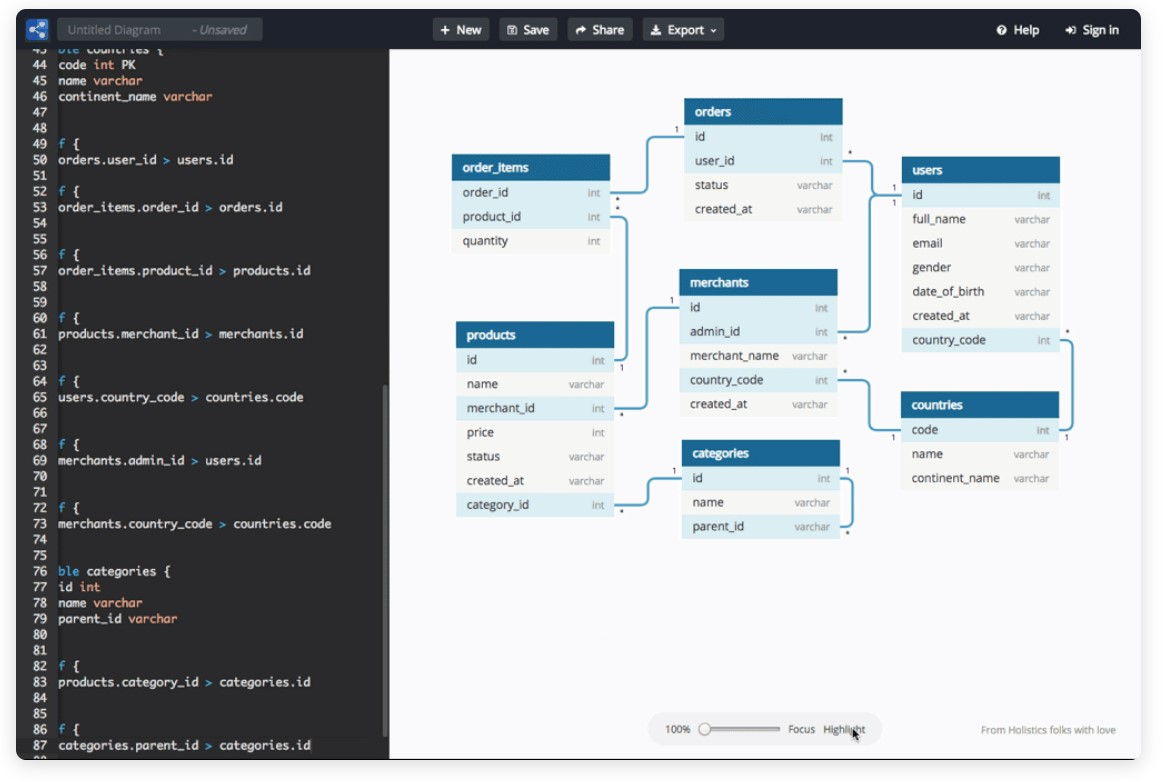
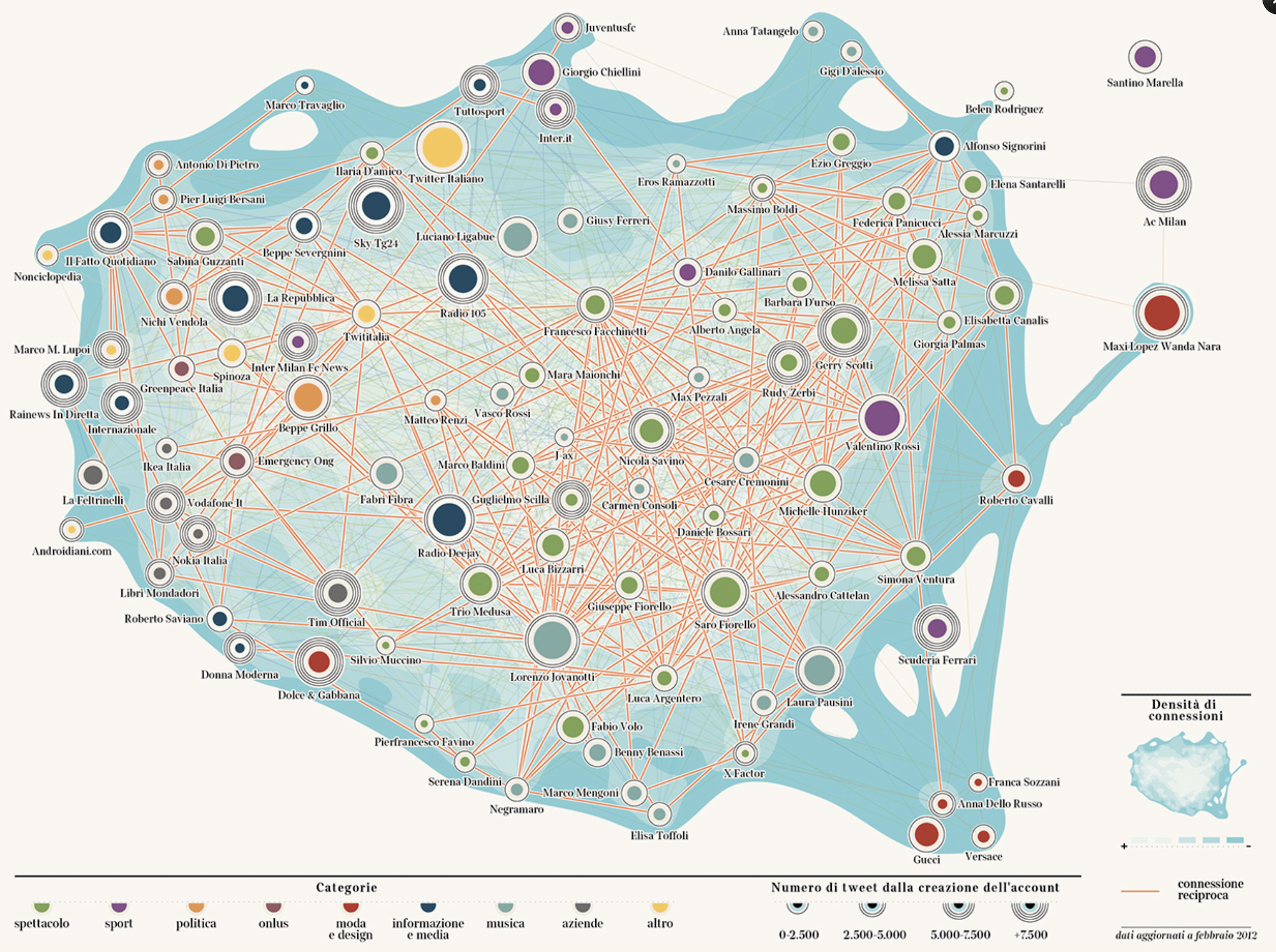
Network diagrams are awesome for mapping out relationships and connections between multiple entities, like in social networks or systems with lots of interconnected data points. They’re especially handy when you need to visualize complex systems that don’t follow a simple, linear path.
While these diagrams are super powerful, it’s important to keep things clear—make sure the connections are easy to follow, and the nodes don’t turn into a tangled mess. Keeping it simple is key to making sure the data speaks for itself.
V. Hierarchical Chart Types (Charts to Show Parts Within a Whole)
Hierarchical charts are perfect for data visualization with layers of complexity or nested relationships. They’re great for breaking down big datasets into smaller, more manageable chunks and showing how everything fits together.
Our senior data analysts emphasize that too much complexity can make the chart confusing, so it’s important to focus on making the data easy to understand without overwhelming the viewer.
25. Treemap Chart
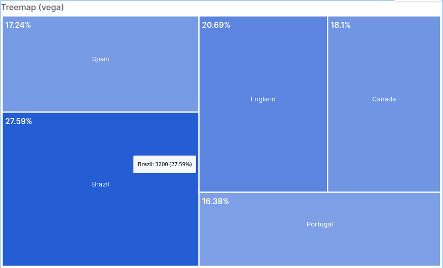
Treemap charts use rectangles to represent hierarchical data, with each category's size corresponding to its value. They’re great for seeing how different parts across multiple categories compare to each other and how they fit into the overall picture.
For instance, if you’re visualizing company revenue by department, treemap charts can show how much each department contributes to the total revenue, with larger rectangles representing departments that bring in more money. This gives a clear visual sense of which departments are the biggest players. But you’ve got to be careful not to add too many levels or details, as it can get cluttered and hard to follow. Maintaining simplicity ensures the chart stays easy to read and informative.
26. Sunburst Chart
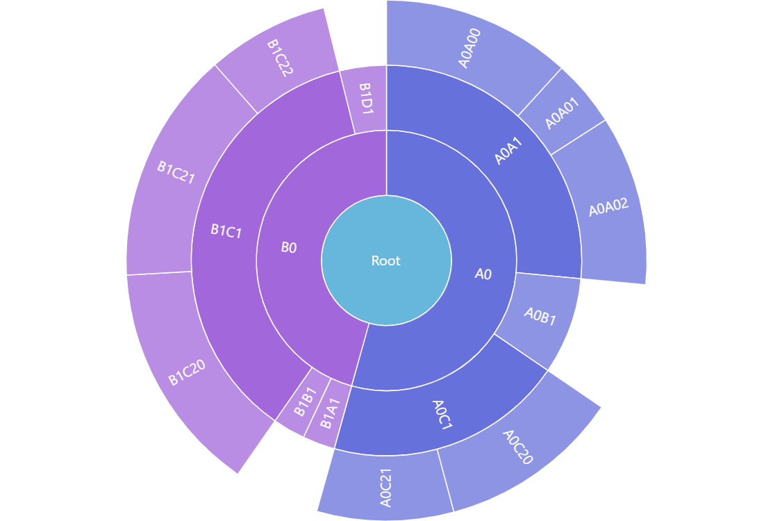
A sunburst chart is a circular version of a treemap chart, using concentric circles to display hierarchical data. It’s perfect for showing relationships between categories and subcategories. Picture visualizing a company’s product lines, where each main category can be broken down into subcategories, offering a clear view of how the parts fit together. As with treemap charts, simplicity is crucial—too many layers or overly complex color schemes can make the chart difficult to follow.
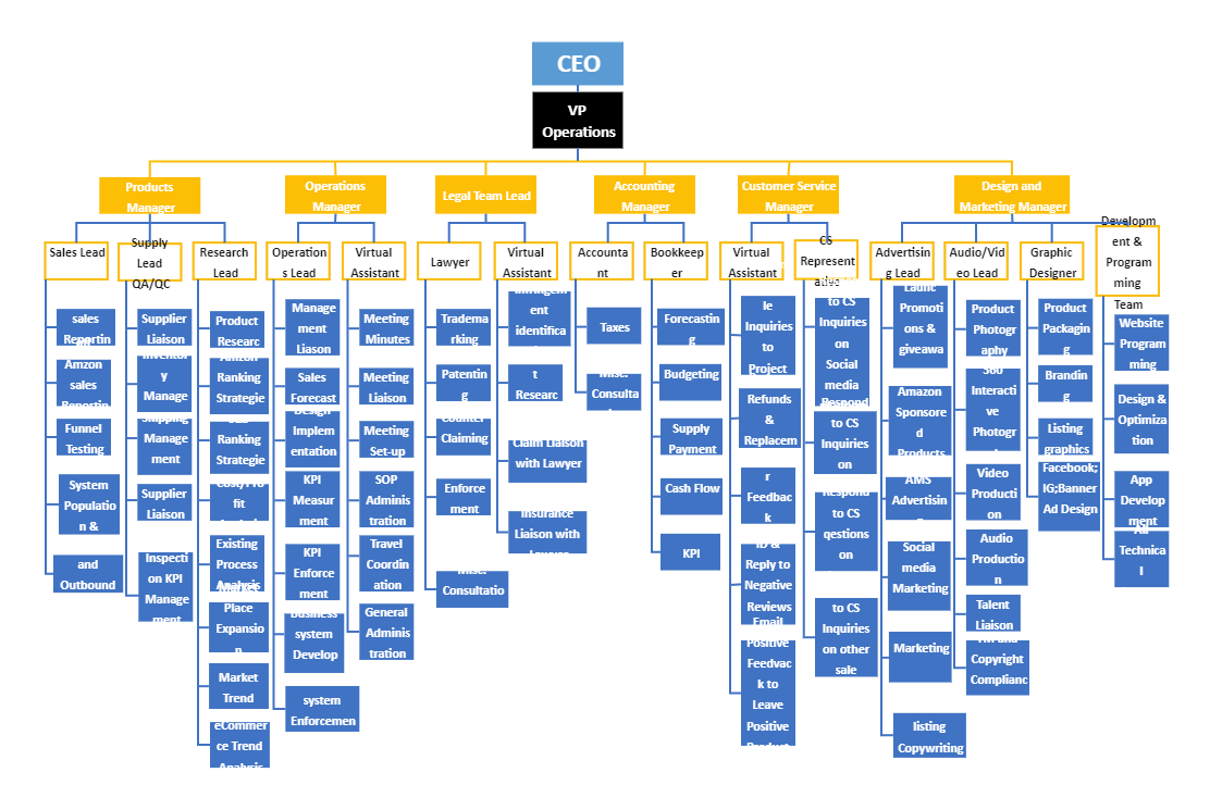
27. Org Chart
Visualizing the structure of a company is where organizational charts come in handy. They clearly map out reporting lines and team structures, showing who reports to whom and how different departments are connected.
Take, for instance, the leadership hierarchy at a large company like Amazon. An org chart would place Jeff Bezos at the top, followed by the senior leadership team, then the department heads, and down to individual team leads. While these charts are typically simple, they can become overwhelming if there are too many layers or if the design is cluttered.
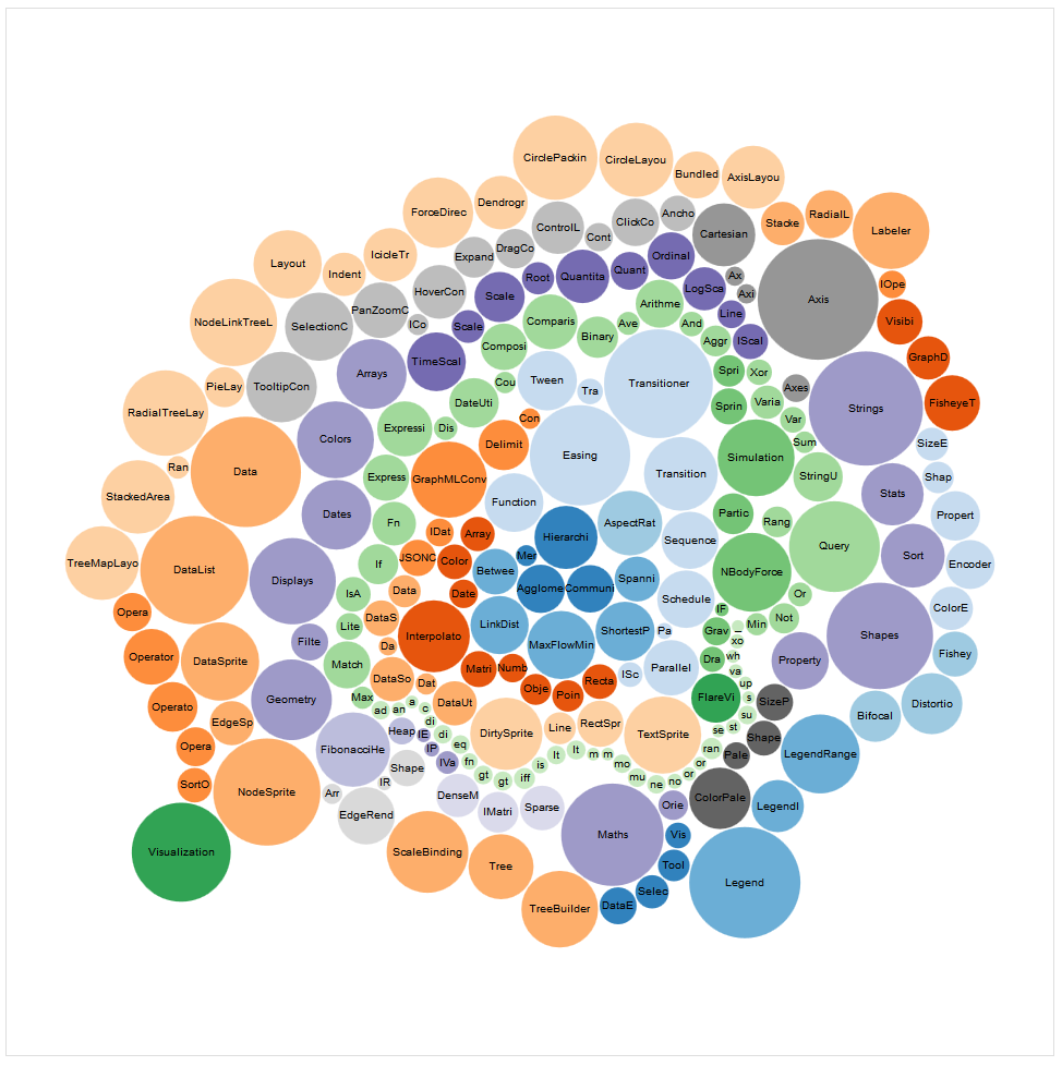
28. Circle Packing
Circle packing charts visualize hierarchical data by nesting smaller circles within larger ones, similar to a treemap chart but in a circular layout. This type of chart is excellent for highlighting the parts of a whole while emphasizing the size of each section relative to the others. It’s especially useful when both space and size are important.
Imagine breaking down a company’s workforce by department—circle packing can visually show how much each department contributes to the overall staff count, offering a visually engaging way to understand the distribution.
29. Parallel Sets
When visualizing relationships between multiple categorical variables, parallel sets provide an alternative to traditional hierarchical charts. Instead of focusing on a single hierarchy, they allow you to see how categories interact across different variables, making them ideal for analyzing complex data with many interrelated parts. Take customer demographics and purchase behavior, for instance—parallel sets can illustrate how different demographic groups interact with various purchasing categories.
VI. Geospatial Chart Types (Charts to Show Data Across Locations)
These charts are perfect for visualizing data tied to specific locations, offering insights into how different geographic areas compare or relate to one another. Geospatial charts are particularly useful for mapping trends, patterns, or concentrations of activity.
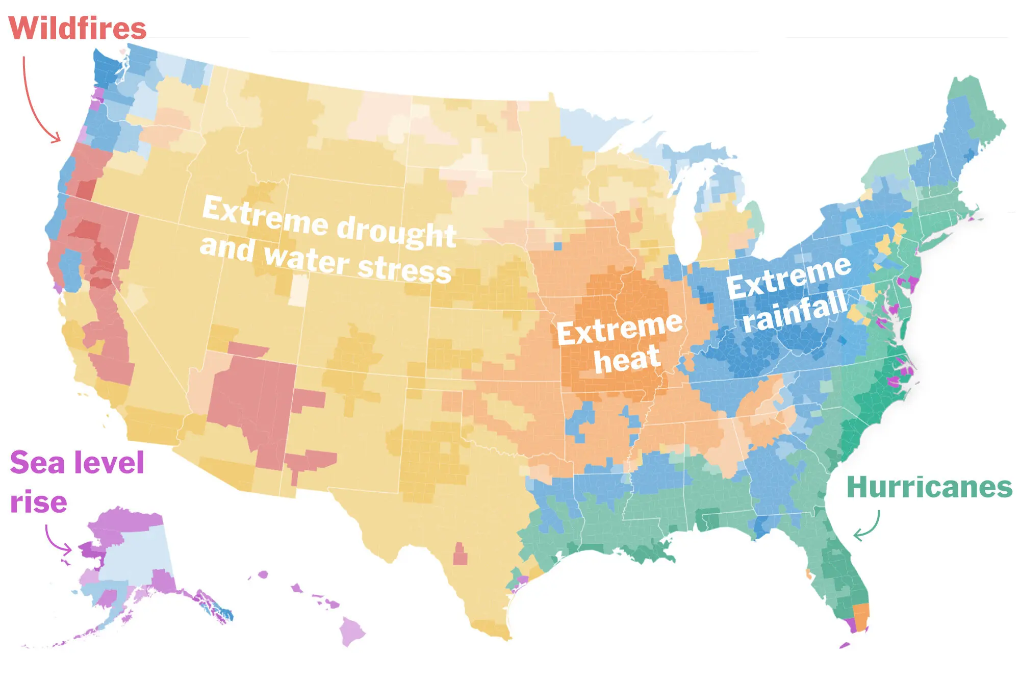
30. Choropleth Map
A choropleth map uses different shades or colors to represent data across geographic regions, making it great for highlighting variations in values.
This chart is especially useful when you need to emphasize regional differences, like population density or income levels by state or country. Picture visualizing voter turnout across the U.S., where deeper shades represent higher participation, and lighter ones show lower rates. This approach quickly draws attention to areas with the most significant differences. To make the map effective, using a simple color gradient ensures the contrasts are clear without overwhelming the viewer.
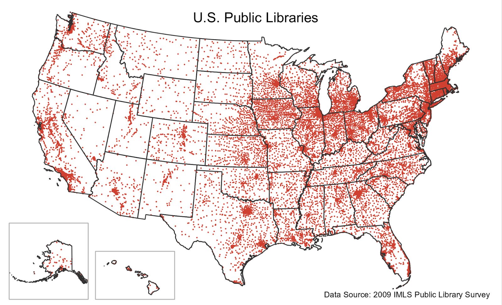
31. Dot Map
Dot maps are an effective way to represent geospatial data, using individual dots placed on a map to show the distribution or concentration of a variable. This makes them especially helpful when you need to visualize things like the locations of retail stores or customer addresses. Picture plotting all the retail stores across a city—each dot represents a store, providing a clear view of where clusters of stores are located.
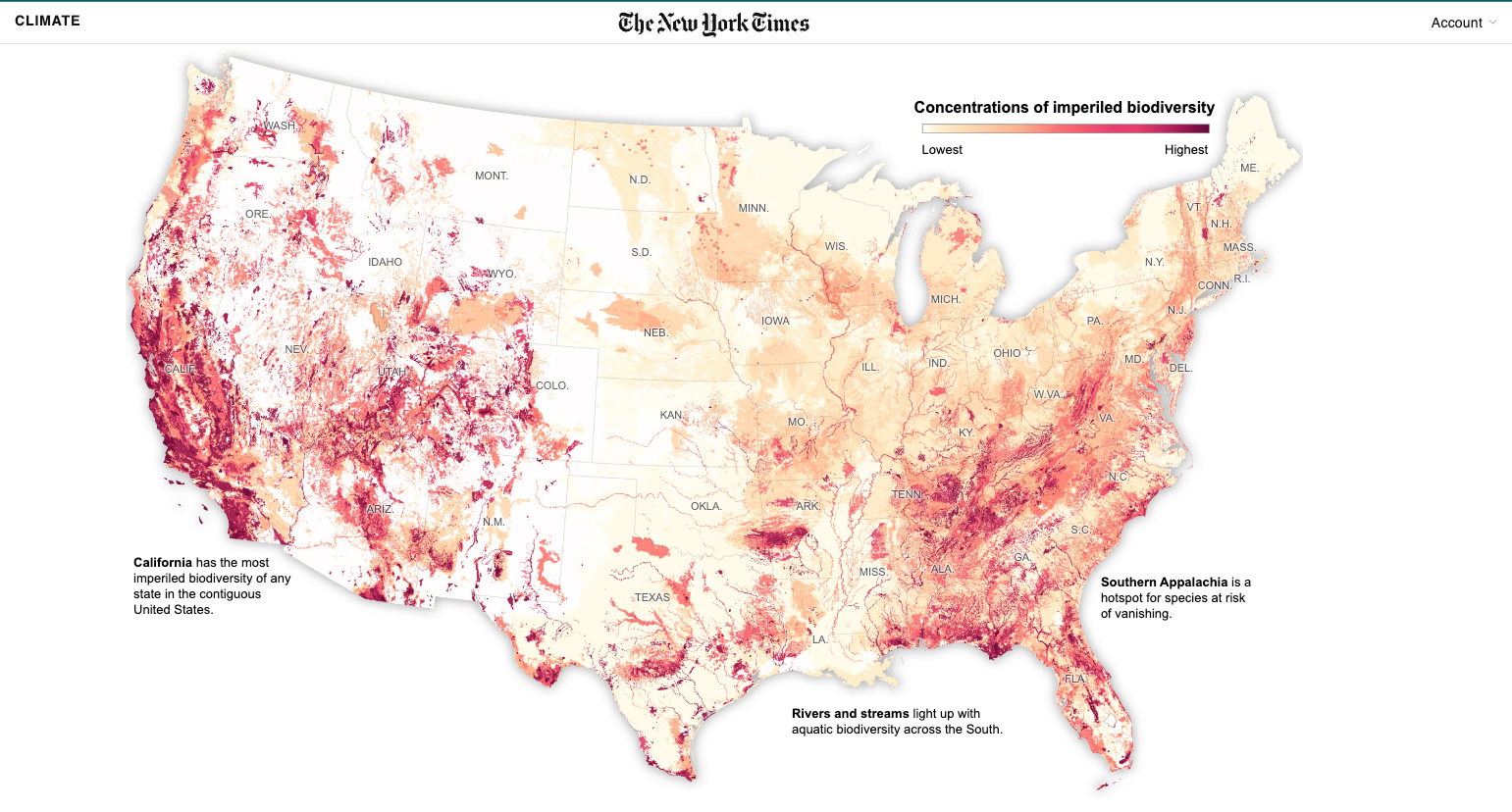
32. Heat Map (Geospatial)
Heat maps are ideal for visualizing the intensity of data across locations, using color gradients to show areas of higher or lower activity. They work especially well when you have a high volume of multiple data points that you want to group into broader patterns. A good use case could be mapping crime reports in a city, where the darkest areas would indicate higher crime activity, and lighter areas show less activity.
Our data analysts suggest using color wisely here—stick to intuitive color schemes that make it easy to identify patterns without overwhelming the audience with too many colors.
33. Bubble Map
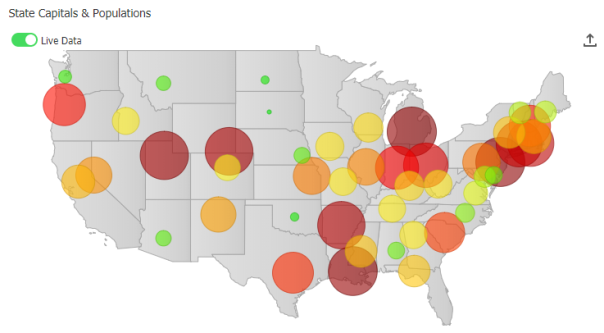
Building on the idea of a dot map, a bubble map takes it a step further by using the size of bubbles to represent a third variable, allowing you to compare data across locations while also showing magnitude. For instance, you could visualize the number of stores in different regions, with larger bubbles indicating areas with more stores. It’s important to ensure the bubbles don’t overlap too much, as that can make the map hard to read.
34. Flow Map
Flow maps are perfect for showing movement or flow between locations, such as migration patterns or the flow of goods between cities. They use lines or arrows to indicate movement, with the thickness or color of the line often representing the volume of flow. A great example might be showing trade routes between countries or customer deliveries from different warehouses. The key to an effective flow map is keeping it simple—too many lines can clutter the map, so focus on showing only the most important flows.
35. Connection Map
Showing relationships or connections between specific points on a map becomes much easier with a well-designed connection map. Whether you’re illustrating transportation routes or linking different company offices, these maps are perfect for visualizing network connections. Imagine plotting airline routes between cities—a connection map would depict direct flights by drawing lines between the cities, making it easy to see the links.
Our data analysts emphasize the importance of keeping connection maps clean by using simple lines and avoiding visual clutter to maintain clarity.
VII. Proportional Chart Types (Visualizing Parts of a Whole)
Proportional charts are ideal for data visualizations that display parts within a whole, helping viewers quickly grasp the relative sizes of categories or contributions. TThese charts and graphs offer a clear visual hierarchy and allow audiences to interpret data as percentages or ratios.
36. Proportional Area Chart
A proportional area chart represents values using the area of shapes—typically circles—to show relative sizes. This makes it useful when you want to compare the magnitude of different categories in a straightforward, visual way.
Think of it as showing the market share of different companies, where each circle’s size represents how big each company’s slice of the pie is. To keep it effective, it’s essential to use proportional circles that are easy to compare, and to avoid overloading the chart with too many small categories.
37. Square Area Chart
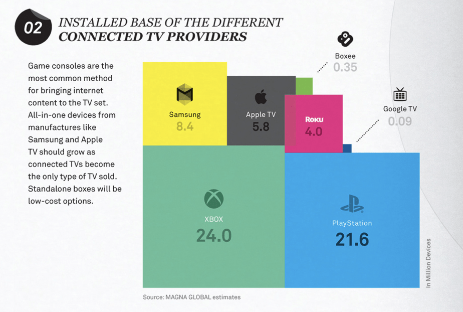
Using squares instead of circles, square area charts provide a more structured way to represent values, making it easier to see exact proportions without the slight distortions that can happen with circles. This type of chart works well for visualizing survey results, where each square could represent a certain percentage of responses, giving a clear view of the distribution of choices. Our data analysts recommend square area charts when precise comparisons matter, as the uniform shape makes interpretation much clearer.
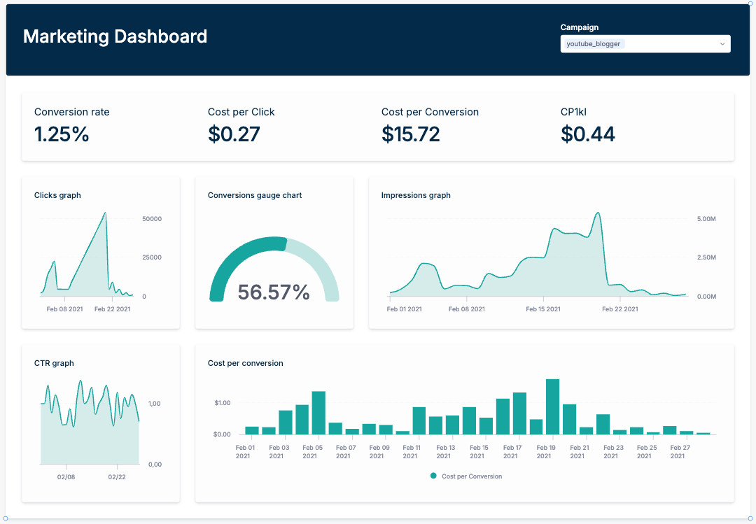
38. Multi-value Gauge Chart
A Multi-Value Gauge Chart is a variation of the traditional gauge chart, designed to display multiple metrics or values simultaneously within a single gauge. It’s especially useful when you need to track multiple related KPIs or metrics in a concise, easy-to-read format.
Unlike single-value gauges, which only show one metric at a time, Multi-Value Gauge Charts allow you to present a more comprehensive view of performance indicators, helping users understand the relationship between metrics quickly.
For example, in a Customer Support Dashboard, a Multi-Value Gauge Chart could be used to track several key metrics that indicate the health and efficiency of the support team.
38. Bullet Graph
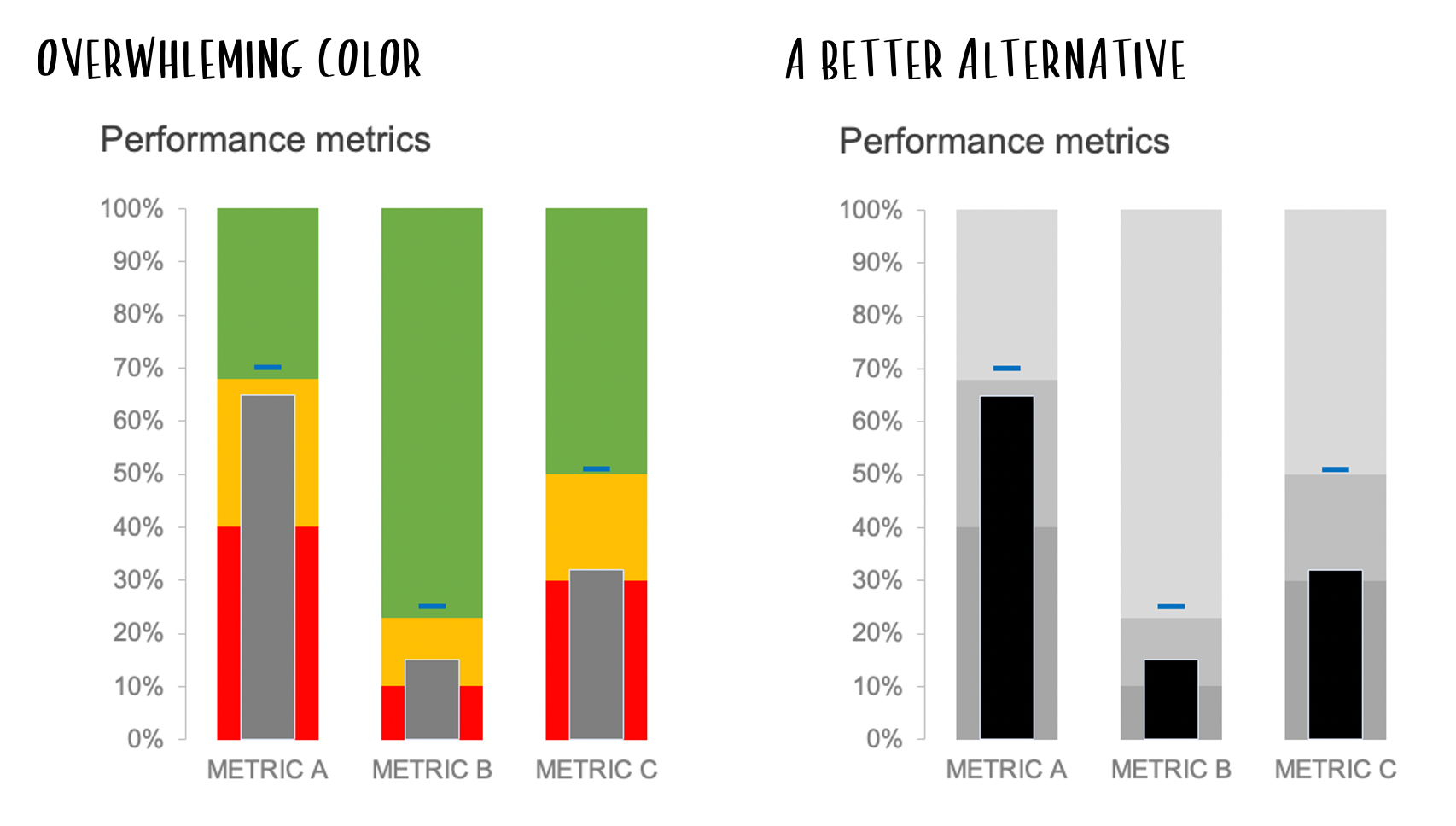
Bullet graphs are compact visuals that compare performance against a target, making them ideal for showing progress or metrics within a goal-oriented context. In a bullet graph, a single bar represents the actual value, with markers or background shading indicating targets or benchmarks.
This type of chart is useful for sales goals, like showing how close a team is to hitting its monthly target or tracking positive and negative values to highlight underperformance. Keeping the design simple and highlighting only relevant benchmarks ensures the data is quick and easy to interpret.
VIII. Advanced and Specialized Charts
Let’s wrap up with Advanced and Specialized Charts. This category includes charts that are more complex or tailored for specific use cases. These visualizations are often used when standard charts don’t fully capture the data’s story. Both Storytelling with Data and The Big Book of Dashboards
advise using advanced charts thoughtfully and only when they genuinely enhance understanding, as their complexity can sometimes make them less intuitive.
39. Sankey Diagram
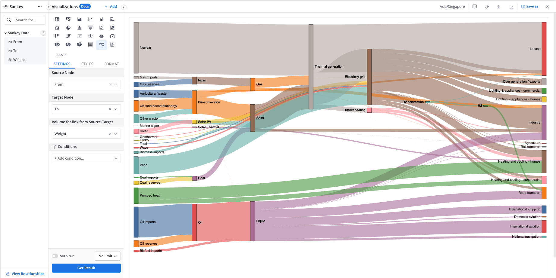
Sankey diagrams are designed to show the flow of quantities between stages or categories, using arrows of varying thickness to represent volume. This makes them perfect for visualizing processes where tracking resource “flow” is key, like energy or budget distribution.
Imagine mapping out a company’s budget—Sankey diagrams can illustrate how funds move from the main budget to departments, with thicker arrows representing larger allocations.
40. Spiral Plot
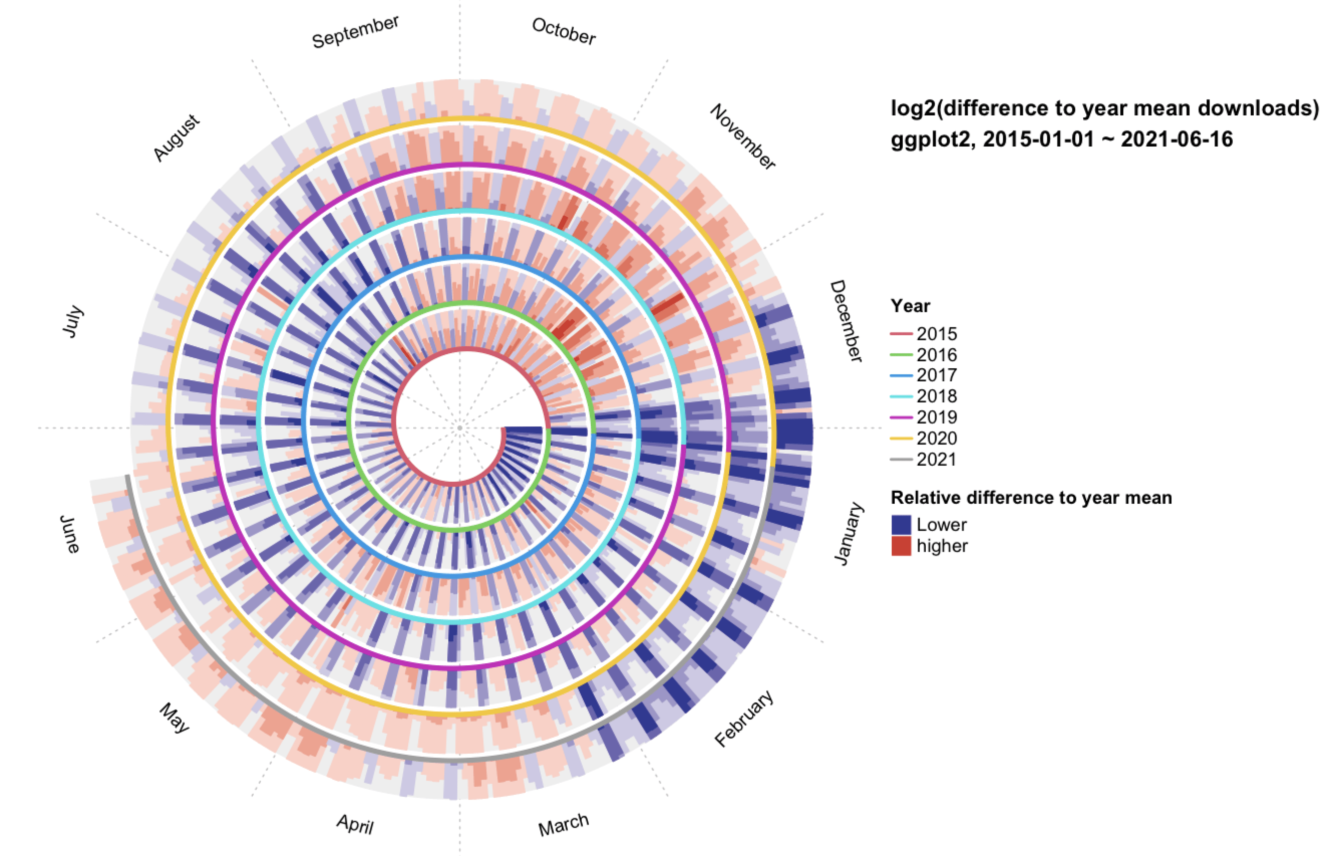
Spiral plots offer a unique way to represent cyclical data, arranging values in a spiral to highlight long-term trends over time. They’re great for visualizing patterns that repeat, like seasonal trends or daily cycles. Imagine mapping monthly website visits over multiple years in a spiral format—this setup can quickly reveal any yearly peaks or recurring patterns. To ensure readability, many data visualization experts advise sticking with simple color schemes and limiting layers, as too much detail can make spiral plots hard to interpret.
41. Arc Diagram
Highlighting connections or relationships between data points, arc diagrams use arcs to visualize links between categories or values. This style works well for showing pairs or networks, like collaborations between departments in a company. Picture using an arc diagram to demonstrate how different departments share resources or collaborate on projects—each arc represents a link, making the connections clear. Experts suggest keeping the number of connections manageable to avoid a cluttered look, a principle noted in both Storytelling with Data and The Big Book of Dashboards.
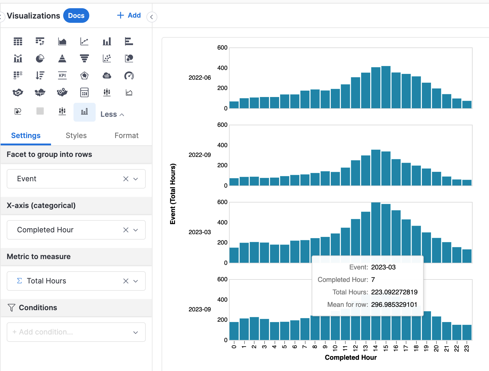
42. Trellis Chart
A Trellis Chart (also known as a lattice chart or small multiples chart) is a type of data visualization that displays multiple small charts in a grid format. Each small chart within the Trellis Chart represents a subset of data, allowing the viewer to compare patterns, trends, or distributions across different groups or categories. It’s particularly useful when you want to see how certain variables behave across multiple dimensions, such as time, location, or categories.
An example of a Trellis Chart is in healthcare analytics, where a Trellis Chart might be used to show the number of patient visits to different departments in a hospital across months. Each small chart could represent a department, with the X-axis showing months and the Y-axis showing visit numbers, making it easy to compare seasonal trends across departments.
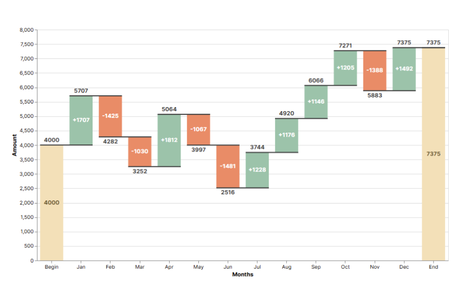
43. Waterfall Chart
The Waterfall Chart is ideal for visualizing incremental changes that contribute to a total value over time or between categories, capturing both positive and negative values as they impact the final total.
Starting with an initial value, Waterfall Charts show how a starting value is affected by a series of positive and negative changes, ultimately leading to an ending value. This makes it perfect for scenarios where you need to demonstrate how individual components contribute to an overall change, often used in financial analysis, project management, and process improvement.
With its step-by-step layout, a Waterfall Chart helps make complex financial or operational changes more transparent, showing exactly where gains and losses happen along the way.
IX. Dashboard Design Principles
Here are a few tips to build better data visualizations and make better dashboards. In case you're looking for examples of well-designed dashboards, check out our playground. (shameless plug, I know!)
1. Focus on the Audience and Context
Getting a solid understanding of who’ll be using the dashboard and how they’ll use it is key. For example, you wouldn’t give a CEO a dashboard cluttered with a hundred blinking numbers, just like you wouldn’t hand an operations team a high-level, fluffy summary. Different audiences, different needs.
Dashboards for real-time monitoring or operations need a different setup than high-level summary dashboards. For real-time use, it’s all about focusing on up-to-the-minute data that helps users spot issues fast and act quickly.
Think about creating personas or scenarios that reveal exactly what each type of user needs. This way, you’re not just designing for some vague “user” out there—you’re building with a clear purpose. Executives get straightforward snapshots they can digest quickly, while analysts receive all the detailed data layers they need. By tailoring content to fit each role’s needs, you’re making it easier for everyone to find their key insights without any extra hassle.
2. Prioritize Key Metrics and Reduce Visual Clutter
Keeping key metrics front and center is important, especially for dashboards used in high-stakes or fast-paced environments. Putting the most important numbers at the top or center makes it easy for users to grab insights instantly. By cutting out non-essential data and keeping decorative elements—like bold colors or 3D effects—to a minimum, you reduce mental load, helping users stay focused on what really matters and compare values quickly. This approach ensures that the dashboard remains practical and user-friendly, letting people explore data themselves and make quick, informed decisions without distractions.
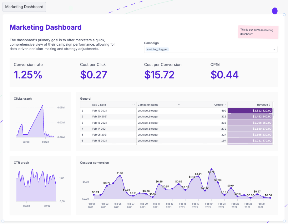
Clarity should be the main priority to avoid distractions.
Use bold fonts and larger text to draw attention to the essential data point. Also, adding subtle background colors to separate data sections is a simple trick that reinforces hierarchy without clutter. It helps users scan through the dashboard fast, letting them spot the essential info right away without extra visual noise.
3. Use Visual Hierarchy for Fast Data Interpretation
A clear visual hierarchy helps users navigate the dashboard smoothly.
Using size, color, and placement to highlight key data makes it easy to see what’s most important at a glance. Real-time dashboards especially benefit from a top-down layout—starting with the critical metrics up top and moving down to supporting details. This way, users can quickly get the main points without distractions, making it easier to stay focused on priorities.
This approach not only makes it easy to see what’s most important but also allows users to compare values effectively without distractions. Testing dashboard layouts with real users early on is a must if you want to know how well they’re navigating the hierarchy. Get feedback on how easily they can find key metrics—it’s the best way to make sure the design hits the mark and actually works the way users expect.
4. Select the Right Visuals for Real-Time Data
Choosing the right type of data visualization is important, especially for live or constantly changing data. Simple visuals like line charts, grouped bar chart, and indicators usually work best for real-time dashboards—they’re quick to read and keep things clear. The goal is to make sure users can recognize what’s important right away, so it’s best to skip overly complex visuals like 3D charts, which can make it harder to see the main points. Keeping things simple ensures that users can process info fast without unnecessary distractions. Using qualitative data cues, like color-coded markers, can make it easier to catch shifts in key metrics at a glance.
Try using color-coded cues to flag any changes in key metrics—think of it as a quick visual alert system so users don’t have to dive into the details to see what’s shifting in the data values. And if you want to go a step further, throw in some subtle animations (like a blinking icon for alerts) to make data point stand out.
5. Maintain Simplicity and Use Minimalist Design
A clean, simple design works best for dashboards, particularly when users need to make quick decisions. Skipping extra decorations and unnecessary colors keeps things from getting visually cluttered. Thoughtful use of white space can make the layout easier to read and give it a clear, straightforward look, helping users find what they need quickly. This design strategy keeps the focus on the most important info without distractions.
When it comes to color, a simple palette does wonders. Limit colors to two or three shades, with one or two pops of color for crucial metrics. This minimalist vibe keeps things professional and easy on the eyes, making it easier for users to focus on the insights that count.
6. Enable Relevant Interactivity Without Overloading
Interactivity can make a dashboard way more useful, letting users dig deeper into the quantitative data. But it’s best to keep interactive features focused on what actually adds value and represent data accurately. In real-time dashboards, too many options can be overwhelming and slow users down. Stick to interactive elements that allow users to quickly filter or zoom in on key info without losing sight of the main metrics—keeping it clear and easy to use.
Adding interactive drill-downs lets users dive into details on their own terms without cluttering the main view. Consider grouping related metrics so users can explore deeper only when they want, keeping the main layout clean and easy to navigate.
To extend that simplicity beyond the screen, QR codes allow static dashboards to become mobile-accessible, perfect for users who need quick access from printouts or presentations.
What's happening in the BI world?
Join 30k+ people to get insights from BI practitioners around the globe. In your inbox. Every week. Learn more
No spam, ever. We respect your email privacy. Unsubscribe anytime.

