6 Best Self-Service BI Tools: A Methodical Comparison Matrix
The concise guide to evaluating self-service analytics tools.
LAST UPDATED April 06, 2026
AUTHOR  Holistics Team
Most self-service analytics guides exist to game search engines. Not this one. Here's a fact-based, methodical breakdown of self-service BI platforms you can actually use.
Our approach:
- Facts are prioritized over opinions, no recommendations pushed
- Details are backed by official documentation
- High-level criteria are broken down into specific, measurable sub-points
- Findings are presented in in clear, comparable tables
- Linking to real-world discussions from actual users
The self-service BI tools compared in this document are: Holistics, Looker, Lightdash, Thoughtspot, Metabase.
We understand we might come across as biased, since we're also a vendor selling self-service BI. Rather than claiming neutrality, we'll let the content below speak for itself.
Found an inaccuracy or want your tool added? Use this form.
Feature-by-Feature Comparison Table
Scroll to the right to see more
| Dimension | | |  Lightdash Lightdash |  Thoughtspot Thoughtspot | |
|---|---|---|---|---|---|
| Demo Playground | |||||
| | ❌ | Available | ❌ | ❌ | |
| Pricing Structure | |||||
| | Feature Tier Offers different pricing tiers based on the number of users and features. Transparent pricing. source | Feature Tier The deprecated AWS Marketplace page shows Looker offers three plans—Standard, Advanced, and Elite, with Standard starting at $66,600/year. source | Feature Tier Starter plan is $800/month with unlimited users and visualizations, while Pro plan is $2,400/month with more features. source | Rows of Data Priced by data rows and permission groups. The Essential plan starts at $1,250/month for 25M rows & 5 groups. source | Feature Tier Free plan available. Paid plans include Starter at $85/mo for 5 users, and Pro at $500/mo for 10 users. source |
| | $9,000+/year The Entry plan starts at $800/month with core self-service analytics. Higher plans offer advanced features like Custom Charts and RBAC. source | $83,665+/year Vendr's data shows Looker costs ~$83,665/year on average. The maximum price for Looker software can reach up to $1,770,000. source | $9,600/year Small teams can start with the Starter plan ($800/month), while larger teams need Pro for features like AI Data Analyst and Usage Analytics. source | $1,200+/year Self-service BI features are included in the Starter plan. To expand access to more users with granular access controls, the Pro plan is required. source | |
| Single Source of Truth Ensure all users work with consistent, accurate metric definitions, reducing ambiguity and discrepancies across reports and dashboards. | |||||
| |  Centralizes business logic in modular, reusable data models, allowing consistent definitions across reports. source |  Enables defining centralized, modular data logic that can be reused across reports. source | dbt semantic layer Lightdash integrates with dbt to define semantic models and save custom SQL queries as reusable models. source | ThoughtSpot Modeling Language (TML) TML allows users to modify objects such as worksheets, views, tables, Liveboards, and answers in a flat-file format (.TML). source | 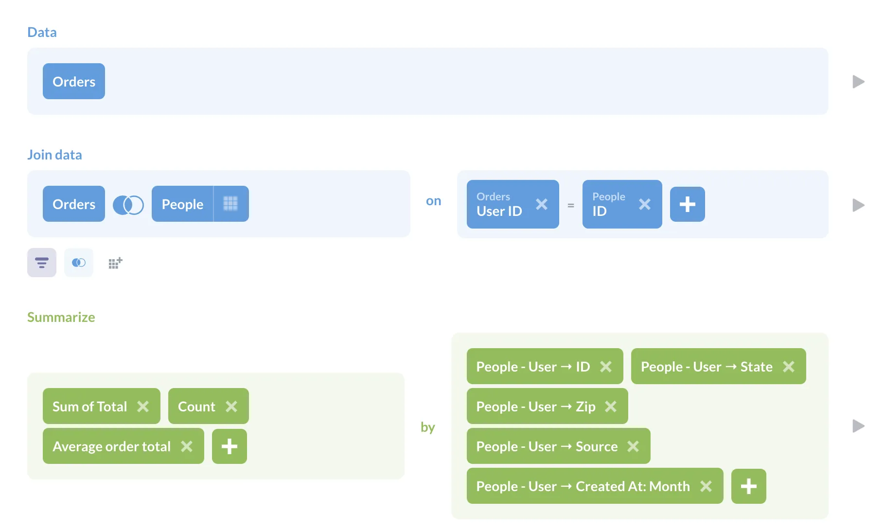 Model data with lightweight table metadata plus reusable Models/Metrics, but it’s not a full semantic layer and is limited by the underlying query performance (and can’t do cross-database joins). source |
| |  Support Git version control natively for both dashboards and models. source | 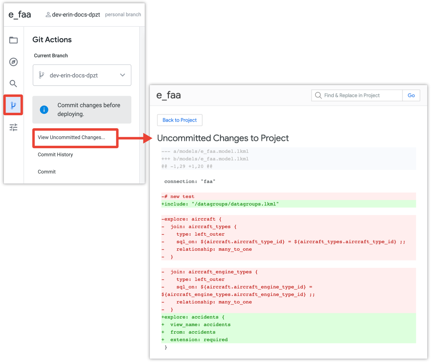 Git-based version control for data models, proprietary dashboard versioning. source | Git Version Control Git-based version control for data models. source | Git for TML Export and sync TML with Git for change control. source | 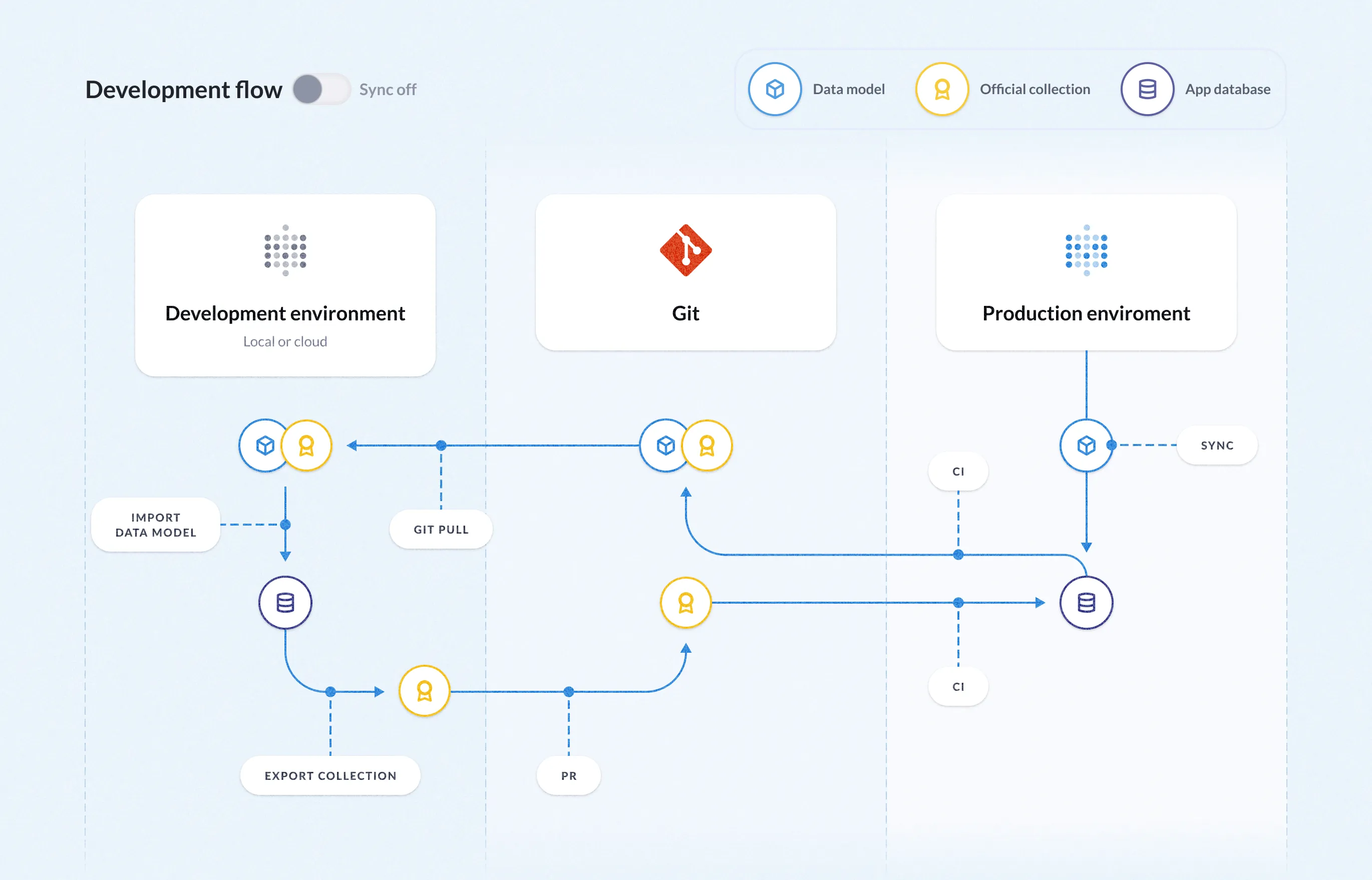 Version control is supported through a proprietary, one-way Git-based serialization process, available with the Pro Plan and higher. source |
| Self-Serve Data Exploration Allows users to easily find, interact and explore pre-built dashboards through self-serve features like filtering, drill-through, grouping, and AI-powered recommendations. | |||||
| | Customizable Metadata Allows data teams to add descriptions and annotations to data models, datasets, and dashboards. source | Field Descriptions in LookML Enables developers to add descriptions to fields within LookML, providing context and explanations. | Metric & Dimension Descriptions Enables users to add descriptions to fields, metrics and dimension. | Column Descriptions and Tags Allows data team to add descriptions and tags to columns for context. | Table and Field Metadata Admins can add descriptions to tables and fields, which are shown to users to improve clarity and context. source |
| | Allows users to ask questions in natural language to explore metrics, run complex analyses, or get step‑by‑step instructions for in-depth exploration. source | Filters and Drill-Downs Provides dashboard filters and the ability to drill down into data points | Drill & Cross-Filters Supports drill into metrics, cross-filtering, and date zoom, enabling users to analyze data points, apply dashboard-wide filters, and adjust date granularity. | Drill & Filter ThoughtSpot's Liveboards allow users to add filters and drill down into specifics data. | Drill-through and Filters Users can explore data with filters, drill-throughs, cross-filtering, and dynamic date granularity. source |
| Self-Serve Report Creation Allows users to customize and build their own reports based on a curated set of data dimensions and metrics. | |||||
| |  Users can drag and drop measures and dimensions from pre-built datasets to create charts, then freely arrange visuals, text, and elements on a free-form canvas to build dashboards. source | 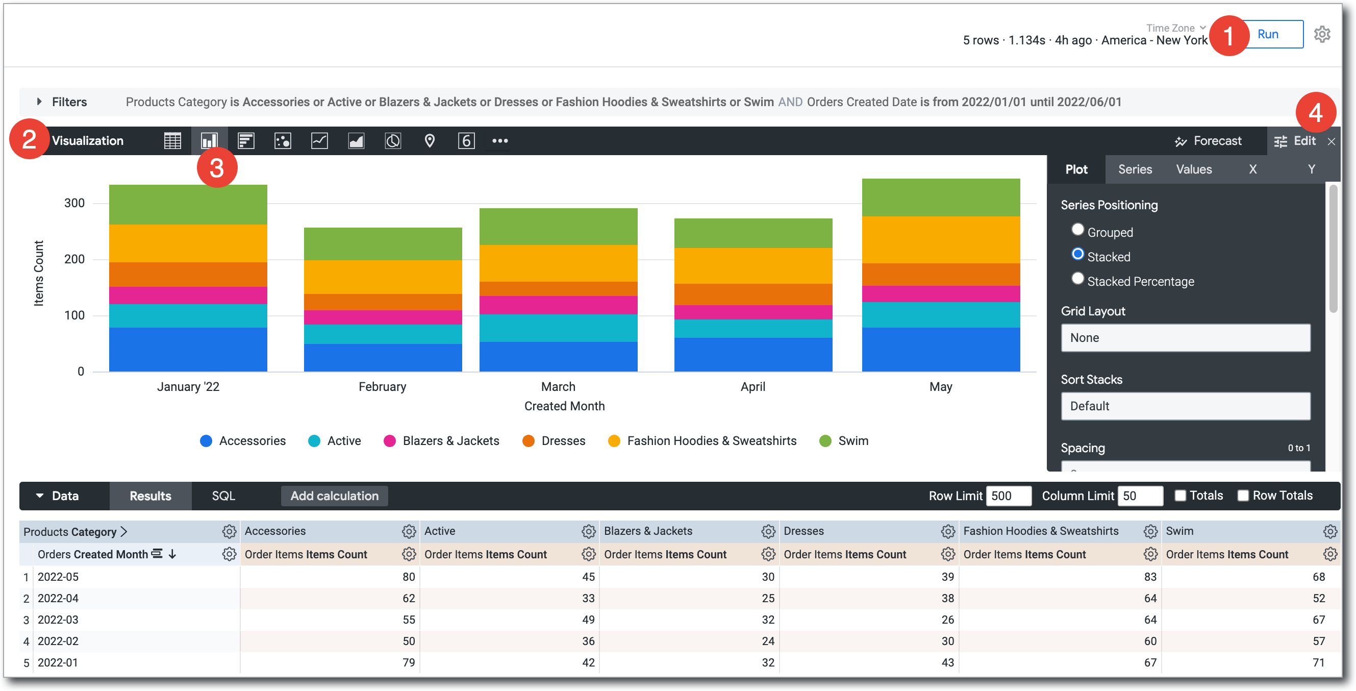 Users create reports by selecting fields from their data model and visualizing them directly in the Looker interface; reports can also be built from templates to simplify configuration. source | 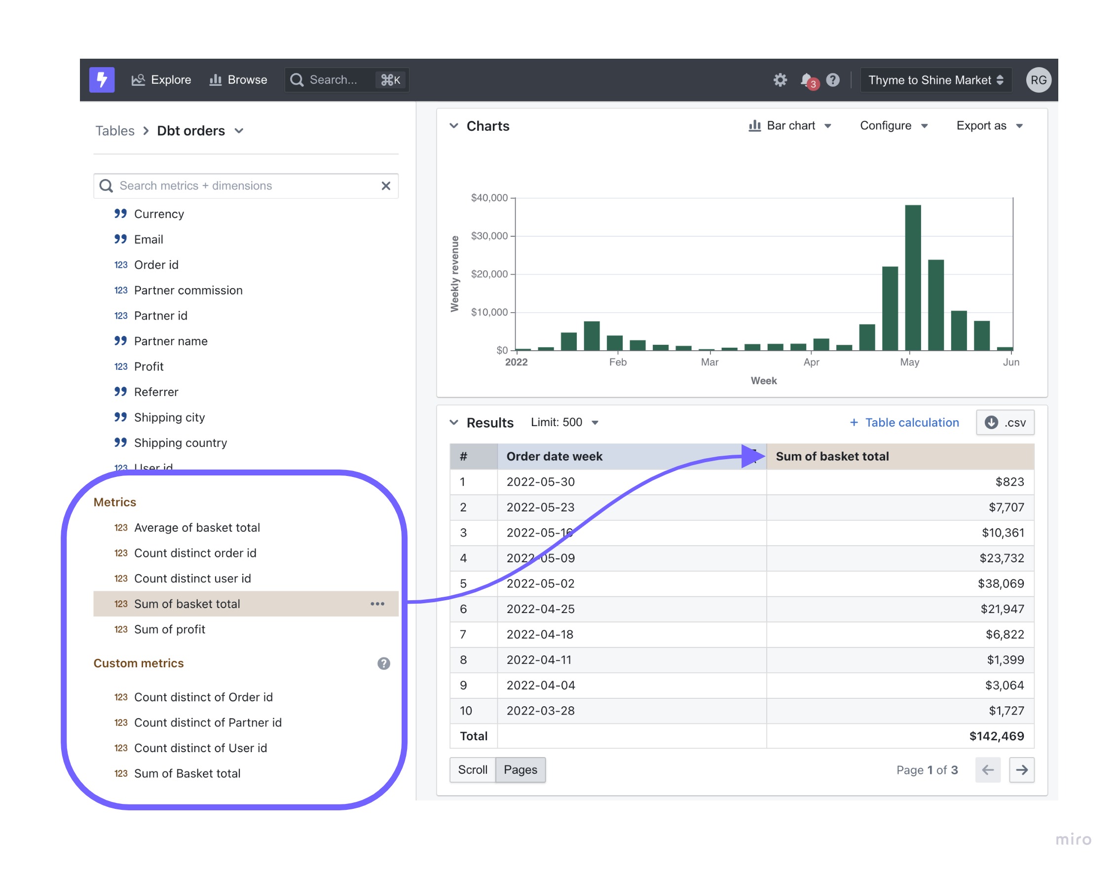 Users choose from predefined chart types and customize them with measures and dimensions, with AI Analyst enabling report generation via natural language queries. source | Users can create reports using natural language, customize Liveboards with drag-and-drop functionality, and leverage Automated Answer Creation for visualization suggestions. source | 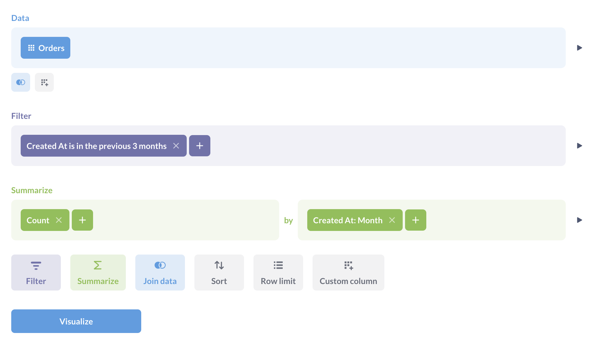 Users create dashboards using a query builder to select fields and filters, and a drag-and-drop interface to add elements. source |
| |  Toggle period comparisons within visualizations. Trend lines are natively supported in Line, Column, Bar, Area, and Combination Charts. source | Custom Modeling Support standard calculations like aggregations, percentages, and running totals. Period-over-period comparisons or trend analyses often require further data modeling. source | In Backlog | 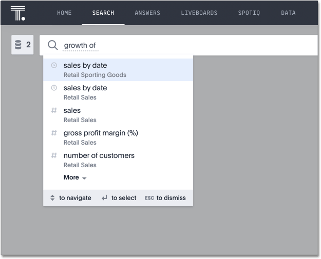 Perform period growth calculations by typing "growth of" at the beginning of a query, selecting a measure, and specifying a date column to compare different time periods. source | Offset Custom Expressions Users perform period-over-period comparisons, trend analysis, and distribution analysis by using offset custom experessions in Query Builder. source |
| |  Supports custom charts via Vega-Lite. source | Via Looker Marketplace Can be defined in JS files, which can be included in LookML projects, hosted externally, or sourced from Looker Marketplace. source | ❌ | 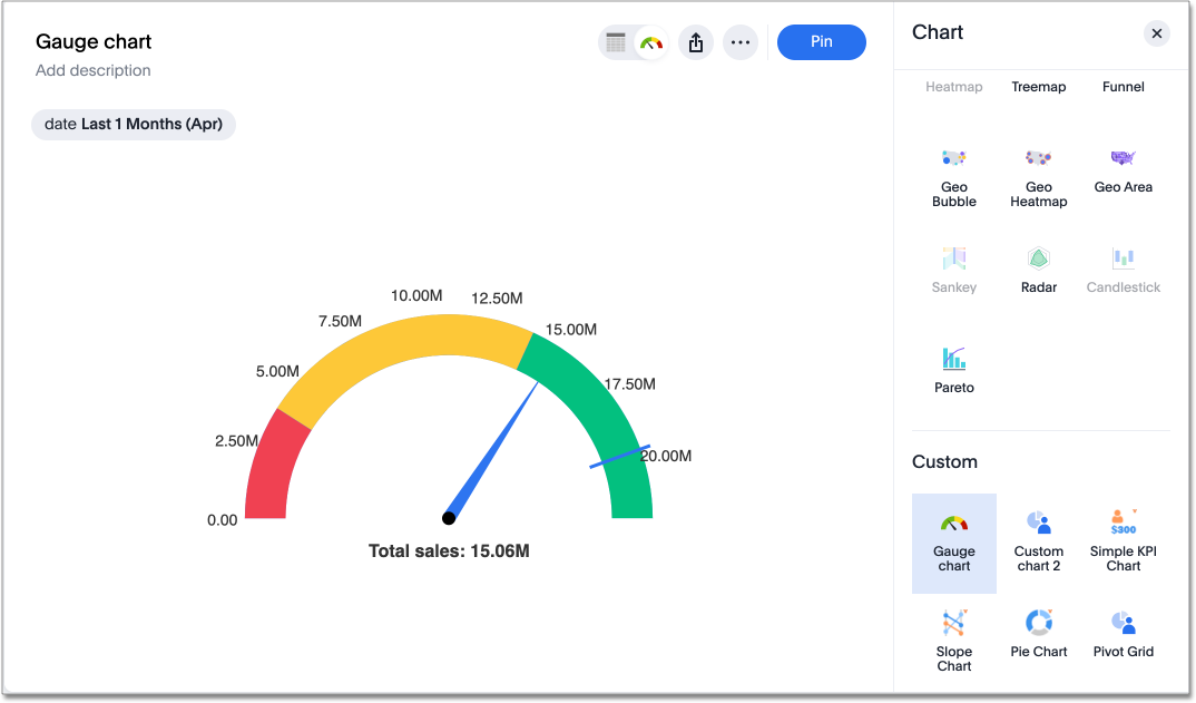 Integrate external libraries, such as Highcharts and D3.js, for custom visualizations. Built-in geo visualization capabilities allow users to configure geographic data for geo charts. source | 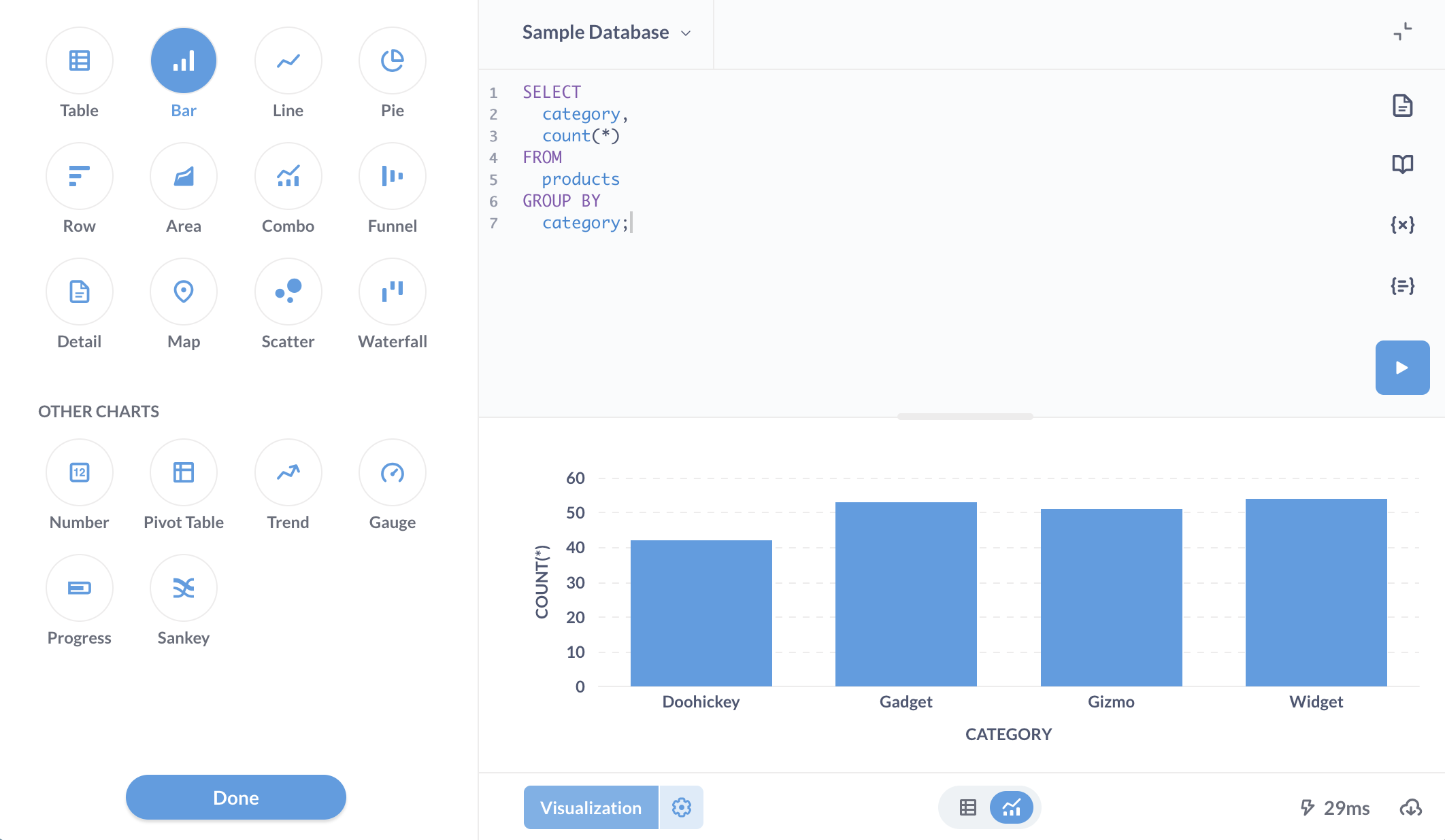 Create visualizations, including charts like Sankey diagrams, by mapping fields in the editor. More advanced chart types are not supported. source |
| |  AQL is a metric-first analytics query language. Users can define AQL metrics ad-hoc during dataset exploration or within a dataset definition. source |  Create ad-hoc calculations based on LookML-defined fields. Analysts can also create LookML-defined custom fields to create new ad hoc custom dimensions and measures in Explore. source | 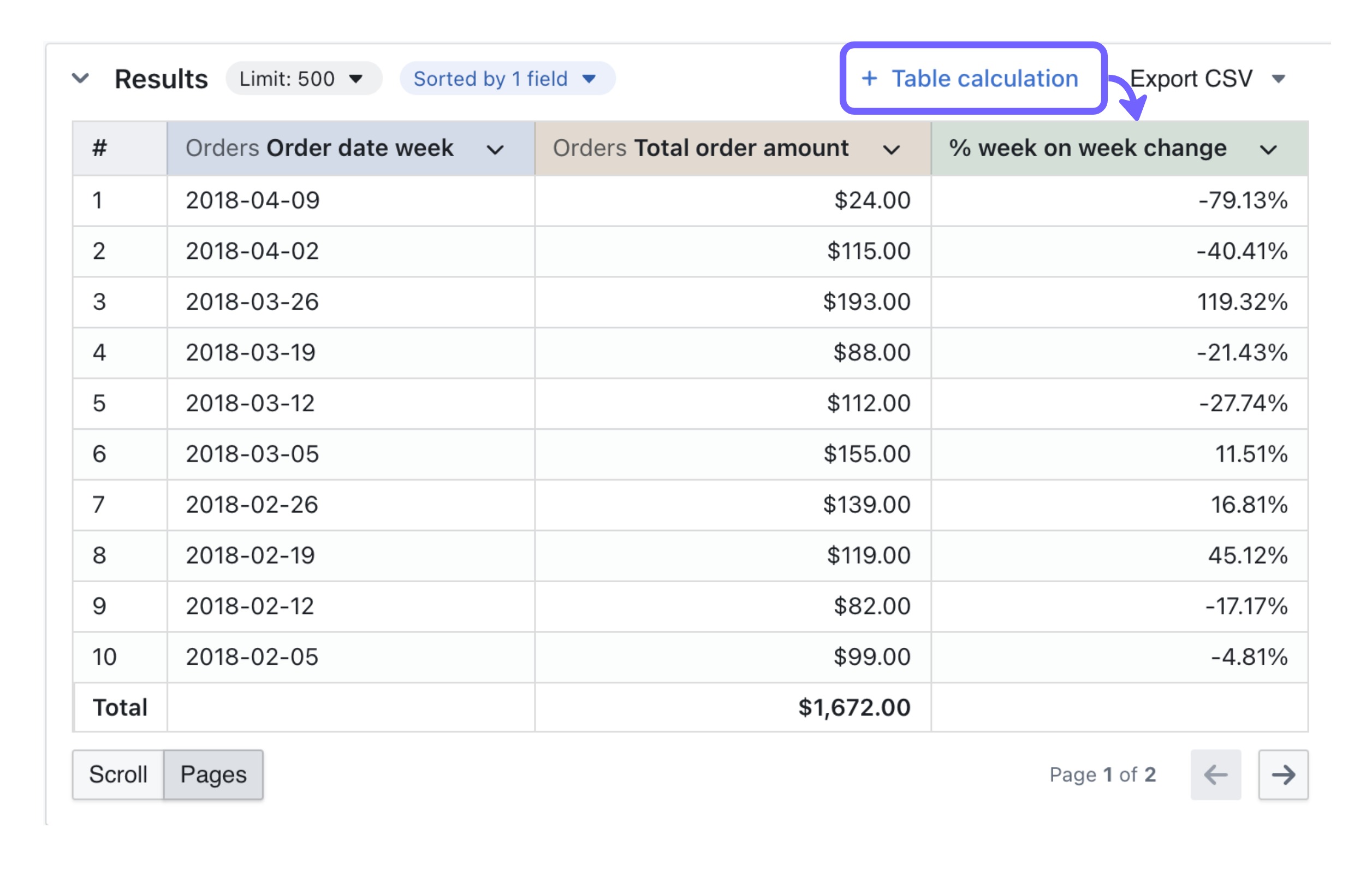 Create custom metrics either through version-controlled definitions in dbt YAML files or via SQL table calculations for ad-hoc analysis. source | Formula Builder Users can define custom metrics using the formula builder, which provides a range of built-in logical, mathematical, date, and text functions. source | Custom Experessions Users can build custom calculations in the Query Builder using custom expressions. source |
| | Allow users to create custom layouts, custom themes and styling through a canvas-based dashboard. source | LookML Dashboard Allow users to create custom layouts, custom themes and styling through a canvas-based dashboard. source | 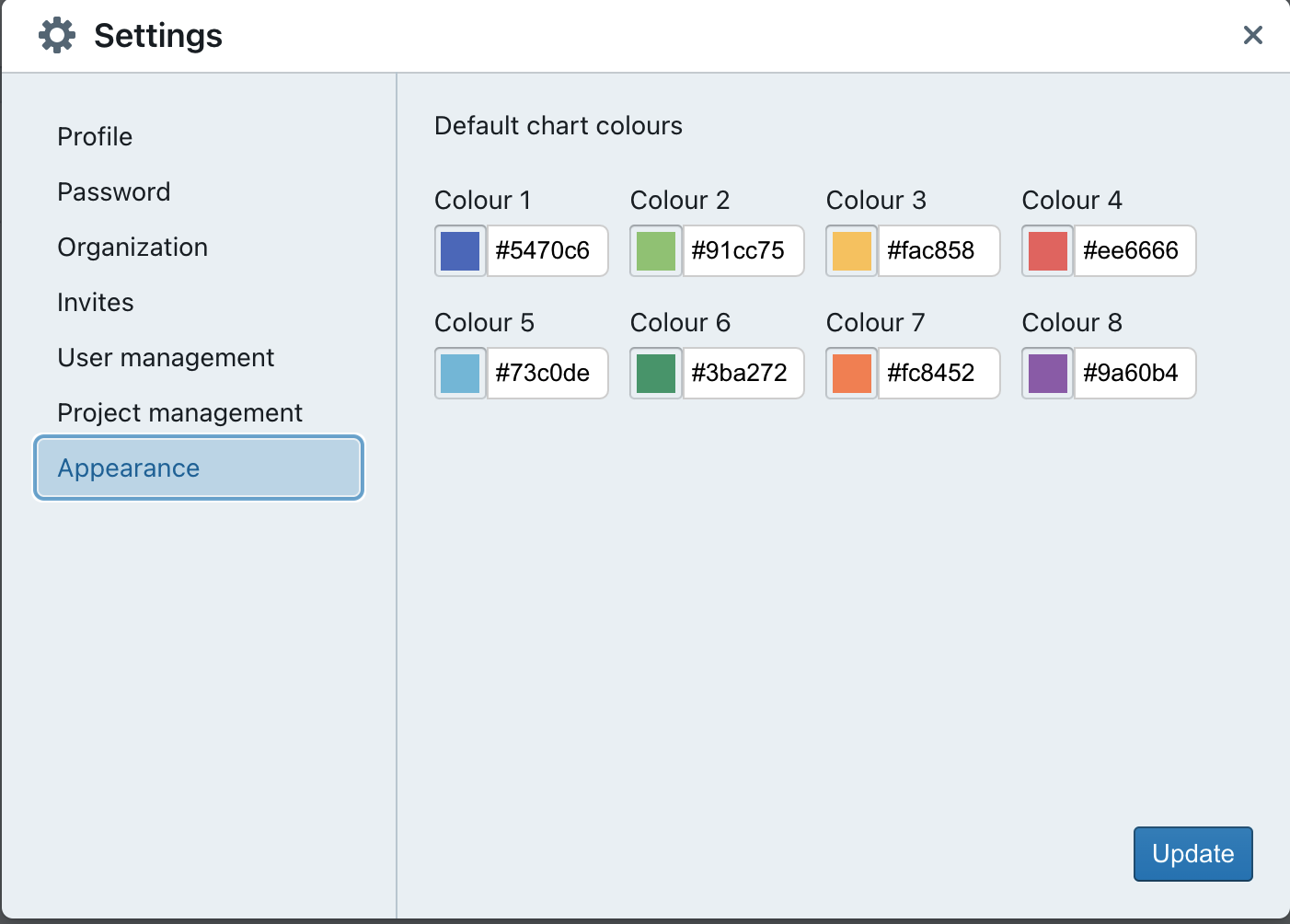 Allows users to add various tiles, including charts and markdown content. Admin can customize chart colours to match branding under Appearances. source | 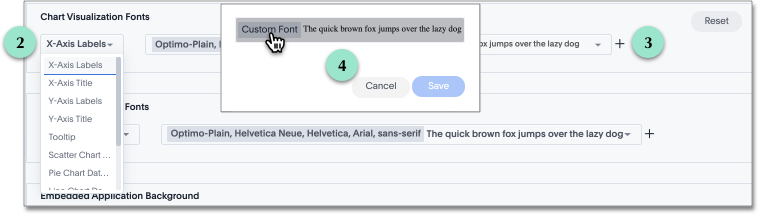 Users can customize the style and chart colour palettes to align with branding through the admin console. source | 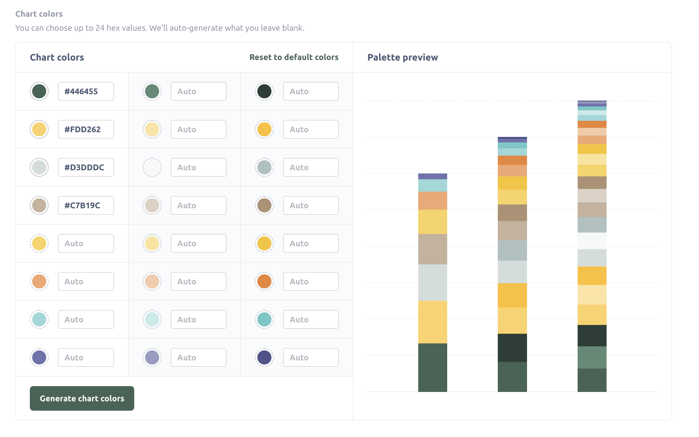 Customize dashboards with logos, custom colors, and custom fonts. Add custom CSS when embedding, and enable interactivity through filters and chart behaviors. source |
| The depth of analytical functions determines how well users can explore trends, compare performance, and uncover insights beyond basic reporting. | |||||
| | Moving calculationas are built-in, one-click operations in Holistics’ Report Builder. Analysts can also use AQL expressions with window functions for more advanced calculations . source |  Create moving calculations with table calculations in Looker, using the function offset_list() or trend line feature. source | Custom SQL Calculation n SQL, this is done using ROWS BETWEEN N PRECEDING AND CURRENT ROW, where N controls the lookback period. source | 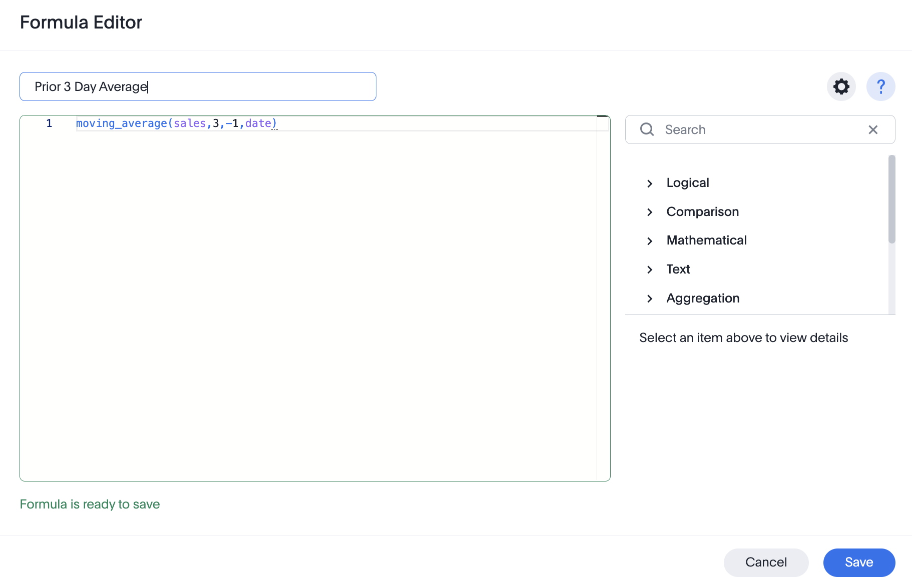 Add moving calculations by writting moving_average formula, providing a measure, a window, and one or more attributes in Formula Editor source | Custom SQL Queries Does not natively support moving averages and rolling metrics in the GUI, but they can be implemented using custom SQL queries. source |
| | Period Comparison can be toggled on at dashboard and visualization level. Custom period comparison can be added via both AQL expressions and built-in 1-click operations. source | 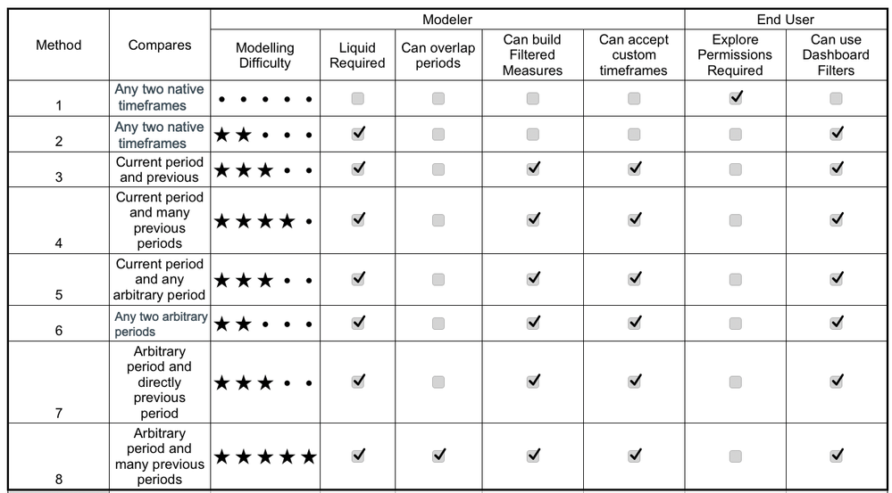 Basic methods use native timeframes, while advanced comparison requires custom LookML modeling and Liquid. Features like filtered measures and dashboard filters vary by method. source | In Backlog PoP comparison is available for big value charts, and support for other charts is currently in backlog. source | 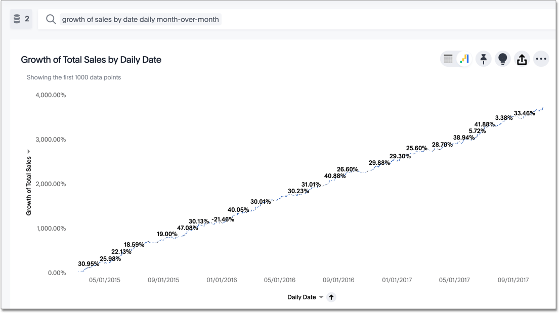 Use the growth of keyword to calculate growth as a percentage change between time periods by dividing the difference by the earlier value. source | Custom Expressions Supports PoP comparisons via Offset, which converts to SQL LAG/LEAD for time-based change analysis. source |
| |  Add "Percent of Total" via the exploration interface, or via AQL’s of_all() function. The result is displayed in tables, pivot tables, or visualizations. source | 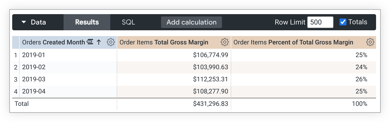 Supports aggregate, non-aggregate, and post-SQL measures, with flexible 'percent of total' via table calcs or viz settings. source | Statistical Functions Aggregate metrics like median and average are calculated within or based on the different values or levels of a specific dimension, and SQL can be used to handle more complex calculations. source | Custom Formua Uses SQL for basic stats, platform functions for medians/percentiles, and supports percent totals via calculated fields. source | Custom Expressions Custom Expressions calculate and filter data using standard operators, with row-level or aggregation functions translated into query logic. source |
| | Not Supported Uses "Trend Lines" to visualize patterns in chart data. Forecasting is not yet available. | 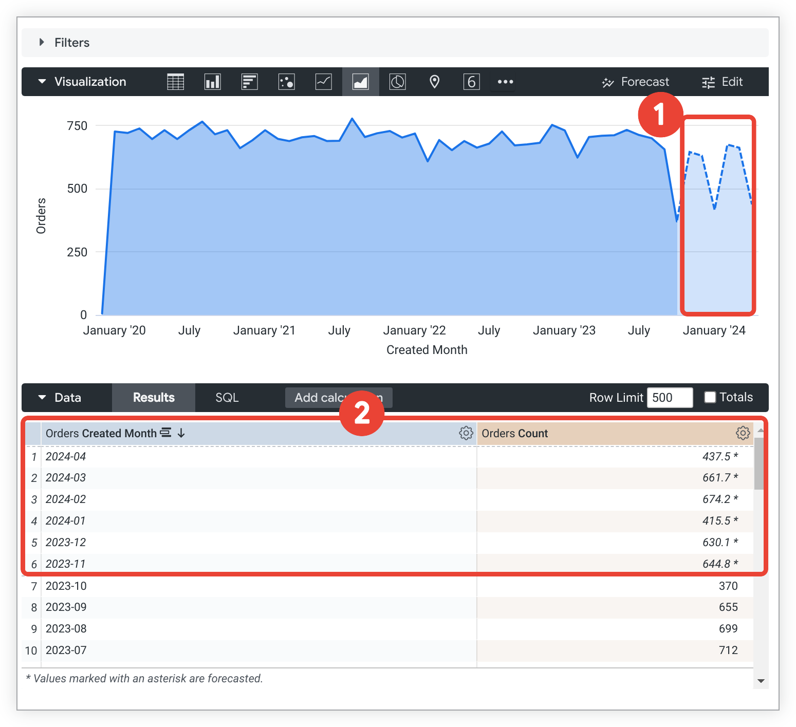 Create, edit, or remove forecasts using AutoARIMA in the Forecast menu. Customize length, confidence, and seasonality for better accuracy. source | Not Supported | 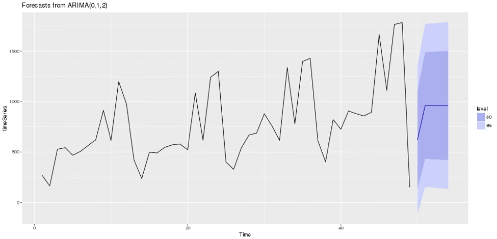 Forecasting (Beta) and analize trends using SpotIQ. Can also use R to perform forecasting. source | Python Project future values with historical data and Offset. For advanced forecasts, use Python or warehouse models to visualize in Metabase. source |
| Governance Ensuring control, and compliance across self-service BI environments is critical to maintaining data integrity and trustworthiness. | |||||
| |  Dashboard views and user activities are tracked, allowing administrators to understand usage patterns and measure adoption. source | System Activity Explores Provide insights into user interactions, content engagement, and query performance. Admins can track platform usage to optimize performance and improve system efficiency. source | 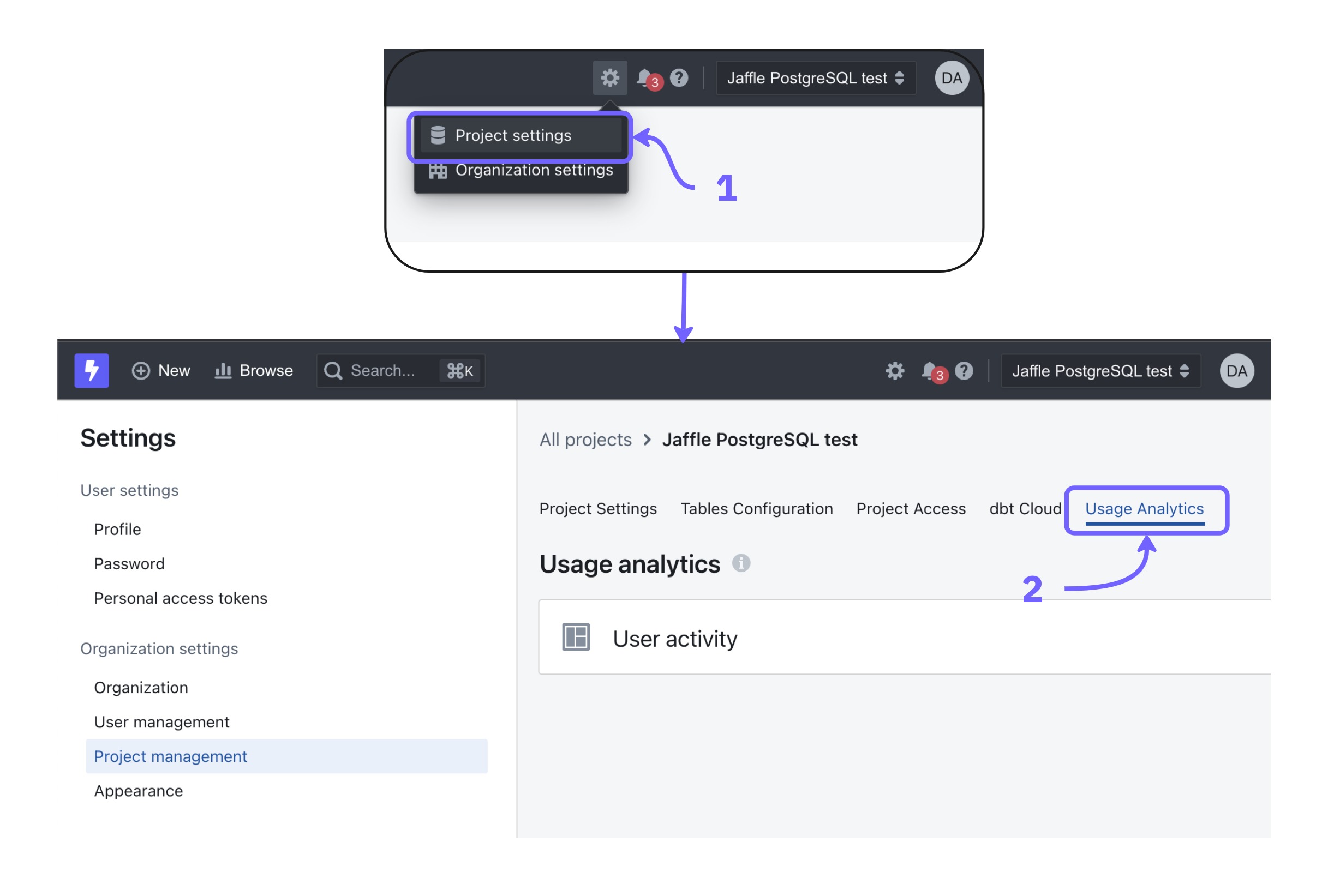 Monitor user activity with Usage Analytics Dashboards and Query Tags. Dashboards track active users and queries, while Query Tags analyze data access patterns, helping admins optimize self-service adoption. source | 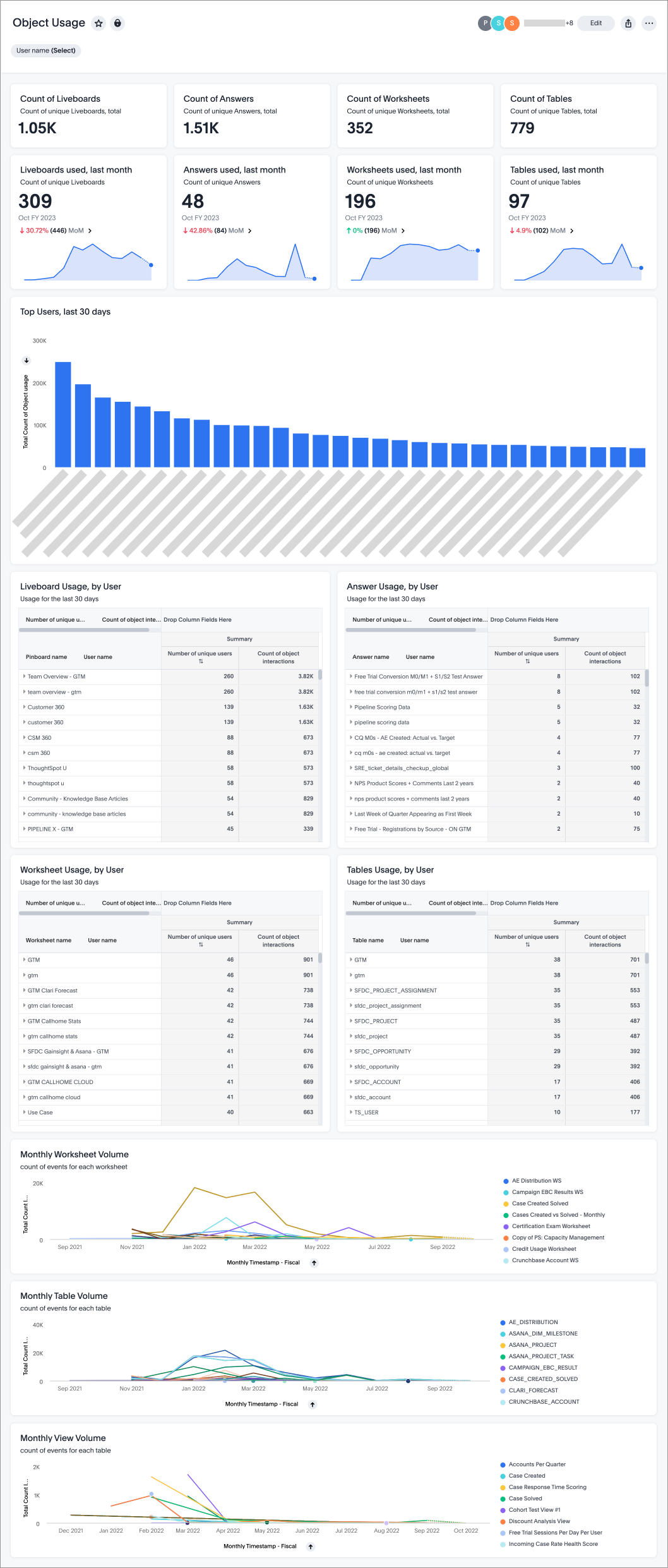 Object Usage Liveboard tracks data object interactions (Worksheets, tables, views, etc), helping identify accessed and unused items. Admins can filter by user for detailed activity insights. source | 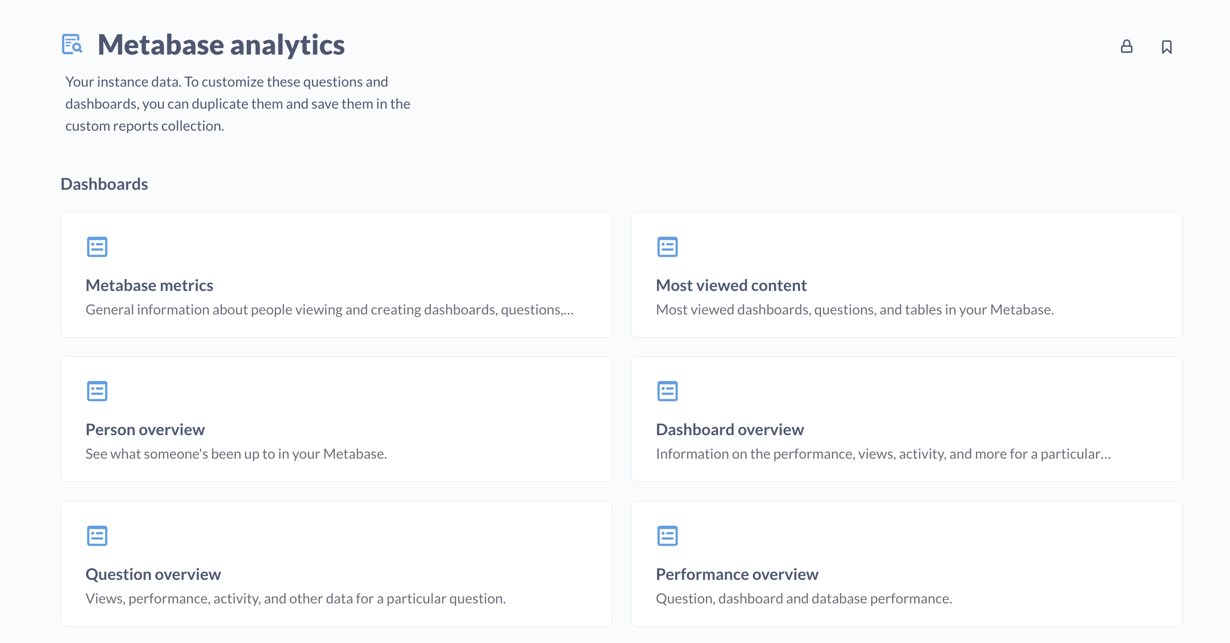 User activity (logins, content views, feature use) is tracked to help admins analyze engagement and optimize adoption. source |
| | RLP & RBAC Allows for fine-grained control over data access by managing permissions at the row level, schema level, data source level, and report/dashboard levels. source | Role-based Admins can define role-based permissions, ensuring secure data access. Users are assigned roles with specific privileges to control feature and content access. source | Role-based Role-based access control (RBAC) and attribute-based permissions enable fine-grained control over data access. source | RBAC & Object-level Data access is managed using role-based access control (RBAC) and object-level access control. source | 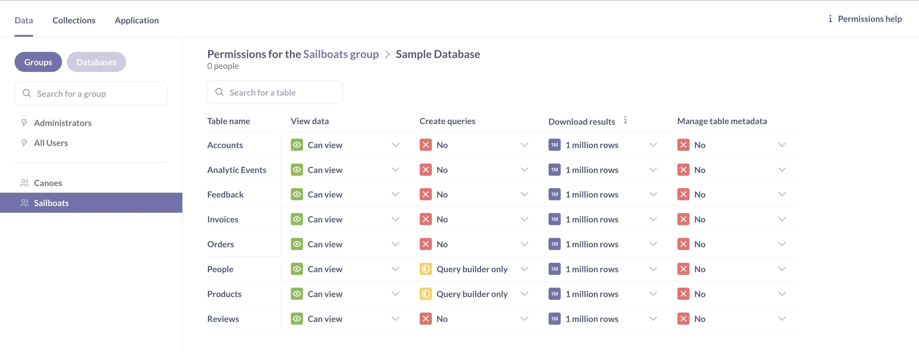 Access is controlled through group-based permissions for data, row-level filtering for user-specific data visibility, and collection permissions for dashboards and reports. source |
| BI Developer Productivity Enhancing productivity for BI developers/data team through automation, modularity, and extensibility enables faster development and easier maintenance. | |||||
| | Define models and dashboards with code, allowing composability, parameterization, reuse, and mass refactoring. source | 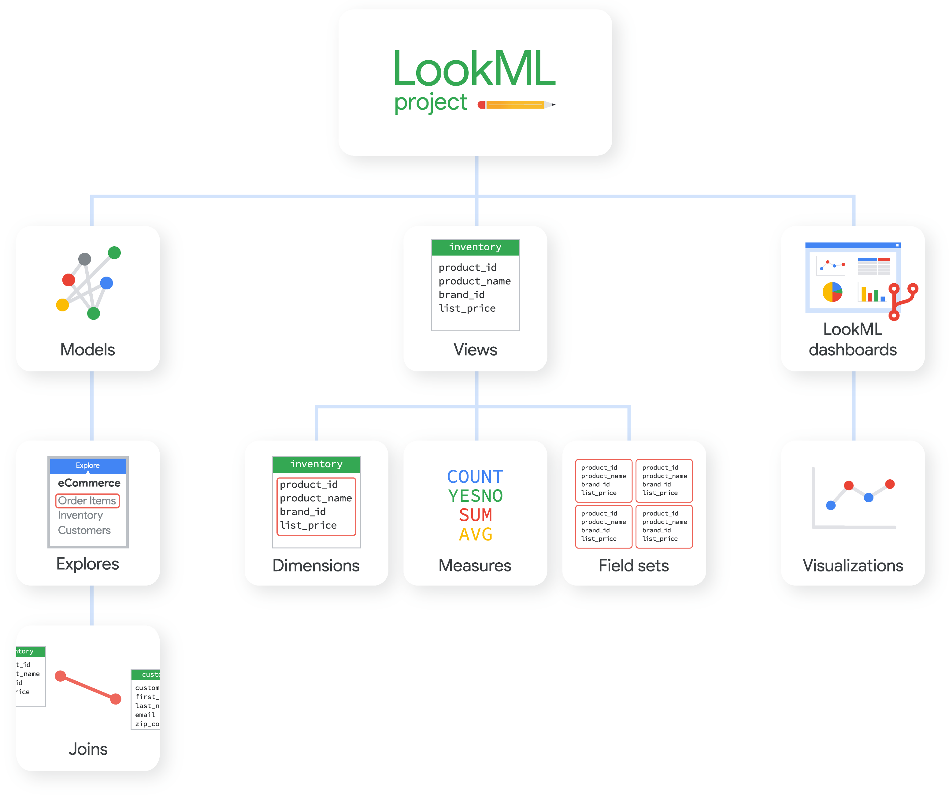 Allows users to define centralized, modular data logic that can be reused across reports, with limitations when solving complex analytics logic. source | 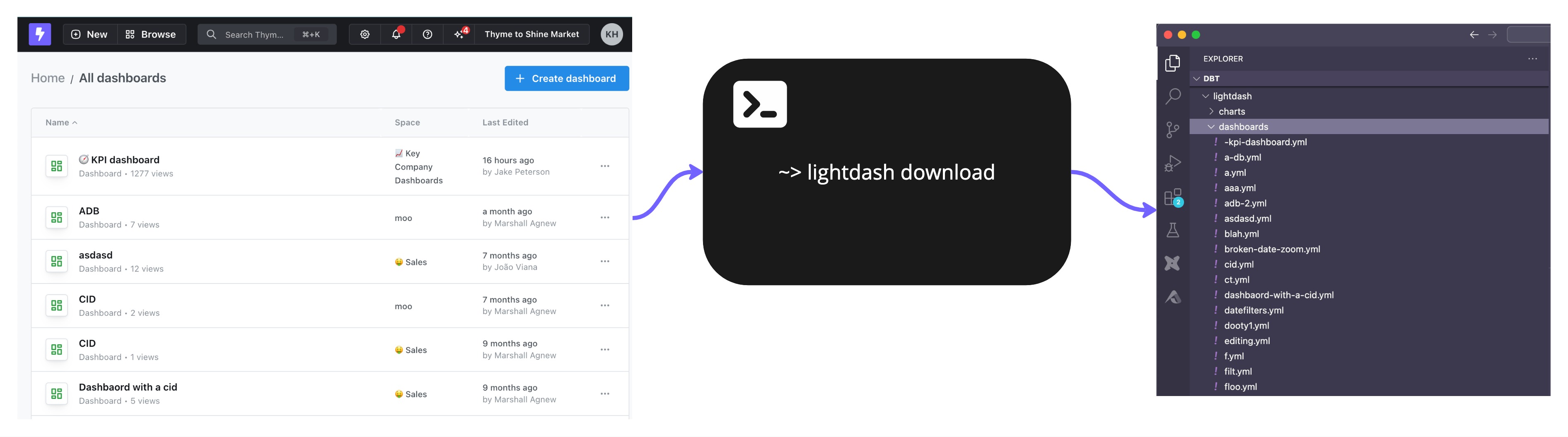 Allows developers to manage dashboards as YAML files within Git. source | Thoughtspot Modeling Language (TML) Users create custom analytics with TML, manage versions, and integrate with data pipelines. source | ❌ |
| |  Users can define reusable chart components and metrics to extend and reuse across the organization. source | Reusable Data Models Define reusable metrics, dimensions, and logic that can be applied across multiple reports and dashboards. source | ❌ | ❌ | Reusable Queries Collections store reusable queries linked across dashboards—edits update all instances automatically. source |
Evaluation Criteria for Self-service BI Tools: Our Methods
The right self-service BI tool helps you avoid the failed state.
The failed state presents itself when your analyst can't keep up with all the requests she's getting from end users, so you hire another. And another. And another. And then your company grows up, creates departments that report to different leaders, and each department hires its own analysts, and now you have an army of analysts in various parts of the company all writing queries or tuning Excel spreadsheets, just trying to keep up with the business requests your company throws at them.
This is the failed state.
In this article, we’ve written about what exactly self-service analytics is. We also argued that business intelligence problems are socio-technical problems, and you usually have to fix some combination of people (read: culture) and process and tool, all at the same time. Self-service business intelligence is most usefully described as a business outcome — a place that you get to through a combination of tools and processes, and org structure. And the way you get to it is by asking yourself, each step of the way: "Does this move bring us closer or further away from the failed state?" In such a scenario, the best thing a tool can do is to not get in your way. The best thing a BI tool can do is to give you handles when you want to evolve your org away from the failed state.
1. Single Source of Truth
The foundation of successful self-service analytics is maintaining consistent, accurate metric definitions. Without this, you risk metric drift, conflicting reports, and erosion of trust in your data platform.
What to look for:
- Semantic Modeling Layer: A self-service analytics platform should allow you to define and maintain business metrics centrally, ensuring that reports generated across different departments are accurate and consistent. This is usually achievable with a semantic layer that offers centralized metric definition capabilities, and the ability to reference and reuse definitions. For a focused comparison of semantic layer depth and metric expressiveness across BI tools, see our semantic layer BI tools guide.
- Version Control: Without governance, self-service report creation leads to report sprawling and not knowing who changes what. Robust git-based version control help you incorporate software engineering best practice to track changes and review changes, and roll backs changes when necessary.
2. Self-Serve Data Exploration
This capability directly impacts how effectively users can answer their own questions without becoming dependent on the data team, addressing the core purpose of self-service BI. Users should be able to easily find and interact with data through intuitive search, filtering, and exploration features. The tool should support different levels of technical expertise, from basic dashboard consumers to advanced analysts.
When evaluating, you should:
- Test the natural language search capabilities and assess the result relevance.
- Evaluate the metadata management system and how it helps users understand the data.
- Review the range of interactive controls including: Filtering options, drill-down & drill-through capabilities, cross-filtering between visuals and date range flexibility & comparisons.
3. Self-Serve Report Creation
Business users should be able to create and customize reports using a curated set of trusted data sources without requiring technical knowledge or assistance from the data team. This determines how successfully you can scale analytics across your organization while maintaining governance and preventing the "SQL translator" failed state.
When evaluating, you should:
- Test the report builder interface to see how easy it is for end users.
- Assess built-in calculation features for common analyses like: Period-over-period comparisons, Running totals and aggregations.
- Review visualization options including: Standard chart library, custom visualization capabilities and conditional formatting options.
4. Data Delivery
Users should be able to share insights and data in various formats and through different channels while maintaining security and governance controls.
When evaluating BI tools, you should look for:
- Integration with common communication platforms (Email, Slack, Teams).
- Diverse export options (CSV, Excel, PDF, PPT) and their customization capabilities.
- Scheduling features for automated distribution.
- Alert configuration options and their flexibility.
5. Governance
The self-service analytics platform should maintain data security and compliance while providing visibility into usage patterns and system performance.
When evaluating BI tools, you should:
- Review the access control system, including: Row-level security implementation, object permission management and role-based access control flexibility.
- Assess usage monitoring capabilities like user activity tracking, resource utilization metrics or adoption analytics.
6. BI Developer Productivity
The tool should enable the data team to work efficiently through automation, reusability, and modern software development practices for better maintainability.
When evaluating BI tools, you should look for:
- 2-way Git version control integration and deployment workflows.
- Component reusability and templates.
- Dev-friendly BI development workflow.
7. Performance
The platform should maintain responsiveness as data volumes and user counts grow, with tools to monitor and optimize performance.
When evaluating BI tools, you should: - Review caching mechanisms and how they might affect report performance. - Assess performance monitoring and optimization tools to help you manage and improve performance.
Community Discussions
Discover what other practitioners are discussing about this topic.

r/BusinessIntelligence
Posted on Jan 2023 View source
What is your biggest painpoint with self service BI?
Self serve at my company has been a huge painpoint, I'm working with a friend to build an app to solve that, curious if people here have the same painpoints
2top comments
r/BusinessIntelligence
Posted on Jan 2025 View source
Any suggestion for self-service bi tools?
We use the traditional ones but they are complicated and not shareable.. Does anybody have experience?
2top comments
- You can attempt to build user-friendly dashboards -- but it will likely take repeated training and may lead to one-off data asks
- You can use a tool like Rollstack to automate recurring reporting from traditional BI Tools like Tableau, Looker, Power BI, etc.,
- This is said ad nauseum, but apply first principles and have some data-goal setting early on, so you're not constantly chasing your tail on one-off asks. Automate everything you can.
We’ve been using Holistics for self-service, and it’s been pretty solid. The drag and drop report builder makes it really easy for our business teams to create reports, and common analytics functions like period comparisons or percent totals are literally just one click. There’s a bit of a learning curve at first, but once people get the hang of it, they just go all out lol.
That said IMO a self-service tool just can’t stand in silos from people and processes, as BI problems are often socio-technical problems, and you usually have to fix some combination of culture and process and tool, all at the same time. When we first brought in Holistics, there was a lot of heel dragging. We had to run a few data workshops, host seminars, and do regular check-ins with stakeholders. Plus, we kept an eye on usage stats to make sure it was actually working for everyone.
Also check out Looker and Thoughtspot if you have a budget
r/BusinessIntelligence
Posted on Feb 2023 View source
What the hell is "Self-Serve Analytics"?
What the hell is "Self-Serve Analytics"?
Recently became aware of this term. Can anyone explain what it means from a BI point of view?
Recently became aware of this term. Can anyone explain what it means from a BI point of view?
2top comments
It's that kind of analytics, where you don't have to ask the BI developer to deliver you a specific report, cause you need to add two more columns - but you can do it yourself.
Basically all of the main BI tools are self-serving - meaning the users can create their own visualizations and answer the question without the BI. And BI is just taking care of the data and building general reports.
In case you're still searching for an answer, this comic explains exactly that (warning: comments reflect the reality when companies tried to implement it).
https://www.reddit.com/r/dataengineering/comments/1bc0bkv/eli5whatisselfserviceanalytics_comic/
r/analytics
Posted on Nov 2024 View source
Any experience with self-service BI tools?
I work in the BI & Analytics department of a traditional mid-sized manufacturing company in Germany, and we’re having massive issues with our dashboard tool (we’re using Tableau).
The database is connected, but whenever we want to make adjustments, it takes hours, and all employees are constantly dependent on us. Are there better solutions out there?
I’ve heard about tools like Scavenger and Looker, where you just connect the data and can immediately ask questions without having to reprogram everything all the time.
So far, though, we haven’t had good experiences with "Self-Service BI". Does anyone have experience with these tools and can recommend one?
2top comments
Tableau is just as quick as any other tool. Taking hours to do anything sounds like a data infrastructure problem, not a dashboard problem. I doubt switching to another BI tool will solve the issue.
Looker is awesome but takes a bit of learning to deploy correctly, not sure about cost. Any BI tool is only as good as the data infrastructure it's built on though.

getdbt.slack.com: #bi-tools-general
Posted on Oct 2024 View source
This Slack community is not public. Register here and read the comments.
Anders B.
I'm looking for a BI tool that has a strong semantic layer (like LookML) and good DevOps practices (like branch development and CI testing). Does anyone have feedback or experience with the list I've gathered below? I'm likely going to be demoing each one.
- Holistics
- Lightdash
- Omni
- Cube + Superset
For reference, we're already using Hex but need something more suited for standard metric definitions and self-service chart building. Analytics Engineers would still be responsible for developing the semantic layer.
- Holistics
- Lightdash
- Omni
- Cube + Superset
For reference, we're already using Hex but need something more suited for standard metric definitions and self-service chart building. Analytics Engineers would still be responsible for developing the semantic layer.
1top comment
As far as BIs with semantic layer + DevOps practices go, I think the list is fairly comprehensive.
Each tool would have a slightly different strength/edge so definitely get on the demos for all to get a good evaluation.
Once you get to Holistics, I’ll be happy to share what makes us further unique, and connect you with our customers who switched over from Looker and Tableau alike.
getdbt.slack.com: #bi-tools-general
Posted on Sep 2024 View source
This Slack community is not public. Register here and read the comments.
Arthur Ho
I'm exploring BI tools to enable self-serve data exploration for my product team. My ideal flow would look something like this:
A PM wants to explore how the search feature performs. They find predefined metrics like # searches or # searches with clicks, with clear descriptions. Then, they can visualize these metrics and slice them using pre-assigned dimensions (e.g., user attributes).
The challenge my PMs face is understanding what’s already available in the data model. If they're working on a feature like Search, what pre-built metrics and dimensions can they easily explore without needing to dig through the model?
We're heavy dbt users, and I’m considering investing more into the semantic layer to define metrics. But this only makes sense if the BI tool can leverage that work effectively.
Are you using a BI tool that aligns with this kind of flow? I’ve read vendor docs but haven’t seen tight dbt integrations like this. Any suggestions would be appreciated!
1top comment
The challenge with doing self service like this is that really when users ask a question they are bringing a whole unconscious mental model to the table. Usually that mental model is wrong in many ways. They need to be told “here are all the ways in which you need to change your mental model. All the things that you don’t know that you don’t know. The problems with the way that you are conceptualizing your question.
getdbt.slack.com: #bi-tools-general
Posted on Apr 2024 View source
This Slack community is not public. Register here and read the comments.
Dharam Lietz
Does anyone know why looker studio (google data studio) is so awful? It’s nice that permissions are a part of the Google ecosystem but in every other way it’s just about the worst BI tool I’ve ever tried to use.
What are others using? I’ve seen some cool new stuff like datachat.ai and evidence.dev that seem promising, but been mostly disappointed with the BI tools I’ve seen.
I like thoughtspot’s self-serve AI-NL-query approach but I kind of don’t buy their dbt sync being reliable.
Criteria #1 is having all the complexity checked in to source code, so a first-class API is the best way I can ensure I don’t spend the rest of my life maintaining it with point-and-click.
2top comments
Curious, what specifically about Data Studio that you find horrible?
Data sources are single tables that have to be defined by a series of 10 clicks, always the same clicks.
Anytime a data source changes, all the charts break and/or revert to some nonsense defaults like sorting by date descending and counting rows.
You can’t name an axis (it uses the name of the first series).
You can’t set a chart title.
Lines and bar colors are atrocious and can’t be modified before hand or using logic.
Y axis can’t be moved to the right.
Bar charts default to 10 bars regardless of how much data you have.
Date range control is buggy and closes midway through the complex configuration required to get anything but a specific date range (for example last 12 months).
Pages default to a tiny visible frame. Changing it is a pain.
It doesn’t work in chrome. I have to use safari.
It randomly slows down my typing.
Top 6 Self-Service Business Intelligence Tools: A Strategic Overview
Disclaimer: If you’re wondering why this list of self-service BI tools doesn’t include the usual suspects (Power BI, Tableau), it’s by design. In our view, those popular platforms belong to an older paradigm of reporting where a small army of analysts churn out reports upon business users’ requests.
By the way, we made a short comic to talk about our self-service BI worldview, what it is, and why it is important, using a story of a pizza restaurant.

These tools weren’t built with a semantic-layer-first, metric-centric philosophy. For example, Tableau doesn’t enforce a centralized metrics model, so teams often end up redefining the same KPIs in silos (leading to inconsistent reports). By contrast, the modern self-service BI tools below emphasize a governed semantic layer of metrics as the backbone of true self-service exploration.
This distinction matters because many self-service BI projects have failed not due to a bad idea, but a bad approach: trying to make every user do full-blown analysis when most just need easy access to trusted metrics.
In other words, self-service BI shouldn’t mean “everyone is their own data analyst and writing full-blown SQL”; it should mean the metrics are predefined and readily available so business folks can explore data on their own terms.
With that worldview in mind, we look into five modern self-service BI tools (beyond Power BI and Tableau) that align with a semantic layer, metrics-first approach, while also prioritizing self-service BI experience. We’ll cover each tool’s unique strengths, where it might fall short, its user feedback, and a candid snippet from a user review to highlight real-world praise or criticism.
1. Holistics
Key Strengths
Holistics is a governed self-service BI platform that allows the data team to define reusable analytics logic and manage them centrally. Business users can explore and combine curated metrics and dimensions on their own to build reports, using a drag-n-drop report builder.
Holistics differentiated itself with Analytics as Code approach: data teams define reusable models, charts, and metrics in code (AMQL), version-controlled in Git, and accessible through a governed semantic layer. This architecture ensures consistency and flexibility at scale, which is a core tenet of our worldview that self-service only works when the logic is centrally maintained and transparently shared.
One of Holistics’ standout features is Canvas Dashboard, a flexible, narrative-style dashboarding system that goes beyond grid layouts. It lets teams build rich, insight-driven stories by layering charts, metrics, images, and commentary, all powered by reusable definitions from the data model.
While Holistics leans technical on the modeling side, the end-user experience is simple: drag-and-drop exploration based on trusted logic. Holistics Capterra rating is a strong 4.6★ (out of 5) based on ~89 reviews and users often commend its balance of power and ease. Another big plus is pricing: Holistics is generally more affordable than giants like Looker, making it attractive for smaller companies or those with many casual users.
Customer stories: ARD, Germany's largest broadcaster, manages self-service analytics for 1,000+ users with a lean admin team. Spenmo's data team built a self-service culture serving 200+ business users with 25% DAU/MAU stickiness.
Potential Limitations
That said, Holistics isn’t without friction. Holistics isn’t the flashiest in terms of visual polishness. You might not get fancy infographics out of the box, but you will get reliable charts and tables underpinned by consistent metrics.
Teams transitioning from SQL dashboards may hit a learning curve, especially when adapting to the code-first modeling layer. It’s also missing some advanced features that make complex tasks, like role-playing dimensions or cross-model calculations, harder than they should be. These edge cases may require extra modeling work or workarounds.
2. ThoughtSpot
Key Strengths
ThoughtSpot is often mentioned in conversations about modern self-service BI tools for its pioneering search-driven analytics. It’s known for letting users simply type natural language queries (e.g. “Total sales in Europe last quarter”) and get answers in seconds. ThoughtSpot’s AI-driven engine interprets these queries against your data schema, so non-technical users can find insights without dragging charts or writing SQL.
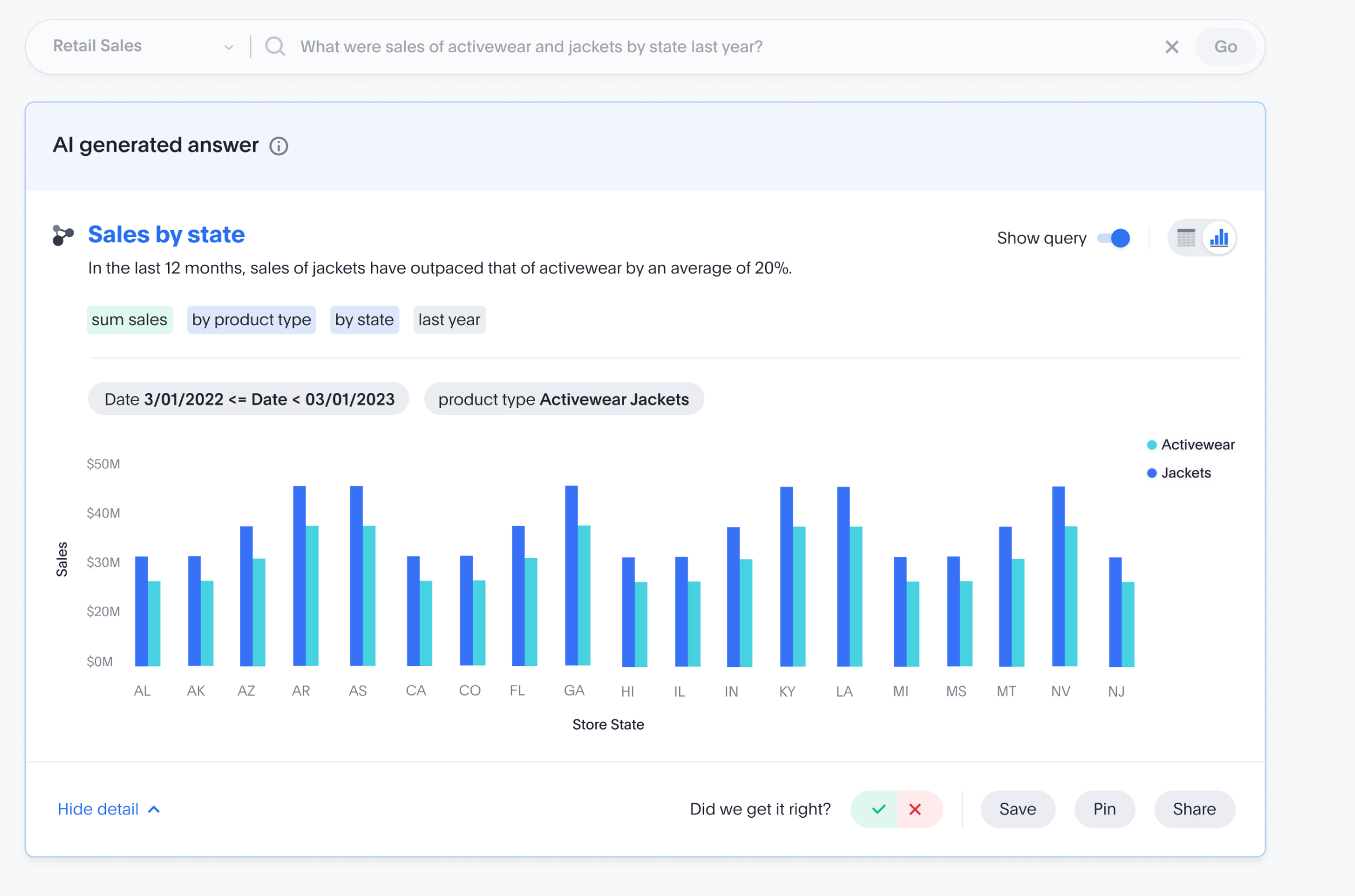
The platform has evolved steadily, even integrating GPT-3 in 2023 via a feature called ThoughtSpot Sage to make its natural language search even more powerful. (It’s also worth noting ThoughtSpot acquired Mode Analytics in mid-2023, bringing in Mode’s strong code-first analytics to complement ThoughtSpot’s search interface, a nod to serving both analysts and business users in one ecosystem.)
ThoughtSpot is great for rapid, ad-hoc questioning. For a sales manager or marketing director with a million questions, the ability to just ask and refine queries on the fly can be really useful. The tool also provides automated insights (SpotIQ) that proactively surface anomalies or trends. Its recent focus on integrating generative AI suggests a forward-looking approach to guided analytics.
ThoughtSpot’s Capterra/G2 rating sits around 4.4★ out of 5. Many enterprises (from retailers to banks) have adopted it, and its customer list is impressive. The mobile app is also a nice touch – enabling on-the-go analytics for frontline folks.
Potential Limitations
That said, ThoughtSpot’s magic doesn’t happen actually by magic, it requires a well-designed data schema underneath. Data teams must do the modeling and defining of columns/relationships so that the search can interpret questions correctly. If your data is a mess, ThoughtSpot won’t automatically fix it.
Some users also find that beyond the simple questions, more complex analysis (e.g. custom calculations or multi-step queries) can be challenging. One user’s “only complaint” was the inability to do a certain type of time period comparison dynamically with filters.
This hints that ThoughtSpot may not yet replace a full-fledged BI tool like Power BI for complex interactive dashboards. Additionally, ThoughtSpot is a premium product, cost can be a barrier for smaller organizations (a common refrain in industry discussions is that ThoughtSpot, like many enterprise tools, “is not cheap”).
3. Omni Analytics
Key Strengths
Omni (Omni Analytics) is one of the newer entrants, often described as an self-service BI tool that combines the consistency of a metrics layer with the freedom of SQL. Founded in 2022 by a team of experienced ex-product builders at Looker, Omni is built cloud-first and aimed at companies embracing the modern data stack. It boasts a unique three-layer modeling approach: you can define metrics in a central layer, use a familiar spreadsheet or SQL interface for analysis, and create visualizations, all within one tool.
In short, Omni tries to give data teams governance and give end-users flexibility, without needing separate tools for each.
A big strength of Omni is its versatility: Analysts can write SQL when needed (and even share those as governed metrics), while less technical users can do drag-and-drop exploration using familiar Excel-like interfaces and functions. Omni’s development pace is reportedly rapid as they push new features frequently, which early adopters appreciate.
Potential Limitations
As a newer platform, Omni is still evolving. It may not have the exhaustive feature set of, say, Tableau (which has had years to accumulate bells and whistles). Some users mention a learning curve, especially if you’re not used to thinking in terms of a metrics layer or if you don’t know SQL at all. The same reviewer quoted above cautioned that, like any SQL-based BI tool, “it takes a technical mindset to wrap your head around it at first”.
4. Lightdash
Key Strengths
Lightdash is an open-source BI tool that has quickly gained attention for its developer-first, dbt-integrated approach to self-service analytics. If your data team loves dbt (data build tool) for transforming data in the warehouse, Lightdash will feel like a natural extension of that workflow. In fact, Lightdash connects directly to your dbt project and lets you define metrics and dimensions in YAML (alongside your dbt models). This means your business logic (the definitions of revenue, churn, conversion, etc.) lives in code, under version control, and Lightdash serves as the UI layer on top of exploration and visualization.
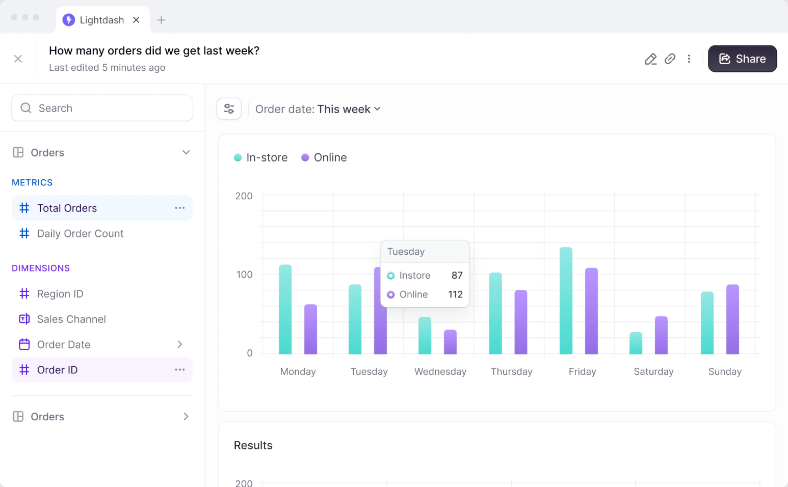
Lightdash is also flexible in deployment as you can self-host it for free (since it’s open source), or opt for Lightdash Cloud for convenience. The interface is relatively simple and focused. Given it’s relatively new, Lightdash’s user base is still growing, but early reviews are very positive, albeit with a small number of reviews. Users love that it feels intuitive for anyone familiar with Looker or dbt. It provides core charts, dashboards, and the ability to drill into the SQL if needed.
Potential Limitations
Lightdash is evolving, and with that comes a few growing pains.
Some users have noted that certain features are still catching up to more mature self-service BI tools. For instance, the mobile experience is one area that could be stronger (e.g. viewing dashboards on your phone isn’t as slick as it could be yet). One user mentioned that Lightdash had “growing pains along the way” transitioning from an alpha product to production-ready, but also acknowledged the team is catching up rapidly. Because it’s open source, companies used to hefty commercial support might need to rely on community support (unless they use the paid Cloud). Also, Lightdash assumes you have (or are willing to build) a dbt layer, if you don’t use dbt or SQL-based transformations, you won’t get the full benefits of Lightdash’s methodology.
In terms of visualization options and UI polish, it’s improving quickly, but you might find fewer chart types or formatting options compared to Tableau/PowerBI. That said, the trade-off is intentional simplicity and consistency.
5. Looker
Key Strengths
Looker is the elder statesman on this list, the product that arguably pioneered the whole semantic-layer-self-service BI approach a decade ago. Now part of Google Cloud (acquired in 2019), Looker’s core philosophy remains a “model once, use everywhere” metrics layer through its proprietary LookML modeling language. Data teams use LookML to define dimensions, measures, and business logic in a centralized model. Then business users get a web interface to explore those metrics, create visualizations, and build dashboards, all with the assurance that (in theory) “Revenue” means the same thing everywhere. This governed approach is why Looker still has a strong reputation for data consistency and governance. In fact, many of the newer tools (Holistics, Lightdash, Omni, etc.) borrow inspiration from Looker’s model-first design.
Looker’s semantic layer is very robust. It allows for complex derivations, relationships, and reuse of logic via LookML. Organizations with large analytics teams love the control it provides, which help you you enforce definitions and avoid the chaos of everyone making their own calculated fields. Looker also supports advanced embedding and APIs, making it possible to embed charts or even the whole Looker Explore interface into other products.
Because Looker has been around, it’s feature-rich: scheduled report delivery, a wide range of visualization types (though not as flashy as Tableau’s), granular permissions, etc. Many data leaders still consider Looker the gold standard for governed self-service in metric-heavy environments.
Limitations
Looker’s strengths come with trade-offs. The biggest is that it requires a data team to maintain the LookML model. It’s not a tool you just install and let everyone click around; it needs upfront modeling. If you don’t have someone willing to write and update LookML, Looker can become a bottleneck (or users will misuse it). Also, Looker’s UI, while decent, isn’t as visually polished or interactive as some competitors. Some business users find the exploration interface a bit rigid or less intuitive for deep ad-hoc analysis (especially if they’re used to more free-form tools).
Another common complaint is cost. Looker’s licensing has traditionally been expensive, which can put it out of reach for smaller companies. As an example, users have noted the high fees: “the cost is significantly higher compared to alternatives like Tableau”, particularly for clients in regions where budgets are tighter. So ROI needs to be clear to justify it.
In summary, Looker remains a popular choice for enterprises that need self-service BI tools with strict data governance and semantic modeling layer. It may not be the trendiest new toy, but it set the stage for this whole category of self-service bi tools and continues to be a benchmark for unified, trustworthy BI.
6. Metabase
Key Strengths
Metabase is a bit of a different beast among these self-service BI tools: an open-source, easy-to-use BI tool that has gained massive popularity, especially among startups and smaller teams. If Looker is about heavy data modeling, Metabase is about quick, user-friendly Q&A on your database. It offers a simple interface where users can run queries (via a GUI or SQL), visualize results, and even embed dashboards. One of Metabase’s standout features is its simplicity as it’s often praised as “great for non-technical users to quickly find information”. You can even start asking questions in plain language and Metabase tries to figure out the relevant data (though this isn’t as advanced as ThoughtSpot’s NL search).
The biggest strength is that Metabase is open source and free (there’s a paid hosted version and an enterprise edition with extras, but the core is free). This lowers the barrier immensely; many companies spin up Metabase as their first BI tool to get something in place. It has a friendly UI, with the ability to save questions, create dashboards, and set up email or Slack alerts. It supports a variety of databases and has a lightweight embedding capability for product analytics. Metabase’s learning curve is shallow; most people can get the hang of it in minutes. This makes it a favorite for enabling basic self-service, things like simple KPI dashboards or letting a sales rep filter a table for their territory.
Potential Limitations
The flip side of Metabase’s simplicity is that it’s not as powerful for complex analytics. As datasets grow and questions get more intricate, Metabase can start to feel limiting. The tool doesn’t enforce a semantic model, so metric definitions can proliferate inconsistently if you’re not careful (it’s essentially the problem Looker set out to solve, but Metabase doesn’t attempt to solve it). Also, performance can be an issue with very large data or complex queries – Metabase sends live queries to your database, so if a user executes a heavy query, it might be slow or put load on the db. One user candidly said that while Metabase is great for quick insights, “for more complex analysis you will need a more robust system like Tableau”, noting it “can be slow to load a lot of data” at times..
Additionally, while Metabase has decent visualization options, it’s not as rich as some paid tools. Dashboard layout and interactivity are basic (they improved over time, but still basic relative to high-end BI platforms). Governance features (like row-level security, revision histories, etc.) are minimal in the open-source version while some of that exists in the paid Enterprise edition. So large organizations might hit a ceiling with Metabase’s free version.
For my company, user adoption is off the chart. They run BI training and internal promotion of the tools and our data platforms. Every team publishes datasets. The problem is that a lot of business users make terrible data models that are difficult to integrate into composite models or produce incorrect aggregations, and sometimes it takes weeks to get access to a dataset if the owner is on holidays.
I’ve never seen a self-service BI setup in use. My theory is that in order to do proper self-service you have to understand the underlying datamodel and the logic within. Most business users don’t care to get to that level of knowledge.